Score
Jiyung Lees Illustrations Of Everyday Items Are Organised Almost Like A Catalogue Layout
Jiyung Lee's approach to illustration emphasizes the organization and presentation of everyday items, akin to a catalogue layout, which can inform brand strategy by highlighting the importance of visual storytelling and the arrangement of products. By treating images as symbols and exploring their narrative potential, brands can enhance their identity and connect more deeply with consumers through thoughtful design and composition.
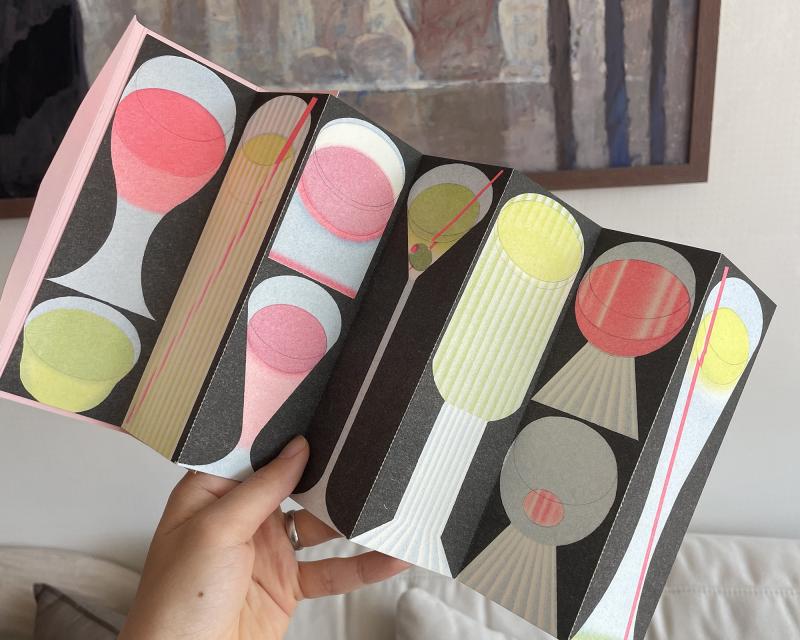
Creative Boom: Inspiration Illustration Jiyung Lee's illustrations of everyday items are organised 'almost like a catalogue layout' The Korean-French illustrator draws objects in grids and collections, finding rhythm and narrative in the most ordinary of things. Written By: Ayla Angelos 14 May 2026 Pocket pages bookmark, designed by Bureau BCD Before Jiyung Lee draws anything, she chooses a single word and then expands outward into every possible form it might take. From that word comes a subject, and from the subject comes a grid.
And from the grid – ruled in pencil, measured with circle and ellipse templates – comes something that looks, at first glance, like a catalogue. Then, a few moments later, you realise it's more like a poem. Jiyung grew up in South Korea, where she studied fine art with 80 students. After graduating, she moved to France to study Communication Design, which she chose out of curiosity: "I thought if I learned the design language, I would also gain another skill to express myself." The French school was small and intimate, and students could take any classes they wanted,, regardless of the degree they chose.
Jiyung moved between printmaking, drawing, installation, editorial and graphic design. "Looking back, it helped me a lot to translate ideas into a visual language using the right instrument or medium." Drawing, though, stayed constant. "Drawing remains the foundation of my practice, and I'm interested in exploring many forms through it." Jiyung still works as an illustrator, but prefers not to call herself as such –" I don't see myself limited to one label." What really fascinates her is how images can be viewed as symbols, the point at which something sits between painting, design and illustration without quite belonging to any of them.
Coffee, personal work. Digital drawing. 2026 Coffee and Water, personal work, risoprint, 2026 Glutton book, printed and designed by Quintal Atelier Her inspiration tends to come from structure and organisation in everyday situations. "I'm drawn to the way everyday objects are organised and presented rather than a single object," she explains. Market stalls are a recurring source of ideas, especially when the fruits, vegetables, and household goods are arranged in a way that is simultaneously chaotic and ordered, almost pattern-like.
Supermarket flyers and catalogues have a similar appeal, especially the way items are grouped, repeated, and systemised into some kind of visual logic. "When images begin to function like language, when composition starts to tell a story through arrangement alone, that's the moment I find most exciting." The process that follows involves Jiyung choosing a subject, before dividing the page into a grid – "almost like a catalogue layout" – and drawing each object within its own space. Rulers, circle templates, and ellipse guides are productive limitations that she uses to restrict certain gestures while opening up new and unexpected ones.
The forms themselves are stripped back to their essentials, pushed towards the abstract pictogram, and then pulled back just enough to remain legible. "To find a balance where you remove or add just the right amount so it is recognisable is something I continually enjoy exploring." Pocket pages bookmark, designed by Bureau BCD Personal work. risoprint Insects Poster, printed by RFI gallery In her bread series, you'll spot croissants, baguettes, buns, pretzels and rolls arranged across a dark background in warm golds and yellows, each forming a silhouette.
Article truncated for readability. Read the full piece →
The article presents a unique perspective on illustration that can influence brand strategy, particularly in visual storytelling, making it significant and relevant for design professionals.