Score
Casagrande Brand Identity by Bortoletto Studio
The development of Casagrande's brand identity by Bortoletto Studio emphasizes the importance of a cohesive visual and verbal identity that allows the product to take center stage. By utilizing a warm color palette and a restrained typographic approach, the brand strategy effectively communicates the essence of custom furniture, enhancing its appeal in a competitive market.
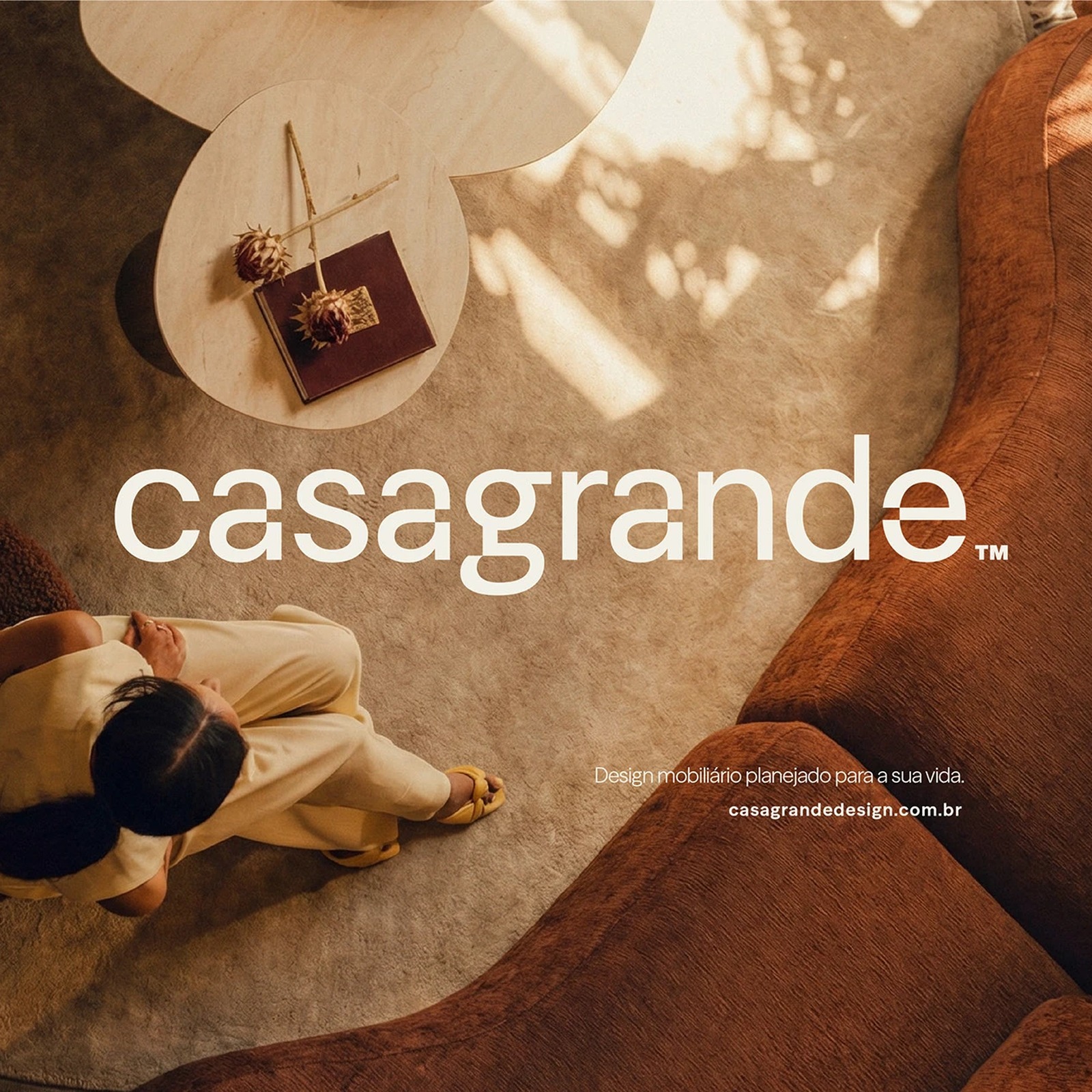
Abduzeedo: Casagrande Brand Identity by Bortoletto Studio jeff April 28, 2026 Bortoletto Studio developed a brand identity for Casagrande Design Mobiliario — warm gold tones, serif logotype, restrained systems for custom furniture. Casagrande is a custom furniture company based in São Paulo, founded by Vitor Saito Casagrande. Bortoletto Studio built this brand identity around a warm gold tone that sits alongside cream and sandstone across the palette. The logotype uses a serif typeface for the Casagrande name and a clean sans-serif for Design Mobiliário below it. One weight, two sizes, no decoration.
The palette reads like materials found on site rather than engineered in a studio. Brand identity in application This brand identity extends to business cards, letterhead, brochures, and digital presence. Dark background mockups use deep charcoal that makes the warm gold tone read with quiet authority. The project includes a visual identity system for both printed and environmental applications. Bortoletto Studio handled the strategic repositioning, verbal identity, and every detail of the brand identity. The restraint in this work lets the furniture speak for itself, which is exactly what a custom maker needs.
Casagrande Design Mobiliário: Behance | Bortoletto Studio: bortolettostudio.com
The article discusses a specific brand identity project that showcases effective design strategies, which is relevant to the industry, but it does not represent a groundbreaking approach or major industry shift.