Score
This New App From Apple Has Something Important To Teach Us About Designing Data
Apple's new Sports app serves as a prime example of effective data visualization, particularly in the context of the upcoming FIFA World Cup. By focusing on clarity and speed in design, Apple demonstrates how to present complex information in a user-friendly manner, which can inform broader brand strategies around user experience and communication.
Creative Boom: Inspiration Digital Apple's new Sports app shows us exactly what good data visualisation looks like With the World Cup just weeks away, Apple Sports' expanded tournament features are a masterclass in visual communication. Written By: Tom May 1 June 2026 There's a moment, usually somewhere around the group stage, when following the football World Cup stops being fun and starts feeling like unpaid admin. Sixteen groups, 48 teams, dozens of simultaneous results, knockout permutations that require a maths degree to untangle… Yes, the tournament is spectacular, but keeping up with it can quickly become an exhausting headache.
Apple, it turns out, has been working on solving just this problem. And the solution it's arrived at is worth paying attention to, even if you hate sport, because it's a wonderfully elegant piece of design thinking. Apple Sports, the company's free iPhone app for real-time scores and stats, has just announced a substantial expansion ahead of this summer's FIFA World Cup 2026, growing from its existing markets to more than 170 countries and regions worldwide, including over 90 newly added territories. Heady stuff.
But the most interesting part, for anyone who cares about design and how information gets communicated, is what Apple has built into the product itself. Namely, a suite of new World Cup features that demonstrate, with typical Apple restraint, exactly what good data visualisation looks like. The World Cup kicks off in June, and between that and the summer's other major fixtures, we're heading into one of the most densely packed sporting calendars in years. Millions will be reaching for their phones mid-match, between matches and during the frantic final weeks of the knockout rounds. The design challenge, then, is real and immediate.
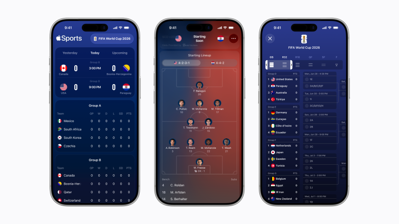
How do you serve up that volume of information to that many people, quickly, without overwhelming them with stuff? Clarity as a design value The app's new tournament bracket view is a scrollable overview of the entire competition, from group stage through to the final, laid out so you can track a team's progression at a glance. That might sound straightforward, but anyone who's tried to reproduce a World Cup bracket in a spreadsheet, on a whiteboard, or anywhere else will know how quickly these things become cluttered and confusing.
Apple's version, though, is clean and navigable, with a tab system separating the group stage, round of 32, round of 16, quarter-finals, semi-finals, and final. It's an object lesson in information hierarchy: knowing not just what to include, but how to sequence and layer it. The visual formations feature is particularly thoughtful. Enhanced game cards now show each team's starting lineup, laid out on a pitch graphic, complete with player photos, names and squad numbers positioned according to their actual tactical formation.
For the opening USA vs Paraguay fixture, for instance, you can see at a glance that the US are lining up in a 4-2-3-1 and Paraguay in a 4-4-2, with individual faces attached to each position. It's the kind of information that used to require hunting across multiple websites or waiting for a pre-match TV broadcast. Here, it's immediate and easy to access. Speed as a design principle As you might expect, Apple Sports borrows much from Apple's broader design philosophy: the dark blue palette, the generous whitespace, the preference for iconography over text wherever possible.
Article truncated for readability. Read the full piece →
The article highlights a significant example from a major brand that can influence design practices, making it impactful and relevant, though the concepts of data visualization are not entirely new.