Score
Saint-Urbain Gives West Village Brand Identity a Voice
The branding strategy developed by Saint-Urbain for the West Village emphasizes community engagement and identity over traditional marketing tactics. By reframing the neighborhood as an active practice rather than a destination, the brand identity fosters a sense of belonging and participation among residents, which is crucial for effective place-based branding.
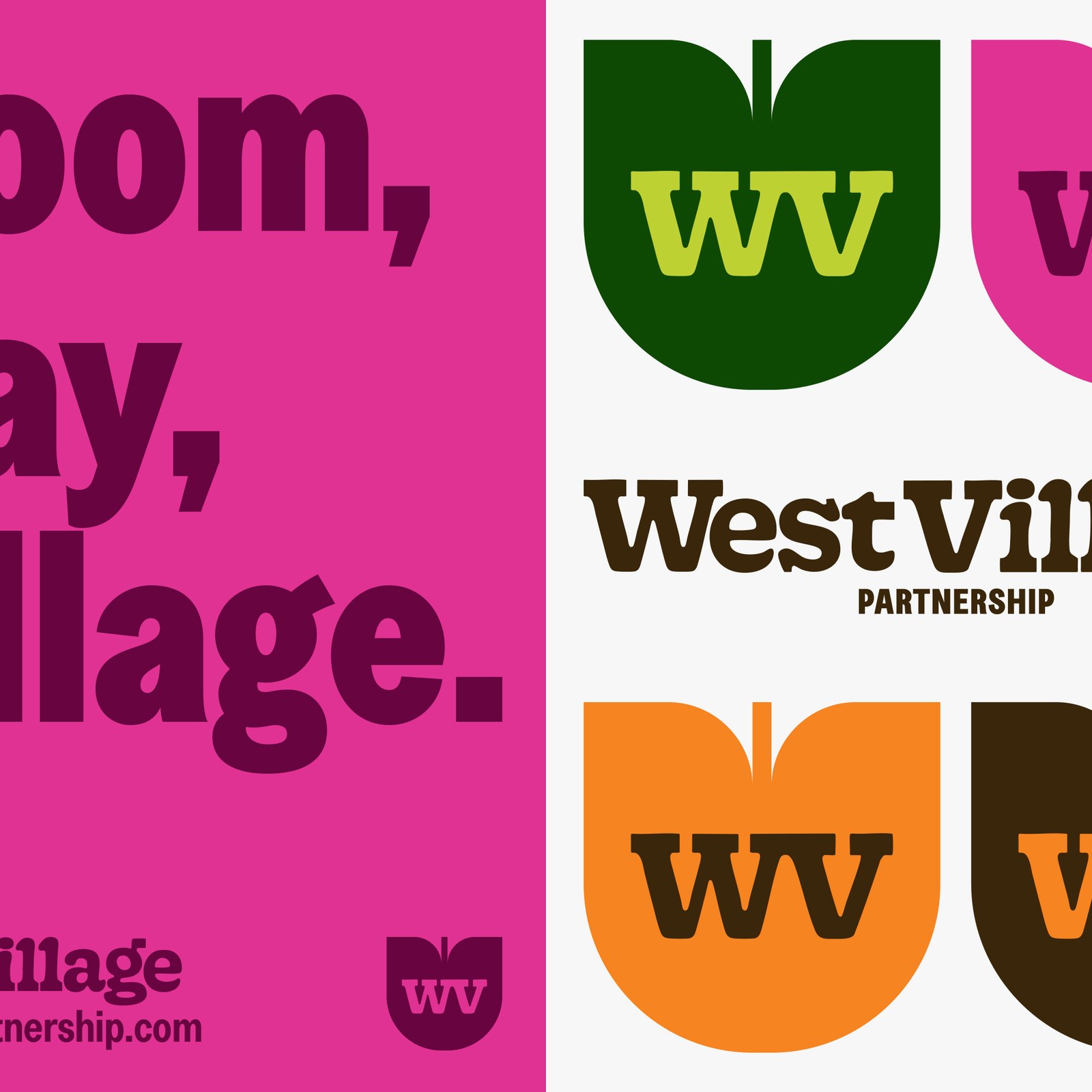
Abduzeedo: Saint-Urbain Gives West Village Brand Identity a Voice jeff March 24, 2026 Saint-Urbain built a West Village brand identity for NYC, turning Village into a verb with bold type, vivid color, and community documentary photography. Montreal studio Saint-Urbain created the identity for West Village Partnership, a Business Improvement District covering one of New York City's most culturally distinct neighborhoods. The core concept reframes the neighborhood not as a destination but as a practice. Phrases like "Together, We Village" and "Bloom, Play, Village" bend grammar on purpose.
They position the neighborhood as something residents do, not somewhere tourists go. The off-balance letterforms in the custom wordmark mirror the West Village's refusal of Manhattan's grid. Creative director Alex Ostroff drew from late-1960s and early-1970s American vernacular type found on neighborhood posters and letterpress prints. The result has what Ostroff describes as a tactile quality: human, lived-in, and expressive. Supporting type comes from Greed Condensed by Displaay, a face that balances past and present aesthetics.
The color palette maps directly onto the neighborhood itself: park greens, warm orange and yellow from street signage, pink from Pride celebrations, and darker anchoring tones grounding the whole system. How the West Village Brand Identity Puts Community First Photography plays an equally strategic role. Rather than shooting aspirational lifestyle imagery, Saint-Urbain commissioned documentary photography of real neighbors at cafes, shopkeepers at work, Pride celebrations in the streets, and kids in active parks. The identity shows up across lamp post banners, storefront stickers, tote bags, and even garbage trucks.
Each touchpoint reinforces the same idea: the brand exists to frame community activity, not to replace it. The WV monogram, a tulip-shaped mark that echoes the neighborhood's parkland, adapts across the full color palette without losing its character. This West Village brand identity succeeds because it understands that the most compelling neighborhood brands do not compete with the neighborhood.
The article discusses a unique branding strategy that emphasizes community engagement, which is significant for place-based branding, making it impactful and relevant to brand strategy professionals, though the concept of community-focused branding is not entirely new.