Score
STARK Architecture Brand Identity by Electric Brand Consultants
STARK Architecture's new brand identity, crafted by Electric Brand Consultants, emphasizes a minimalistic yet bold approach that reflects the natural landscape of Squamish, BC. By integrating real architectural blueprints and a clean typographic style, the rebranding strategy effectively communicates STARK's values of creativity and authenticity, positioning the firm as a leader in innovative design.
Abduzeedo: STARK Architecture Brand Identity by Electric Brand Consultants sofia April 01, 2026 STARK gets a new architecture brand identity from Electric Brand Consultants: embossed type, blueprint textures, and mountain minimalism in Squamish, BC. STARK is an architecture and interior design studio in Squamish, British Columbia. The town sits at the foot of the Coast Mountains, and the landscape shapes every architecture brand identity decision Electric Brand Consultants made here. The rebranding centers on a concept called The Thrill Seekers: a framing that captures STARK's drive to push limits in design and terrain.
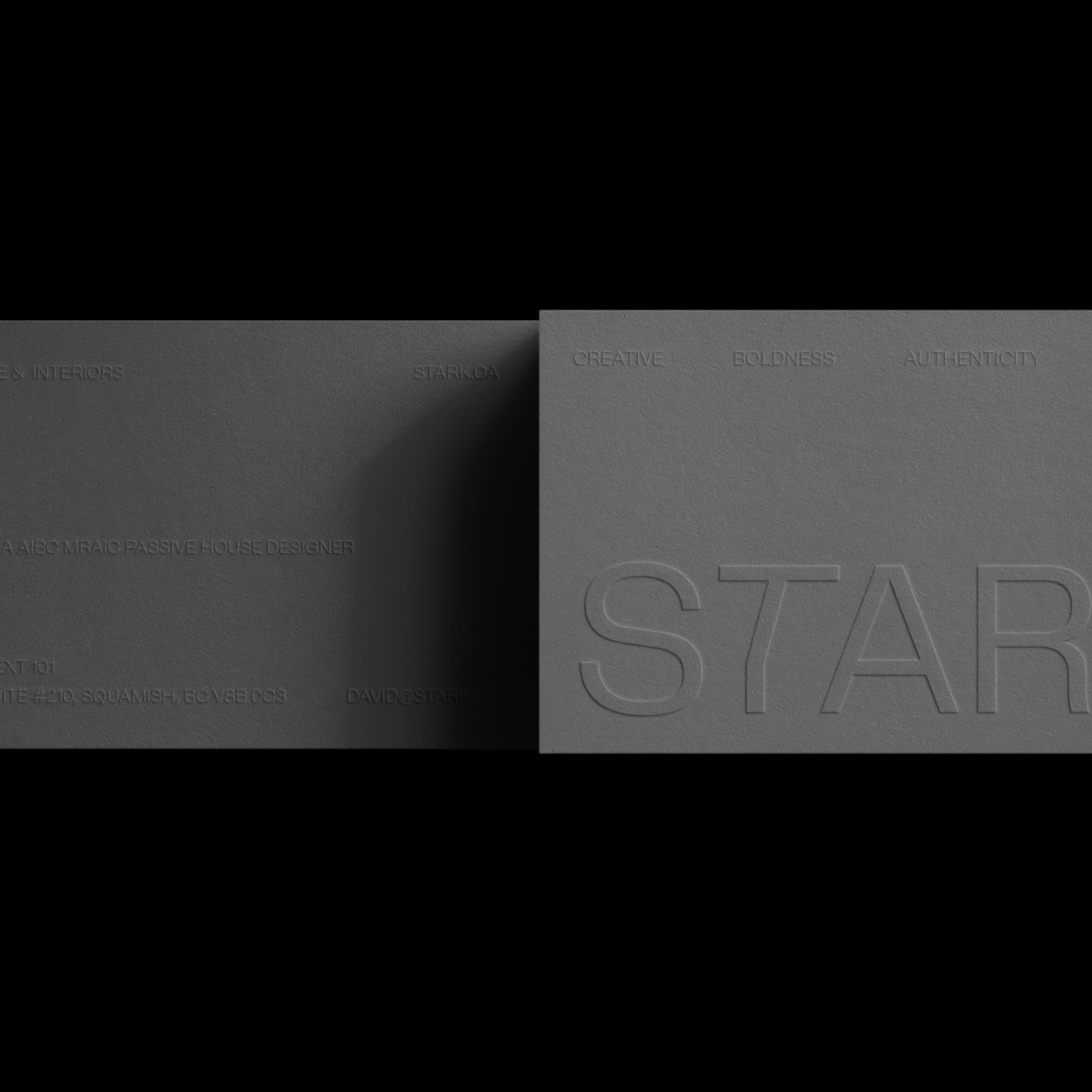
The visual system draws on soft minimalism with deliberate material references. The wordmark uses a clean, tightly-spaced sans-serif pressed into dark grey card stock as a debossed letterform. It reads quietly but communicates confidence through tactile weight. Brand values including CREATIVE, BOLDNESS, AUTHENTICITY, and CO-CREATION appear as a secondary typographic register, running like a sub-grid beneath the primary mark. Architecture Brand Identity Rooted in Blueprint and Terrain One of the more precise decisions is the use of actual house blueprints as a texture element. These are not illustrative sketches.
They are real architectural drawings reproduced at a scale where they become pattern rather than document. Paired with a photography direction favoring natural light and open space, the architecture brand identity reads as lived-in rather than produced. The website extends the system cleanly. Linear grid layouts echo the logic of architectural drawings. White space and deliberate type sizing carry most of the visual weight. As an architecture brand identity, STARK's rebrand earns its sustainability claims through specific visual choices.
See the full project at Electric Brand Consultants on Behance.
The article discusses a significant rebranding effort for an architecture firm, which is impactful for the design industry, while the approach is somewhat novel and relevant to brand strategy professionals seeking insights into effective identity development.