Score
The Best New Typefaces For June 2026
The latest typefaces released in June 2026 showcase a diverse range of styles that can enhance brand identity and communication. For brands, selecting the right typeface is crucial as it can convey personality, evoke emotions, and establish a strong visual presence in various applications, from packaging to digital platforms.
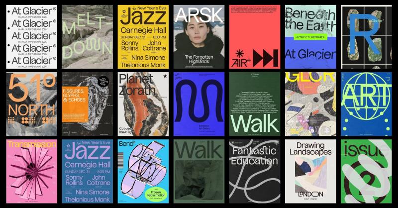
Creative Boom: Resources Typography The best new typefaces for June 2026 For all you graphic designers out there, we've rounded up the latest big releases from foundries across the planet. From display fonts to classic serifs and a family inspired by Iceland's wild landscape, June's offering is so good that some might end up in your current projects. Written By: Katy Cowan 15 June 2026 At Glacier by Omar Careaga There's something about midsummer that seems to bring out the best in type foundries and designers. Maybe it's the long days. Maybe it's a rush of projects finally being signed off on.
Whatever it is, June has an unusually rich crop: revivals lovingly reworked, stencils that break their own rules, and display faces with enough presence to fill a poster that could be seen from space. Well, perhaps not. But you get the picture. What I love about this month's haul is the sheer range. This is creativity at its finest. There are monospaced workhorses built for important data, dashboards and tidy code. We have warm wedge serifs that nod to mid-century America. There's even a display face carved straight out of Iceland's volcanic landscape.
Whether you're after something quiet and dependable or loud and unapologetic this June, Creative Boom has you covered. So grab a brew, settle in, and see which of the following typefaces make their way into your next project. Sticks by Nguyen Gobber Sticks is a monospaced typeface built from rectangular shapes with rounded inner corners, reminiscent of reinforced joints in precision-cut metal components. Its strict, rigid appearance follows the same visual language of construction, technology, and industrial machinery. Perfect for any branding projects in that field.
Originally released in 2019 and discontinued a few years later, the typeface was fully reworked, expanded, and re-released this month as a family of individual styles and a variable font. Nicely done, Nguyen Gobber. Sahlia Stencil by Arcane Type Foundry Introducing Sahila Stencil, the latest release from Arcane Type Foundry and an expansion of its existing typeface Sahlia, from a single weight to a 10-style family with true italics and a variable font that covers all styles. Sahlia is a stencil typeface that breaks all the rules.
Where most stencils slice away parts of the letters, Sahlia's extreme contrast dissolves the thin parts entirely, as though worn away over time. The result feels both structured and organic: sharp, high-contrast serifs softened by delicate forms. In the lighter weights, Sahlia has a graceful presence, while at its heaviest, it becomes more dramatic, yet it keeps its luxurious tone. Designed for projects that want to make an elegant statement but with a little edge, Sahlia performs in editorial layouts, on luxury packaging, and across lifestyle content. Think candles, self-care, and slow living... that sort of thing.
Curo by Silver Stag Type SLTF Curo is a super-heavy display sans-serif typeface designed for brands that want some serious presence. Built around a single extreme weight, Curo comes in five distinct corner-style variants: Sharp, Crisp, Regular, Soft, and Rounded, giving designers a complete tonal range within a single typeface family. Each variant carries the same bold, unapologetic mass but shifts in character. From the hard-edged tension of Curo Sharp to the warm, voluminous fullness of Curo Rounded, the result is a complete design system of five fonts available with a single purchase.
Article truncated for readability. Read the full piece →
While the article discusses new typefaces that can enhance brand identity, the topic of typography is a common subject in design and branding, making it less impactful and novel, but still relevant to brand strategy professionals.