Score
A first look at the vibrant branding for the 2028 Los Angeles Olympics
The vibrant branding for the 2028 Los Angeles Olympics, inspired by the superbloom phenomenon, emphasizes a cohesive visual identity that integrates bright colors and abstract graphics across all event materials. This strategic approach not only enhances the overall aesthetic experience but also aims to unify the branding efforts of sponsors and partners, ensuring a consistent theme that resonates with the diverse culture of Los Angeles and maximizes commercial success.
FastCompany: It’s still more than two years until the cauldron lights up for the 2028 Summer Olympics in Los Angeles, but we now know what the multibillion-dollar global sports spectacle will look like. The design team at LA28 , the local organizing committee for the games, has given Fast Company a preview of the concepts and visuals that will guide the look and feel of the 2028 Olympics. The design approach is conceptually based on the superbloom, a natural phenomenon sometimes experienced in Southern California when an unusually wet winter leads to an explosively colorful spring bloom of wildflowers.
The LA28 design approach uses bright, almost neon tones and an abstract graphic that will become the basis for the design of everything from stadium decorations to event tickets to promotional material and signage plastered across Southern California. [Image: LA28] “It’ll take over miles of printed graphics, probably the same amount of digital screens, thousands of pieces of sport equipment from batons to hurdles to rugby balls,” says Geoff Engelhardt, head of brand and design for LA28.
As a branding expert who has worked in the Olympics sphere since a stint with Team USA’s official outfitter, Ralph Lauren, for the 2008 Summer Olympics, Engelhardt is deeply versed in the history and complexity of designing for the games. Working alongside LA28 executive design director Ric Edwards, Engelhardt has helped craft a 250-page guidebook that sets the visual tone for every aspect of the games. “All of these things will carry our look,” Engelhardt says.
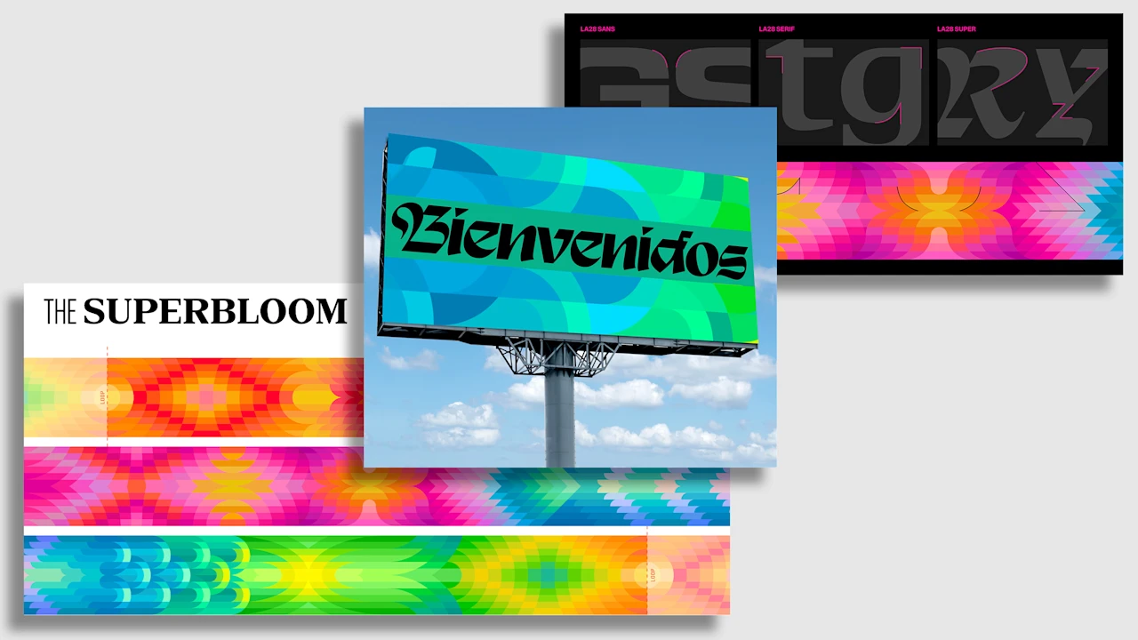
“To create a system that can work for all of that was quite challenging.” [Image: LA28] The superbloom concept became a framework for this design language, providing a vibrant color scheme as well as the visual form of flower petals to guide the graphic treatment. The team developed a core superbloom graphic made of 12 long horizontal rows that are subdivided into kaleidoscopic arrays of primary and secondary colors. Different patterns within the graphic form 13 discrete “blooms” that represent different aspects of L.A.’s culture and history, including its status as a world stage, a culinary crossroads, and a diverse melting pot.
The shapes within each bloom are designed to seamlessly flow into each other, allowing them to either stand alone on a poster or flow together for miles along a marathon route. “It was really important that we developed a toolkit that worked for millions of brand impressions,” says Edwards. “Each real estate is not always a one-by-one square ratio or perfect rectangle. You have to solve for everything and anything.” [Photo: Rodin Eckenroth/Getty Images/courtesy LA28] A high bar for L.A.
Olympic design Defining the visuals of a Summer Olympics is no small task, but it carried an even greater weight in L.A., which last hosted the event in 1984 and had one of the most beloved designs in Olympics history. Led by the design firm Sussman/Prezja, the look of the 1984 Olympics was a flamboyant and celebratory event that diverged from the more conventional and austere Olympics of the past. [Image: LA28] Defined by a bold magenta, yellow, and teal color scheme that spread across dozens of sites and venues in the city, it became a widely celebrated and influential design .
Article truncated for readability. Read the full piece →
The branding for the 2028 Los Angeles Olympics is significant for the brand/design industry due to its high-profile nature and potential influence on future event branding strategies, while its vibrant and cohesive approach offers fresh insights that are highly relevant to brand strategy professionals.