Score
BBH’s new visual identity harks back to its founding ethos
BBH's recent rebrand emphasizes a return to its foundational ethos, showcasing a new visual identity that reflects its heritage while adapting to current market challenges. By introducing bespoke typefaces inspired by its founders and making them open-source, BBH aims to foster engagement and interaction, reinforcing its commitment to cultural advertising rather than mere commercial delivery.
Source: Driven by a combination of technological disruption, macroeconomic pressures and changing client demands, some of the world’s biggest advertising groups have been feeling the pinch of late, with some commentators even heralding “the death of big agency models” . In the past few months alone, we’ve seen WPP’s market valuation decline sharply to roughly £3 billion from its 2017 peak of £25 billion, while the Omnicom-IPG merger has so far resulted in the loss of thousands of roles, alongside significant restructuring across long-standing agencies such as DDB and FCB.
Against this challenging backdrop, BBH has launched a new visual identity that feels pointedly out of step with where much of the industry seems to be heading. The agency’s first significant brand update in its 44-year history isn’t newsworthy just for the redesign itself, but also because it has decided now is the time to reassert its founding beliefs. “The idea that built BBH – ‘When the world zigs, zag’ – is still what keeps us going,” explains Felipe Serradourada Guimarães, ECD at BBH London. “We didn’t want to invent something new just because it looked pretty. We wanted something new to be born out of where it all started.
It’s our first proper rebrand since 1982, so we wanted to make it count.” Developed internally by Guimarães and design director Adam Buckland, with type design by Studio Drama (the London-based studio behind the Heinz typeface), the new system is anchored by three bespoke typefaces, each inspired by and named after one of the agency’s founders: Bartle, Bogle and Hegarty. All three typefaces have been made available for free as open-source Google Fonts. All images © BBH “When we started this project we wanted to make sure it came from the right place but also gave back in some way,” says Guimarães.
“So much of this concept came from the way the founders signed their names to create the BBH logo. Each in their own way, each in their own pen, each in their own personality. Making it open-source just summarised how we work and what we believe in. The best work is always made for people to engage and interact with it. We wanted our rebrand to have that element too.” For Studio Drama co-founder Chris Nott, the brief was explicitly about “honouring BBH’s British heritage.
The typeface builds on the classic British Grotesque classification, reimagined through a global lens to create a family that is bold, precise and unapologetically display-driven,” he says. Doubling down on BBH’s black sheep mentality, “the typeface includes distinctive stylistic alternates” while “angularity, fluidity and unexpected shapes are built into the design … allowing individual glyphs to stand out when used in context”. BBH has always believed in advertising as a cultural object, not just a delivery mechanism, and the rebrand is framed as a statement rather than a service announcement.
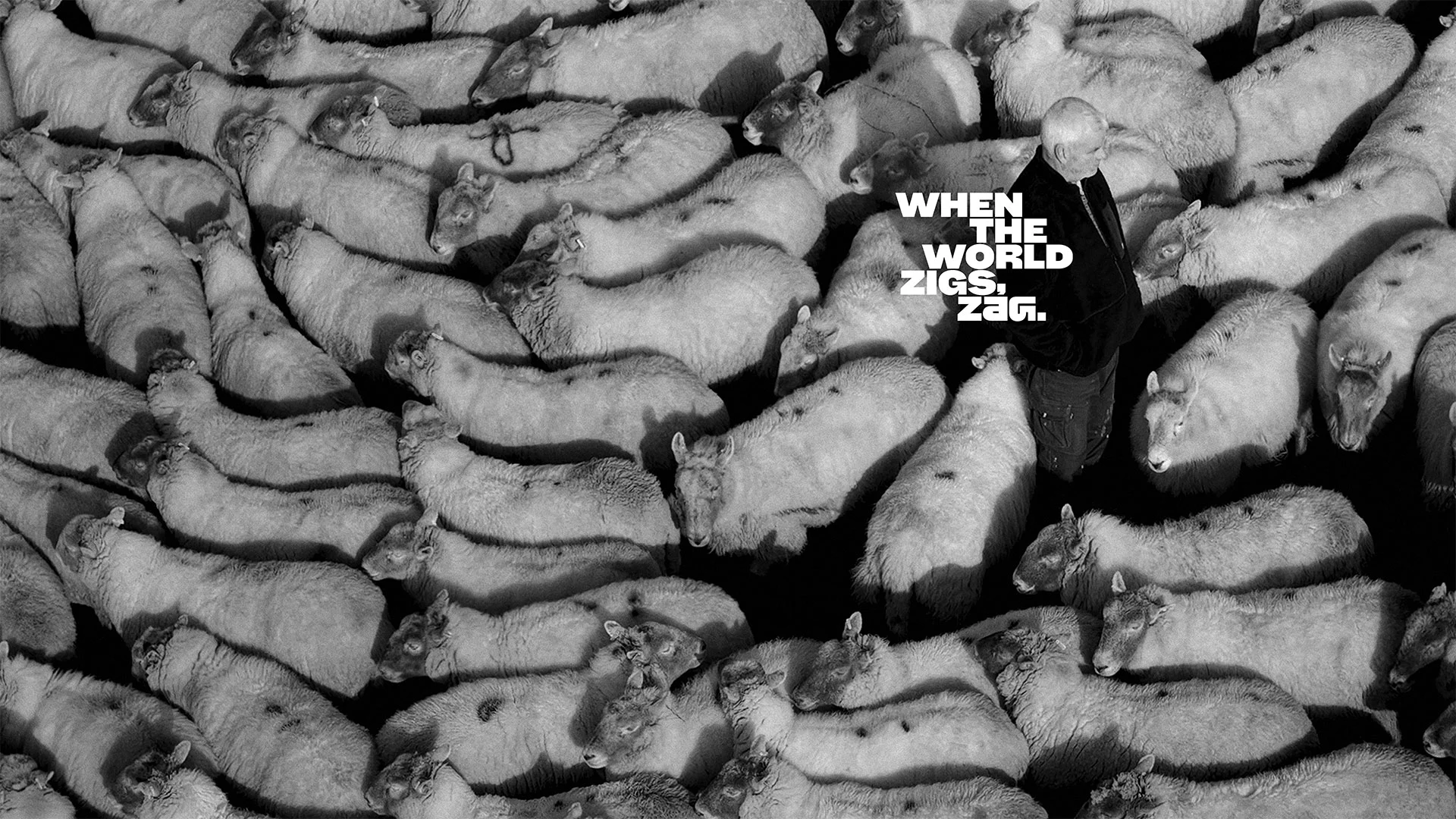
Leaning into its British heritage also feels significant in a market where many large agencies have sanded off their edges in pursuit of global consistency. There’s also a 44-second brand film that nods to BBH’s inaugural Levi’s campaign, made 44 years ago in 1982. The film was shot on location with a flock of heritage Radnor sheep in Pembrokeshire, Wales, and directed by artist-filmmaker Gilly Booth. It launches alongside a new global website created in-house in collaboration with creative developer Oliver Brown. Guimarães summarises: “Just doing the rebrand was never enough, we wanted to launch it in a proper BBH way.
Article truncated for readability. Read the full piece →
The article discusses a significant rebranding effort that connects to foundational principles, which is impactful for the industry, while the introduction of open-source typefaces adds a novel twist relevant to brand strategy professionals.
Weekly digest
Get the Signal digest
Every Monday morning — the top 3 brand trends, 10 high-signal articles, and one emerging signal to watch.
No spam. Unsubscribe anytime.