Score
Big Tech is cutewashing its AI agents
The article discusses the emerging trend of 'cutewashing' in the branding of AI agents by major tech companies like SpaceXAI, Meta, and OpenAI, which are adopting anthropomorphic designs to make their technologies more approachable. This trend reflects a broader strategy to encourage mass market adoption of AI amidst public skepticism, but it also raises concerns about oversaturation and loss of distinctiveness in branding. Brand strategists should consider the importance of maintaining uniqueness in their brand identities to avoid blending into a sea of similar designs.
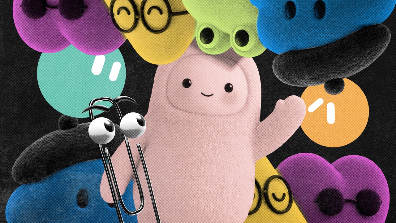
FastCompany: First came the buttholes . Then the sparkles and gradients . Now, the next Big Tech AI branding trend has arrived. As the biggest artificial intelligence players introduce new agent capabilities, they’re all converging around the same visual shorthand: cute little guys. On August 11, SpaceXAI (Elon Musk’s AI-focused mashup company ) launched GrokBot, a series of AI agents designed to work on tasks autonomously, even when the user’s computer is closed. They’re represented by shapes with giant, orb-like eyes.
On September 8, Meta came out with its own agent , called Muse, which looks like a fluffy monster toy (it has also been integrated into a Tamagotchi-style keychain ). Then on September 29, OpenAI joined the party with a suite of AI agents called dots, which look like customizable Pixar characters and were described by the company as “remarkably capable” and “remarkably cute.” We are firmly in the era of the anthropomorphic AI mascot, and according to multiple researchers and designers I spoke with, the trend makes perfect sense.
In moments when tech companies want to encourage mass market adoption of an unfamiliar service, they’ve historically turned to friendly, approachable design. Meta’s Muse mascot “Jolly” [Photo: Minh Connors/Bloomberg/Getty Images] In a recent interview with Fast Company , Anthony Cappetta, partner and creative director at the creative studio Super Okay, explained that these emerging trends help companies “signal compliance” with established digital norms. “There’s a shared advantage in looking familiar and ‘safe’ within the ecosystem, especially for massive platforms where aesthetic shifts are scrutinized heavily,” he said.
“It’s less about being original and more about being instantly legible and trustworthy at scale.” But this visual shorthand comes with its own drawbacks. As AI makes its biggest consumer play in a moment of unprecedented doomerism around the technology , cutewashing a new and largely untested technology can spark its own backlash.
[Image: SpaceXAI] Investigating the Big Tech aesthetic ‘gravity well’ Kevin Walker, chief creative officer at the creative company Buck , has had a front row seat to watch tech companies falling into what he calls the aesthetic “gravity well”—or the phenomenon that causes Big Tech giants to coalesce around the same visual symbols. A Facebook illustration from 2019. [Image: Facebook ] In the mid-2010s, Buck was tapped to help a pre-Meta Facebook clean up its surface and brand expression.
Back then, Walker says, there was no “cohesive idea of what Facebook is or the way that Facebook was going to talk to us.” The brand wanted a system that would highlight its ability to bring together people from all around the world, without trying to show literal individuals. The Buck team landed on an illustration style that it called Alegria, Spanish for “joy,” which showed figurative people with slightly wonky proportions that were easy to replicate.
Article truncated for readability. Read the full piece →
The article highlights a significant trend in branding within the tech industry that could influence how AI products are perceived and adopted, making it highly relevant for brand strategists while also introducing a fresh concept of 'cutewashing'.
Weekly digest
Get the Signal digest
Every Monday morning — the top 3 brand trends, 10 high-signal articles, and one emerging signal to watch.
No spam. Unsubscribe anytime.