Score
OUTFIT by ++hellohello: Type-Led Merch Store
The launch of OUTFIT by ++hellohello exemplifies a strategic approach to branding where the merchandise serves as an extension of the agency's design philosophy. By treating the online store as a stage for typography and design principles, ++hellohello reinforces its identity and engages its audience through clever product naming and a visually striking layout.
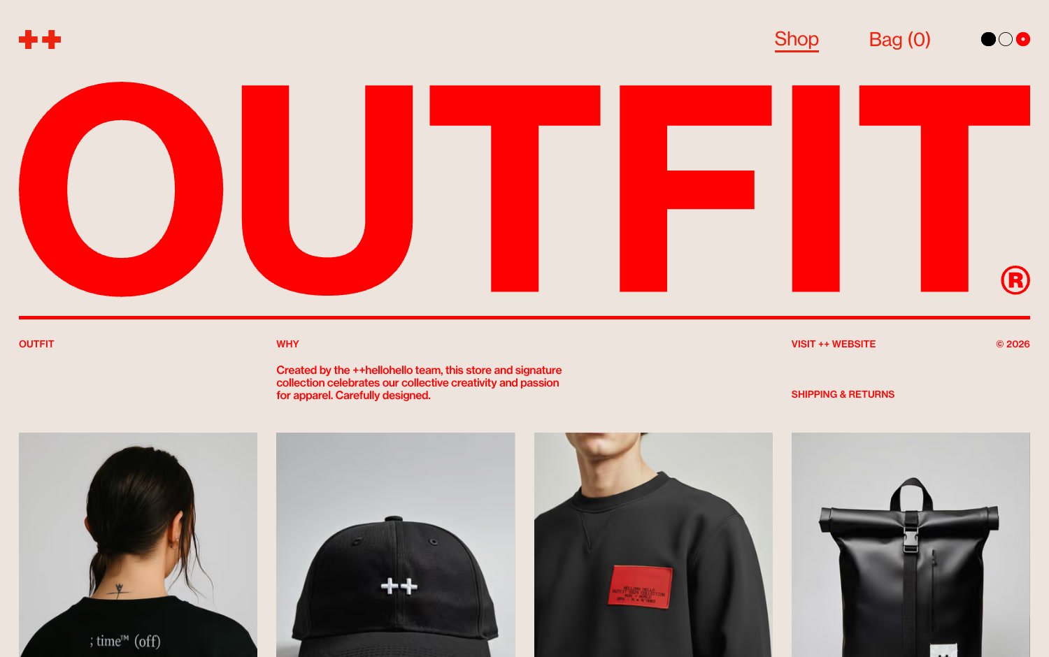
Mindsparkle: Visit website Visit website SOTD ++hellohello DATE September 18, 2026 EDITOR Mindsparkle Mag OUTFIT ++hellohello, the design and technology agency with a studio in Montevideo, has turned its own merch into a small piece of brand theatre. OUTFIT® is the team’s store and signature apparel collection, and the site behind it treats a shop the way the agency treats client work: as a stage for type, grid and restraint.The homepage opens on a full-width, heavy red OUTFIT® wordmark on warm cream, with a single rule and a short manifesto underneath.
Thirteen products then drift down the page in a deliberately uneven grid, where tall totes, small caps and a metallic silver bag change size and offset as you scroll. A three-dot switcher in the header flips the whole store between its red-on-cream default and a black-and-cream dark mode, and a counter-driven loading screen flashes product shots around the wordmark before the shop appears.The collection reads like a design-school in-joke made wearable.
Products carry names like Kerned Confidence, Grid System Go, Neutral Grotesk and Whitespace Matters, and the copy stays in character: the roll-top backpack is perfectly aligned for designers on the move (or on the run from deadlines). Typography carries the range as much as the photography does, from the silver tote printed with Contrast, Grid, Typeface and Spacing to the “; time™ (off)” tee.Product pages keep the same restraint: a large photo on the left, an oversized title, price, one line of copy and size selectors on the right, with sold-out pieces struck through instead of hidden.
Under the hood, the store is built with Next.js and hosted on Vercel, with product imagery served from Shopify’s CDN. It closes on a big “Made to be worn. Or judged. Or both.” beside an oversized ©26. Highlights
The article discusses a unique approach to branding through merchandise that aligns with design principles, making it significant and relevant for brand strategy professionals while also introducing a fresh perspective on typographic merchandising.
Weekly digest
Get the Signal digest
Every Monday morning — the top 3 brand trends, 10 high-signal articles, and one emerging signal to watch.
No spam. Unsubscribe anytime.