Score
Koto Just Proved That Design For Enterprise Platforms Doesnt Have To Be Beige
Koto's rebranding of Mews demonstrates that enterprise platforms can embrace bold design choices to stand out in a crowded market. By leveraging a distinctive color palette and a confident verbal identity, Mews effectively communicates its value proposition while appealing to human emotions, challenging the notion that B2B branding must be bland or overly restrained.
Creative Boom: News Graphic Design Koto just proved that design for enterprise platforms doesn't have to be beige The global creative studio behind Airbnb, Discord and Netflix just rebranded a hotel software company, and the result is the most interesting B2B identity in years. Written By: Tom May 22 April 2026 There is a particular kind of blandness that afflicts software companies.
You know it when you see it: the gradient hero section, the stock photo of a smiling professional in a hotel lobby, the tagline about "seamless solutions" or "powering your tomorrow." Users of Mews, a Netherlands-based hospitality platform that helps hotels manage everything from bookings and payments to housekeeping and guest experience, knew this feeling all too well. "Mews had outgrown the language of a traditional property management system," explains Cat Hill, senior strategist at Koto. "The platform had become far more powerful, but the brand wasn't helping people see that.
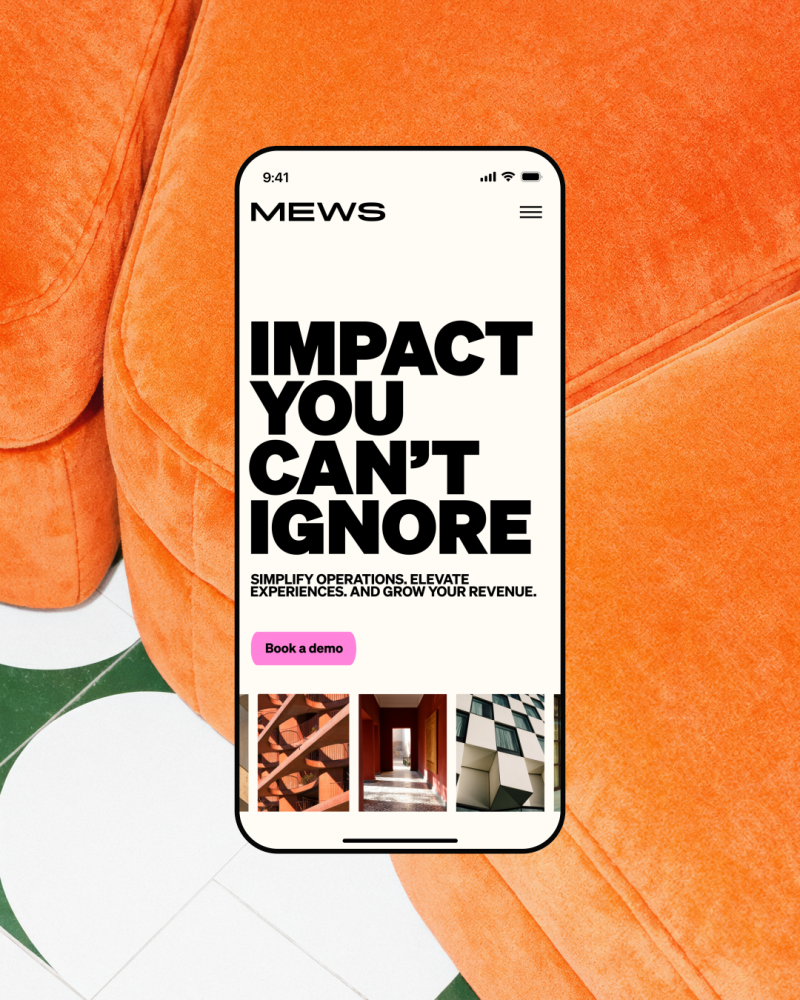
'Impact you can't ignore' gave us a simple yet expansive idea: technology that drives visible growth for operators and creates experiences guests genuinely feel. It became the foundation for a brand that explains complexity more clearly, without losing the ambition behind it." That tension, between complexity and clarity, between warmth and credibility, was the central design challenge of the entire project. And what makes the Mews rebrand worth studying is not just that it solved the problem well. It's that it solved it in a way some of Mews' rivals probably couldn't bring themselves to do.
The problem with being too sensible Mews is, on paper, a deeply unsexy proposition. It's an operating system for hotels that covers property management, point of sale, revenue management, housekeeping, payments, and more. Serving over 15,000 customers across 85 countries, it processes enormous volumes of operational and financial data every day. This is the kind of product whose sales process involves procurement teams, enterprise contracts and six-month onboarding timelines.
And yet here is the new brand: hot pink, black and white, with enormous condensed type screaming "MINI BAR / MAJOR REVENUE" and "HOTEL RUN WELL" across campaign assets that look more like they belong in a gallery than a SaaS sales deck. This boldness is not accidental, and nor is it superficial. The brief, at its core, was about visibility. As the hospitality tech category has grown and matured, the noise has grown with it. Every platform is now making the same claims in the same voice.
Mews needed to do something visually and verbally distinct enough to cut through, while still being credible enough to close enterprise deals with serious hotel operators. Pink as a strategic asset The decision to double down on pink, rather than retreat to something safer, is one of the most interesting choices in the project. Pink was already part of Mews' existing brand, but it was being used cautiously, like a flourish rather than a foundation. The rebrand treats it as the primary asset, amplifying it to the point where it becomes genuinely ownable.
Article truncated for readability. Read the full piece →
Koto's rebranding of Mews showcases a significant shift in B2B design, emphasizing the importance of bold aesthetics in enterprise platforms, which is highly relevant for brand strategy professionals seeking to differentiate in a competitive market.