Score
How Risotto Studio Found The Filing Cabinet To Be An Underrated Canvas
The collaboration between Risotto Studio and Bisley demonstrates how thoughtful design and color can transform utilitarian furniture, like filing cabinets, into vibrant elements of a workspace that inspire creativity. This approach emphasizes the importance of the physical environment in shaping work output, suggesting that even standard products can be reimagined to enhance a brand's identity and mission.
Creative Boom: News Experience How Risotto's refurb turned the humble filing cabinet into an expressive canvas When Bisley partnered with Glasgow's Risotto Studio to furnish a new creative headquarters, the result was a masterclass in how colour and storage can transform the way people work. Written By: Tom May 23 April 2026 All photos by Richard Gaston There's perhaps no object less romantic in the history of the office than the filing cabinet. It sits in the corner. It holds things. Nobody photographs it. Nobody talks about it at design festivals. It is, by almost universal agreement, furniture as infrastructure.
Necessary, neutral and entirely beside the point. Gabriella Marcella, founder of Glasgow-based Risotto Studio, has a different view, though. And her new creative headquarters, furnished in collaboration with British manufacturer Bisley, makes the case forcefully. A studio built as a statement Risotto is, for the uninitiated, a design studio built around the risograph: a Japanese printing process that produces rich, slightly unpredictable colour through a stencil-based system originally designed for office document reproduction. The risograph was never meant to be an art tool: it was meant to print newsletters and community notices.
Risotto has spent years proving that the most creatively interesting things often start with the most utilitarian equipment. It's fitting, then, that its new Glasgow headquarters should take a similar approach to furniture. The space functions as a working print studio, a creative hub, a workshop venue and an exhibition space. So the refurb needed to do a lot. It also needed to look like Risotto, which meant it needed to feel alive. Bisley, founded in 1931 and now Europe's leading manufacturer of steel storage, was brought in to furnish it. On paper, this sounds like a facilities management decision.
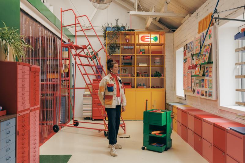
In practice, it produced one of the more visually arresting workspace interiors you're likely to see this year. Colour as a design decision The first thing to understand about this collab is that the colour choices were not decorative; they were compositional. Marcella specified a mix of Bisley Blue, Bisley Pink, Cardinal Red, and Golden Sunflower Yellow across MultiDrawer units, LateralFile cabinets, Outline shelving, and classic filing cabinets, deliberately avoiding uniformity and treating each piece as part of a larger visual composition.
Alternating coloured drawers, contrasting product combinations and layered tones turn what would ordinarily be a storage specification into something closer to a site-specific installation. The classic Bisley Coffee and Cream finish appears on card filers throughout the space, a deliberate historical reference that sits in productive tension with the brighter, bolder pieces around it. This isn't colour for colour's sake. Marcella's graphic design practice is built on a deep understanding of how colour functions emotionally and spatially, how it creates energy or calm, how it guides attention and shapes mood.
"Welcoming people into my own design world is a key part of this experience," she says. "I want to share my passion for colour, process and the positive impact it can have on our lives." That ambition is what elevates this project beyond a well-photographed office fit-out. The studio is designed to be inhabited, to be worked in, to be a place where the environment actively supports and inspires the making of things. The Bisley paradox There's something quietly subversive about using Bisley's standard product palette to achieve this effect. These are not bespoke, custom-lacquered pieces.
Article truncated for readability. Read the full piece →
The article highlights an innovative approach to reimagining everyday office furniture, which can inspire brand strategy professionals to consider the design of their physical environments as part of their branding efforts.