Score
Open Top 10: Music Festival Branding
The article presents a ranking of the top ten music festival branding identities, highlighting how effective branding can create a strong visual and emotional connection with audiences long before the event. Each featured festival showcases unique design systems that reflect their music, location, or cultural significance, emphasizing the importance of motion and adaptability in festival branding. Brand strategists can learn from these examples how to create identities that resonate with diverse audiences while maintaining a consistent core message.
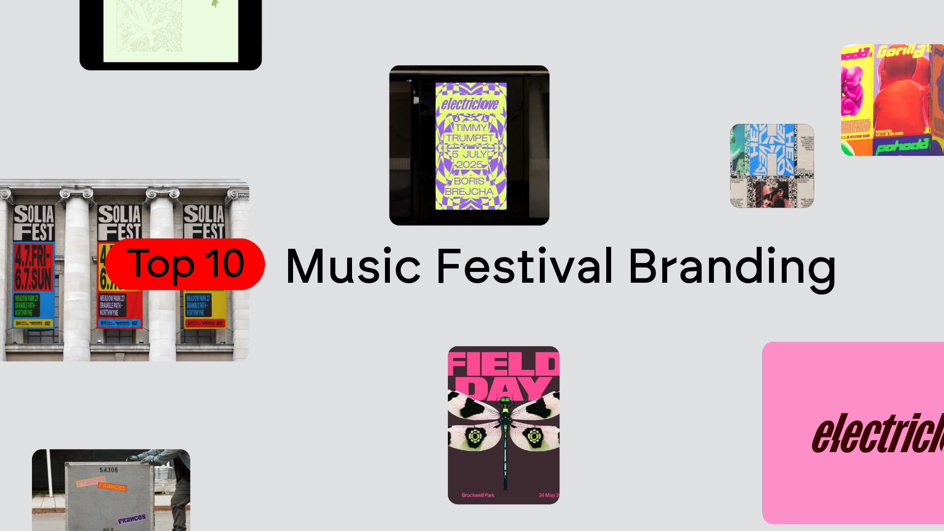
Mindsparkle: Mindsparkle Mag DATE October 08, 2026 EDITOR Mindsparkle Mag Top 10: Music Festival Branding A festival brand identity has to make sound visible months before a single note is played. It shows up first on a line-up poster, then on tickets, wristbands, stage screens, flags and the merch people take home, so it carries the whole promise of the weekend long before anyone arrives. The best ones do more than decorate a date and a list of names: they turn the music itself into a system that can move, grow and come back every year without getting stale.This edition of the Top 10 series looks for exactly that.
Every project below is built on one clear idea that comes from the festival's music, its place or its name, and every one is shown working across real applications, from code-driven type and 3D emblems to letters the size of buildings. The selection mixes identities from across the music and festival branding collection on Mindsparkle Mag with standout work from studios in Rotterdam, London, Montréal, Brisbane, Istanbul and beyond.Each entry opens with the strongest piece of the system, followed by three more views of how it behaves in the wild.
Read them in order as a ranking, or skip to the festivals you know and see how their designers solved the same problem in very different ways.01. NN North Sea Jazz by Studio Dumbar/DEPT®NN North Sea Jazz came out of the pandemic with a far broader programme than its name suggests, spanning jazz, fusion, hip hop, world music and R&B, and it needed an identity that could welcome new audiences without losing loyal ones. Studio Dumbar/DEPT® answered with a system built on rhythm and movement, writing custom code that makes line-ups, dates and venue details twist, flex and stretch like a soundwave.
The same animations are frozen into still frames for posters, flags, brochures and T-shirts, so print carries the feeling of a live set.The festival's famous green swash stays at the centre as the anchor, joined by high-contrast accents in red, electric blue and purple that signal a festival still evolving. Because the typography does all the work, artist names themselves become the image, and no illustrated world is needed around them. The Rotterdam identity has since been extended for the festival's 50th anniversary, which says a lot about how well a motion-first idea can age.02.
Field Day by Studio NARIField Day marked its 15th year and its move to Brockwell Park with a full rethink by Studio NARI, and the London electronic festival got a central marque for the very first time. The studio built the identity around an idea it calls Reactive Future, where the wordmark stays fixed while the visual world around it changes with each edition. That gives the festival something it never had before, a constant to recognise, plus permission to reinvent itself every summer.For 2025 the marque was fused onto insect-like creatures that seem to live in the park's undergrowth, a direct way of announcing the new location.
Soft gradients suggest a fresh start, while hyper-bright accents echo the fast tempo of the music on stage. Modular platforms that range from single furniture-like pieces to stage-sized blocks carry the system across the site, so the identity reads as a place as much as a poster.03. Pohoda Festival by Andrej & AndrejPohoda Festival has used the same emblem for almost three decades: two babies resting side by side, a picture of the Slovak word pohoda, a feeling of ease and togetherness.
Article truncated for readability. Read the full piece →
The article provides valuable insights into effective branding strategies within the music festival industry, which is significant for brand strategists, though the concept of branding in this context is not entirely new.
Weekly digest
Get the Signal digest
Every Monday morning — the top 3 brand trends, 10 high-signal articles, and one emerging signal to watch.
No spam. Unsubscribe anytime.