Score
Clara Biel Paints Laundromats Pool Halls And Supermarkets To Remind Us To Slow Down
Clara Biel's artistic approach emphasizes the importance of slowing down in a fast-paced world, using vibrant colors and everyday settings to evoke nostalgia and reflection. For brand strategy, this highlights the value of authenticity and human connection in design, suggesting that brands may benefit from embracing a more personal, tactile approach to their visual identity, especially in an era increasingly dominated by digital and AI-generated content.
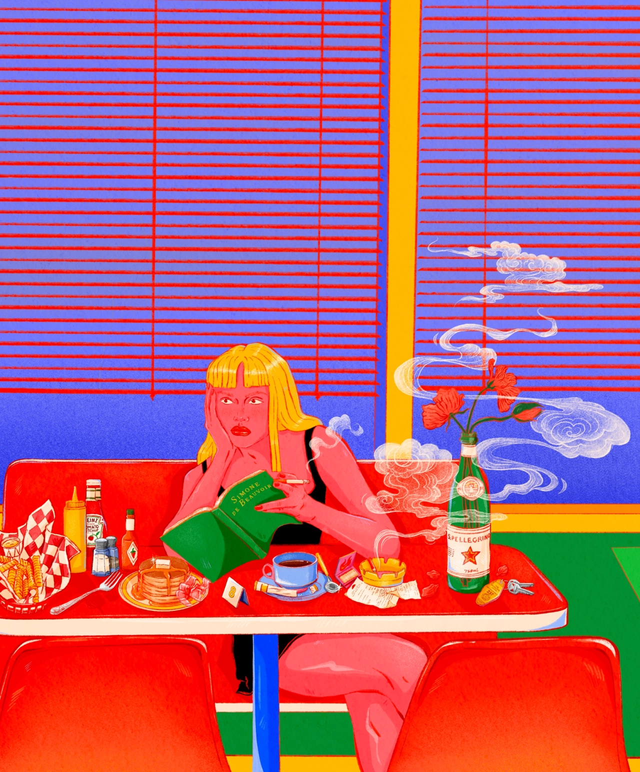
Creative Boom: Clara Biel turns laundromats, pool halls and supermarkets into reminders to slow down The French illustrator behind Champ Magnétique is taking her hot pinks and oranges from screen to canvas, and finding that how she paints and what she paints both come back to a gentler pace. There isn't a creative I know who doesn't feel the speed of change right now. The overwhelming need to "step up" and keep going is real.
Maybe that's why so many of us are deliberately slowing down, and finding ways to remember why we create in the first place—turning to analogue pursuits, perhaps, or opting for things we can actually grasp. Clara Biel, aka Champ Magnétique, is slowing down in two different ways. The French illustrator draws the everyday places we often rush through, and she's increasingly turning to painting on canvas – a practice that calms her. What does she paint? Oh, anything from a laundromat or photo booth to a supermarket or pool hall. "These places feel like real time capsules," she tells Creative Boom.
"There is something almost frozen about them, as if they've remained untouched while the world continues to change around them." Yeah, it makes sense. I yearn for the comfort of familiarity like anyone. For Clara, they're also spots where she can dream up various scenarios. "I'm drawn to the contrast between the ordinariness of these settings and the richness of what might be happening inside," she says. "They are familiar places that most of us have experienced, but we don't necessarily stop and look at them. With my painting, I like to slow things down and give these everyday moments a sort of significance.
I then invite the viewer to wonder what's gone on." What strikes you most about Clara's illustrations is the colour palette. Hot pink, red and orange run throughout, a recurrent theme she says just happened naturally. "I've simply always been drawn to bright, pop colours and to combinations that have a certain warmth and intensity to them." She puts it down to her love of the 1980s, "the packaging, interiors, shop fronts, and all those slightly artificial, colourful environments", plus the Pop Art of Andy Warhol and Tom Wesselmann, who "could make colour feel almost tangible". And The Beatles, especially the world of Sgt.
Pepper's Lonely Hearts Club Band and Yellow Submarine. "That mix of colour, fantasy and a certain playful weirdness really speaks to me," she says. The same dreaminess runs through her posters for festivals such as La Bonne Aventure and Foreztival. She's not interested in drawing the stage or crowd. She'd rather capture the feeling a festival leaves behind. "The image can then become less of a representation of the festival itself and more like a memory, a sensation, or a fragment of a dream," she says. On some of her works you'll notice words. "Keep a tender heart" reads one. "Karma is real" states another.
"Am I overly dramatic?" makes me wonder if Clara has read my mind. In fact, they're thoughts plucked from her own life. "There's something comforting for me in putting these feelings into an image, because even though they come from a very personal place, I know that other people might recognise themselves in them too," she says. "Making these images can feel quite cathartic, a way of giving a shape to a deep or complicated feeling, and somehow getting it out of myself." It's nice to know she's happy to laugh at herself, too. "Some of these phrases are deliberately dramatic or slightly ridiculous, and I like not taking myself too seriously.
Article truncated for readability. Read the full piece →
The article presents a unique artistic perspective that encourages brands to prioritize authenticity and human connection, which is increasingly relevant in today's digital landscape.