Score
15 Typefaces Designers Cant Stop Using Or Admiring In 2026
The article highlights the typefaces that designers are gravitating towards in 2026, emphasizing the importance of classic and versatile fonts like Helvetica, Poppins, and Futura in brand strategy. Brands should consider these typefaces for their visual identity, as they not only convey professionalism and reliability but also reflect current design trends that prioritize accessibility and personality.
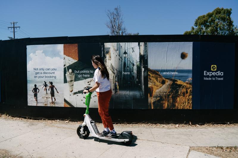
Creative Boom: Resources Typography 15 typefaces designers love to use in 2026 From timeless classics to fresh favourites, these are the fonts the creative community keeps returning to. Written By: Tom May 15 April 2026 Aeonik in use for Expedia Ask a designer which typeface they're using and you'll often get a considered answer. Ask which one they actually reach for at the start of a new project, and the truth may be more revealing. That's essentially what we did in Creative Boom's annual State of Creativity survey... and the results are in. The fonts that have come up most often aren't obscure newcomers trying to signal distinction.
They're workhorses, classics and a few sharper, more characterful choices that suggest designers know exactly what they want: type that works hard and holds its own. Helvetica, Poppins and Futura lead the count by some distance. But further down, the picture gets interesting. The presence of Inclusive Sans reflects a genuine shift in thinking about accessibility, while Bricolage Grotesque, Degular, Trim Poster and Aeonik suggest a growing appetite for type with a bit more texture and personality. Here are the 15 typefaces our community can't stop using and admiring in 2026. 1. Helvetica Our number-one entry is not the biggest surprise.
The neo-grotesque, designed by Max Miedinger and Eduard Hoffmann in 1957, remains the most-nominated typeface in our survey by a considerable margin. Critics argue it's the lazy choice: safe, ubiquitous, characterless. Defenders point out that neutrality is a feature, not a bug. Either way, Helvetica Now, Monotype's 2019 update with three optical sizes for micro, text, and display use, has given this timeless font fresh relevance for the digital age. Nobody gets fired for using Helvetica. Helvetica Now via Monotype 2.
Poppins This geometric sans-serif from the Indian Type Foundry, designed by Ninad Kale and Jonny Pinhorn, is one of the most downloaded typefaces on Google Fonts. Its near-monolinear letterforms, generous x-height and clean geometric construction give it a friendly, modern feel that works across fintech apps, lifestyle brands and nonprofits alike. A free font with a full range of weights, it supports both Latin and Devanagari scripts. 3. Futura Paul Renner's 1927 geometric masterpiece is nearly a century old and still feels contemporary.
Built from circles, triangles and straight lines in the spirit of the Bauhaus, it's seen everywhere from Wes Anderson's title sequences to campaigns for Louis Vuitton, Nike and FedEx. Its low x-height gives it an elegant, almost classical quality at display sizes. For designers seeking geometric authority, Futura remains the obvious choice. It's also another one to get the Monotype treatment, refreshing it for the digital era with the launch of Futura Now. 4. Inter Designed by Rasmus Andersson and released in 2017, Inter has become the defining UI typeface of the current era.
Created for screen legibility, particularly at small sizes, it features a tall x-height, open apertures and ink traps that improve legibility in dense interfaces. Free, open source and available as a variable font, it was one of the most accessed Google Fonts in the 12 months to May 2025. Its presence here alongside Helvetica and Futura suggests it's earned the status of a modern classic. 5. Inclusive Sans Designed by Australian type designer Olivia King and released as a fully variable family on Google Fonts in 2025, Inclusive Sans was built around accessibility research.
Article truncated for readability. Read the full piece →
The article discusses popular typefaces that are significant for brand identity, making it relevant for professionals, but the topic of typeface trends is somewhat standard and predictable.