Score
Arsenal’s new blackletter font is a tribute to a star player
Arsenal Football Club has introduced a new gothic font named Rocastle, designed as part of a multi-font branding strategy to celebrate the club's heritage and culture. Created by designer David Rudnick, the font pays tribute to the late player David Rocastle and aims to blend modern aesthetics with traditional elements, reflecting the club's identity and aspirations. Brand strategists can learn from Arsenal's thoughtful approach to typography as a means of engaging with fans beyond just the game day experience.
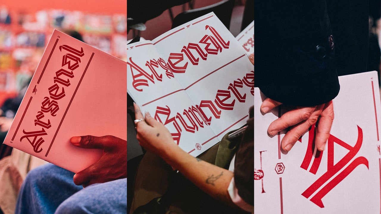
FastCompany: Arsenal’s new gothic font is a modern take on black letter. It’s part of a larger multi-font branding strategy for the 140-year-old English football club. The team unveiled its new font, Rocastle, at a pop-up exhibition this month at the Design Museum , in London. It’s named for the beloved late Arsenal player David Rocastle (1967–2001), also known as Rocky, and was created by David Rudnick, founder of the research and design studio terrain , with Léa Bruneau. [Type Design: terrain.
studio/David Rudnick with Léa Bruneau] Rudnick—an Arsenal fan who says “I would only ever have worked with one club” —is also the architect behind the club’s new, bespoke font book developed over the past four years. For Rocastle, he sought an aesthetic that felt distinctly English and custom-tailored to the team. The font has to do “a lot of very difficult contradictory things,” Rudnick tells Fast Company .
“It had to be sufficiently distinctive and bold and proud as a set of letterforms that it functioned as a kind of glorious pinnacle of the identity, but it also had to be simple, legible, modern, and applicable enough to function in the way that a modern typeface would.” [Type Design: terrain. studio/David Rudnick with Léa Bruneau] The letterform is unmistakably black letter, but a mix of elements like an inline weight and swashes that recall the shape and flow of pennants in the wind, make it feel modern and English. “You create the sense of something that feels more chivalric or knightly,” Rudnick says. [Type Design: terrain.
studio/David Rudnick with Léa Bruneau] Arsenal began updating its typography in 2022, and Rudnick designed three fonts licensed exclusively to the team around three pillars: team, community, and culture. Rocastle represents “culture,” or “where football intersects with fashion, art, music, and more,” according to a curator statement from the exhibition. It’s a font that would work in a fashion drop or, say, on the walls of a pop-up design museum show; contemporary but heritage. [Type Design: terrain.
studio/David Rudnick with Léa Bruneau] The team assembled hundreds of pieces of Arsenal memorabilia and type specimen during the research phase of the four-year project. The Rocastle font—along with a blackletter “A” mark that’s now one of the club’s three primary logos alongside its crest and cannon—is inspired by the lettering in the club’s retro VCC crest ( Victoria Concordia Crescit , victory grows through harmony). [Photo: Josh Upton/courtesy Arsenal Football Club] Rudnick’s first font for the club in 2022 was Northbank, a bold, thick sans-serif font.
It appears in all caps in player names, words in animations like “Goal” and “Believe” that show up on stadium video screens , and “We Are the Arsenal” signage at the club’s training facility. The designer built it using letterforms from signage on the club’s old Highbury Stadium. Northbank represents the “team” pillar, and a superbold version of it was designed “so that any other club that wants to go into a shouting match with us can’t win,” Rudnick says. The second font, Chapman, released in 2023, is a humanist sans-serif font that’s used in sentence case and designed for the club’s “community” pillar.
Article truncated for readability. Read the full piece →
The introduction of a new font as part of a branding strategy for a major football club is significant and showcases a creative approach to identity, making it relevant for brand strategists looking to engage audiences.
Weekly digest
Get the Signal digest
Every Monday morning — the top 3 brand trends, 10 high-signal articles, and one emerging signal to watch.
No spam. Unsubscribe anytime.