Score
Jkr Evolves Kfcs Entire Identity Around The Bucket Welcome To The Bucketverse
KFC is undergoing a significant brand evolution led by JKR, focusing on its iconic bucket as the central theme of its new identity, termed the 'Bucketverse'. This comprehensive rebranding effort aims to enhance customer experience across all touchpoints while maintaining brand loyalty and recognition, positioning KFC as a leader in the fast-food category.
Creative Boom: News Branding JKR evolves KFC's entire identity around the bucket – welcome to the 'Bucketverse' Jones Knowles Ritchie reworks every touchpoint, from a 3D logo and custom typefaces to a refreshed Colonel, as KFC's biggest brand evolution begins rolling out across more than 150 countries. Written By: Katy Cowan 15 June 2026 Chicken is having a moment. I only realised this recently at a Spanish airport, when I spotted a new Popeyes branch past security. On further investigation, it appears the brand is rapidly expanding its global footprint as it seeks to dominate the category.
It's why an email from Jones Knowles Ritchie (JKR) made me smile this morning. It's just helped KFC evolve its entire identity, reminding us that few fast-food brands carry a kit of parts as distinctive as its own. The bucket, the stripes, the Colonel, and its strapline "Finger Lickin' Good" – each one is instantly recognisable, even out of context. Perhaps KFC wants to remind us that there is only one place to enjoy chicken. That, in a nutshell, was the mission. JKR, the global branding agency behind the work, was not asked to start KFC over but to take it into what the brand calls its next chapter.
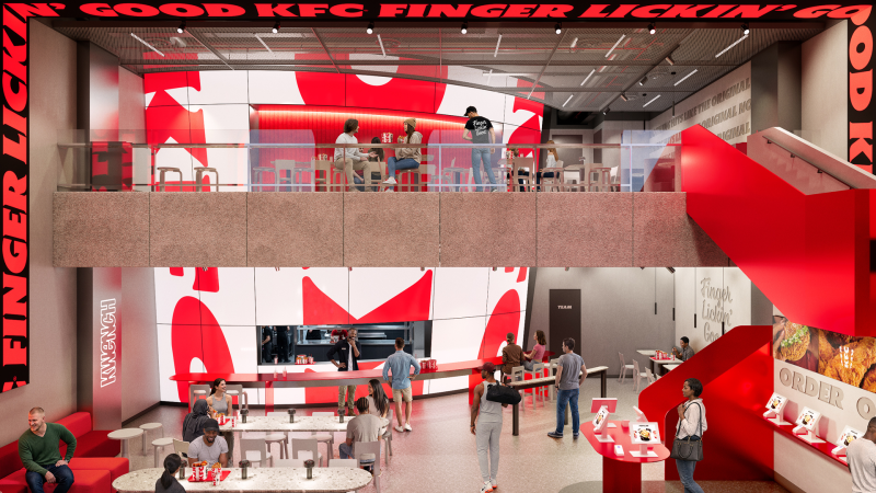
It wanted to evolve, confidently, without losing brand loyalty. The result is a full 360-degree evolution that runs from the design system and brand assets through to restaurant environments, packaging, digital platforms and tone of voice. JKR describes it not as a refreshed logo but as a "single, connected world" – one built entirely around KFC's most famous asset: the bucket. "Our role was to help it evolve for the next chapter, in a way that only KFC could," says Sean Thomas, global executive creative director at JKR. The studio set about "building a world and experience that consumers could step into.
We call it the Bucketverse." The bucket is the unlock The bucket sits at the heart of everything. But JKR has redefined it as a central brand device, standardising its distinctive shape for a consistent global rollout and treating it as both a framing system and a storytelling one – an extension of the logo that can hold food, culture, energy, and just about anything in a single frame. From there, the system spreads out.
The logo becomes a three-dimensional asset rather than a flat mark; the lettermark is stripped back to a cleaner, more legible shorthand; and the stripes, once only a background texture, are reworked into an expressive, type-based asset that does much more of the storytelling. The core red, white and black palette, meanwhile, stays put for instant recognition. And it's joined by a secondary system called Herbs and Spices – a nod to the original recipe – for moments that need a bit more oomph. Typography-wise, KFC now has its own custom-built type system, Kentucky Fried Serif (well, they had to call it that) and Kentucky Fried Sans. Genius.
It's drawn from the lettermark and developed in partnership with StudioDRAMA. 'Finger Lickin' Good', meanwhile, is reframed from a tagline into what JKR calls "a standard of behaviour" – a global brand asset rather than a sign-off. Lettering artist Tobias Hall crafted the mark itself. A gentler Colonel Then there's the famous Colonel. Looking at the 'before' and 'after' icon, you can spot the difference, but it's incredibly subtle. Not surprising, given that it's the brand's most sacred asset and therefore needs to be handled with care. It's enough to keep any designer awake at night, worrying about getting it wrong. JKR smashed it, though.
Article truncated for readability. Read the full piece →
The rebranding of KFC by JKR is significant for the fast-food industry and showcases a unique approach to brand identity centered around a well-known product, making it highly relevant for brand strategy professionals.