Score
ValkaAI Brand Identity: Studio L–AB Puts AI Faces First
The ValkaAI brand identity emphasizes the emotional connection that synthetic faces can create, positioning the brand as an entertainment entity rather than a technology company. By prioritizing human-like expressions and warmth in design elements, the strategy focuses on establishing a strong emotional presence that resonates with audiences before any branding elements are consciously processed.
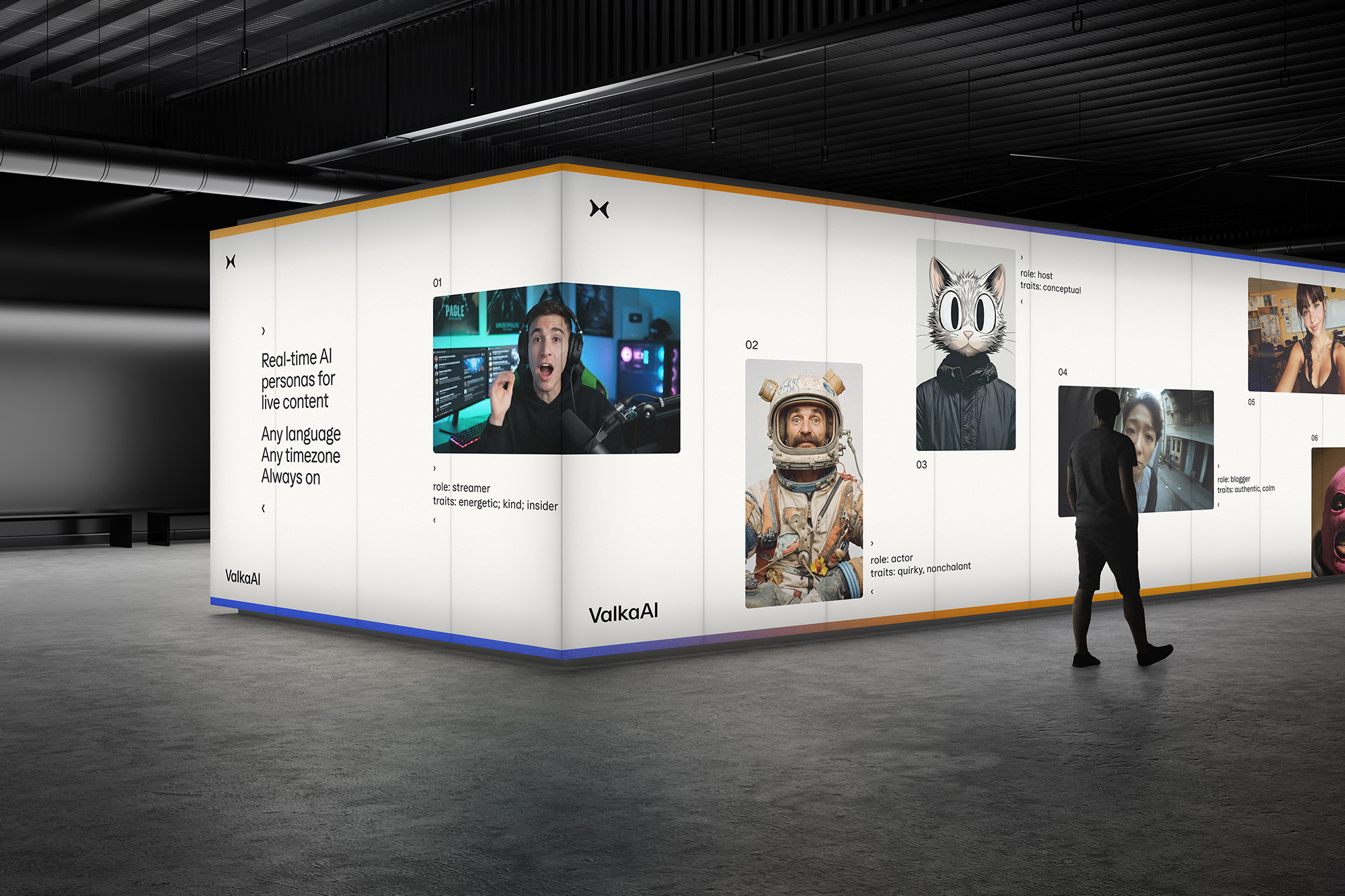
Abduzeedo: ValkaAI Brand Identity: Studio L–AB Puts AI Faces First jeff March 17, 2026 Studio L–AB created the ValkaAI brand identity with AI faces as the lead, backed by a butterfly logo and a variable typeface that reads digital yet warm. Studio L–AB, a boutique branding studio based in Prague, has unveiled the ValkaAI brand identity for an AI-native entertainment startup that builds synthetic video personas for sports, gaming, and media platforms. The project positions ValkaAI not as a technology company but as an entertainment brand where synthetic human faces carry emotional weight before any logo or headline has a chance to register.
Studio L–AB co-owner Petr Skovajsa explains that facial expressions register emotionally in milliseconds, long before rational processing kicks in. That single insight shapes every visual decision across the ValkaAI brand identity. ValkaAI Brand Identity: How Studio L–AB Makes AI Faces Lead The geometric mirrored butterfly at the heart of the ValkaAI brand identity works on two levels at once. Visually it reads as a butterfly in perfect balance. Conceptually it represents the bridge between the physical world and the digital realm ValkaAI inhabits. The faceted wings carry technical precision without losing warmth.
Studio L–AB paired this symbol with Ease, a variable typeface by Studio Feixen that shifts from engineered precision to approachable warmth depending on context. Where broadcast-quality AI personas demand credibility, internal communications borrow from analogue photography, referencing the raw aesthetic of Pixar’s early production years. The ValkaAI brand identity color palette keeps warm whites and greys in the foreground so AI personas stay luminous and present. Blue and orange appear as navigational accents, not brand colors.
Motion design follows the same restraint, with natural easing curves and subtle micro-expressions replacing mechanical transitions. ValkaAI marketing director Vendula Richter put it simply: the first impression should be about presence, personality, and emotional authenticity, not technology.
The ValkaAI brand identity achieves exactly that by letting faces lead and letting design follow quietly behind.
The article discusses a significant rebranding effort that leverages AI in a unique way to create emotional connections, which is highly relevant and impactful for brand strategy professionals.