Score
CRAVEA Coffee Brand Identity and Packaging Design
The CRAVEA coffee brand identity and packaging design exemplifies a holistic approach to branding, where every element—from the cobalt blue color to the custom wordmark and line art—is integrated into a cohesive system. This strategy emphasizes the importance of consistency across all touchpoints, ensuring that the brand's personality is communicated effectively in both physical and digital spaces.
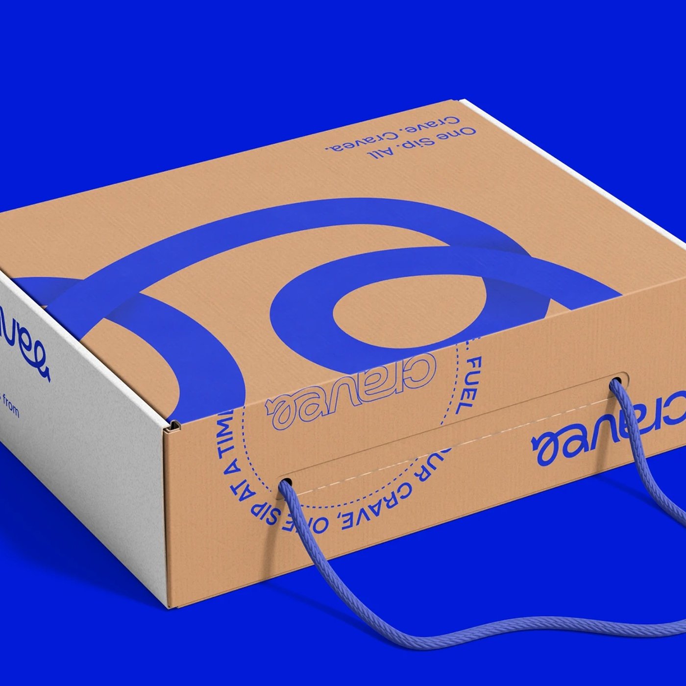
Abduzeedo: CRAVEA Coffee Brand Identity and Packaging Design jeff May 02, 2026 Sleeko Studio and DewApples Studio built CRAVEA's coffee brand identity and packaging design as one total system — cobalt blue, custom wordmark, line art The wordmark drives everything. Sleeko Studio built a rounded, variable-weight sans with a scripted 'ea' tail that loops back on itself — then extracted that tail as a standalone 'ee' monogram used on cups, bags, and the app icon without explanation. The primary color is cobalt, RGB(21,7,179), applied as full-bleed across every surface. Not an accent — the entire field. Kraft boxes run cobalt. Apparel runs cobalt.
The single exception is amber, reserved for typographic emphasis. An oversized 'a' letterform bleeds across two faces of the shipping box, turning a structural container into a statement about the wordmark. Eight single-weight line characters — barista, skateboarder, musician — carry brand personality across physical and digital applications without photography. This is coffee brand identity packaging design that reads as one decision, not a sequence of handoffs.
Coffee Brand Identity and Packaging Design Built as One Brief What distinguishes CRAVEA as a coffee brand identity is that the packaging design, the UX, and the motion layer were all built simultaneously by Sleeko Studio and DewApples Studio — two Bangladesh-based studios collaborating on a single brief. The brand guideline document visible in the isometric spread includes a Bezier-point wordmark anatomy slide, evidence that the system was documented as architecture, not assembled as decoration.
For independent studios competing in 2026, this coffee brand identity and packaging design case study is a precise example of what full-stack ownership looks like when the brief covers every touchpoint from shipping box to app icon.
See the full project by Sleeko Studio x DewApples Studio on Behance.
The article discusses a specific branding case study that illustrates important principles in brand identity and packaging design, making it significant and relevant for professionals in the industry, though the concepts presented are not entirely groundbreaking.