Score
Editorial Design: Compagnie 3B Presskit by Florian Cornut
The editorial design of the Compagnie 3B presskit highlights the importance of a cohesive visual identity that aligns with the narrative of the content it represents. By employing a minimalist Swiss design approach and specific typography, brands can enhance their communication and engagement with audiences, reinforcing their overall strategy.
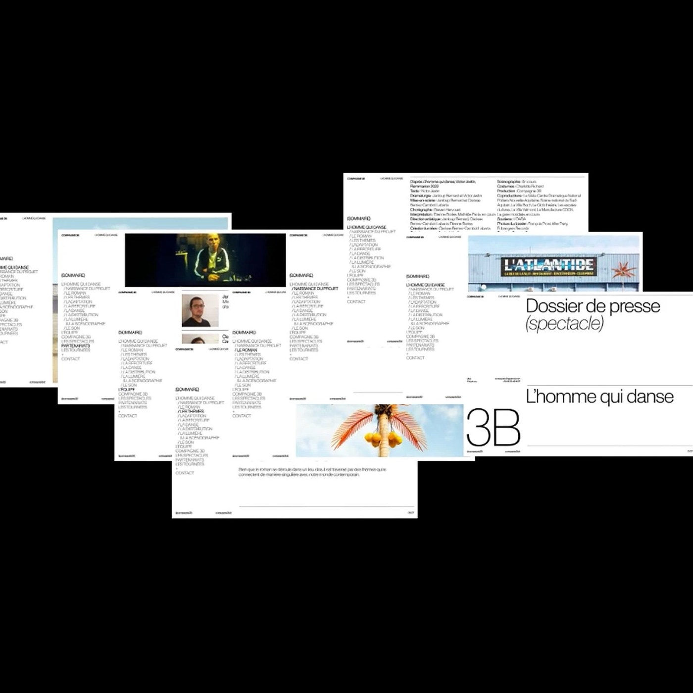
Abduzeedo: Florian Cornut structured the Compagnie 3B presskit using stark Swiss editorial design, Dinamo Monument Grotesk type, and club photography. Commissioned to translate Victor Jestin's 2022 novel L'homme...
The article discusses a specific case of editorial design that emphasizes cohesive visual identity, which is significant for brand strategy, but the concepts of minimalism and typography are well-established practices in the industry.
Weekly digest
Get the Signal digest
Every Monday morning — the top 3 brand trends, 10 high-signal articles, and one emerging signal to watch.
No spam. Unsubscribe anytime.