Score
Best of the Week: Motion, Mass, and Material
The article highlights the importance of design elements that communicate through their physical attributes rather than relying on labels or intent. For brand strategy, this means that brands should focus on creating identities that are structurally sound and visually impactful, ensuring that every design decision reflects a coherent narrative and purpose.
Abduzeedo: Best of the Week: Motion, Mass, and Material jeff May 03, 2026 This week's strongest work shared a structural quality: every piece has something physically legible about it. A typeface built for dominance at frame-filling scale. A packaging system where every visible decision traces back to a constraint. A brand identity where instability is the point, not a failure. The editorial throughline for W18 is design that communicates through the body of its elements — through weight, surface, and material — rather than through labels and intent. Ten picks this week. Eight from Abduzeedo's own coverage, two from outside.
All of them earned their place by having a specific reason to exist. MakeMake — The Dinosaurs Title Sequence (Netflix) MakeMake's main titles for Netflix's Colossal Earth: The Dinosaurs work as visual camouflage: creatures are folded into valley floors and mountain crags, their scale only registering as the camera holds long enough for the eye to re-read the landscape. The compositional idea and the technique are the same thing — this is not a sequence where you can separate concept from execution. The still frames hold on their own because the geometry is structural, not decorative.
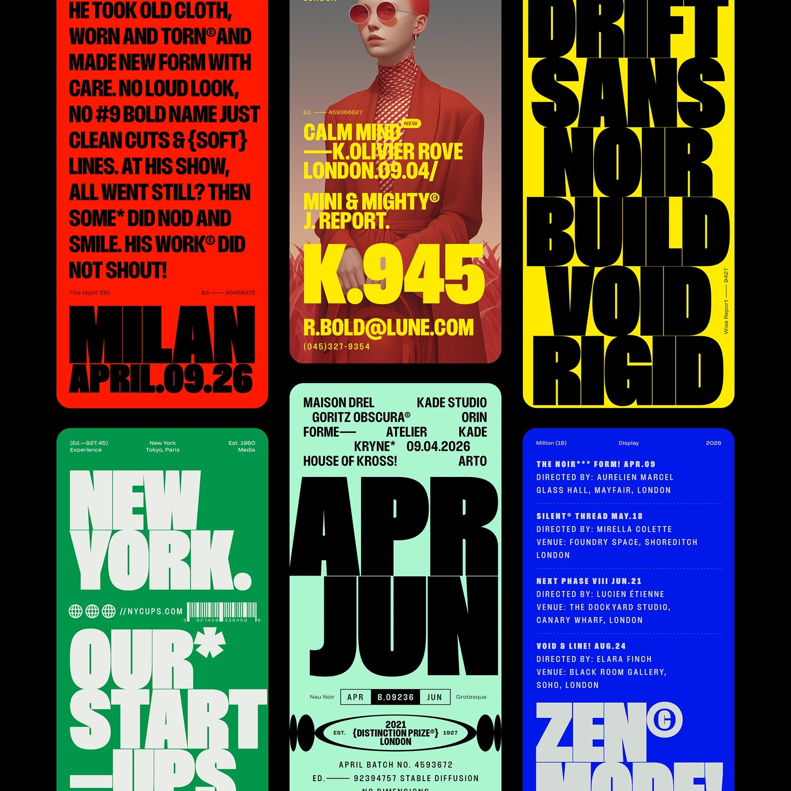
The meteorite impact sequence, built from fluid simulation and rigid body dynamics, closes on a geological event with the same visual patience as the opener. Read on Abduzeedo Rajesh Rajput — Million Typeface (18 Styles / Variable) Million is a condensed display typeface in 18 styles with a variable weight axis, and it was designed for situations where the type occupies the full frame rather than sitting inside it.
The specimen layouts demonstrate this directly — wordmarks bleeding off all four edges, weight progressions that read as physical material rather than stylistic variation, advertising mockups where the letterforms are the entire visual event. The specimen itself is the argument: if you need proof that this typeface works at dominance scale, the gallery is the proof. Rajesh Rajput practices what New Delhi's design scene produces when it stops deferring to Western display conventions.
Read on Abduzeedo Unspoken Agreement — SanDisk Packaging System Unspoken Agreement redesigned SanDisk's packaging as a scalable modular system — one visual language that works across SD cards, USB drives, and SSDs without the system feeling diluted at any product tier. The 3D renderings are not decoration; they served as the system's proof-of-concept before production, demonstrating flexibility across form factors before any tooling decisions were made.
The organizing constraint — waste reduction without compromising shelf presence — is visible in every decision: the system earns its environmental claims through engineering rather than messaging. Read on Abduzeedo Plus X — KT Visual Identity Renewal An 11-person team at Plus X built KT's new corporate identity system across 22 documented applications — from billboards to app icons — for a telecom operator that has to be everywhere in one of the world's most screen-dense markets. The hard design problem for a brand at this scale is not what it looks like but what it standardizes versus what it lets breathe across contexts.
Article truncated for readability. Read the full piece →
The article discusses significant design principles that can influence brand identity, making it relevant to professionals, though the concepts are not entirely new in the field.