Score
Boom Brief 8 How You Brought A Fictional Italian Bakery To Life
The article highlights the creative challenge of branding a fictional Italian bakery, emphasizing the importance of originality and resisting visual clichés in brand strategy. By exploring unique concepts and personal stories, designers can create identities that resonate with consumers on a deeper level, showcasing the brand's character and connection to its roots.
Creative Boom: Inspiration Graphic Design Boom Brief #8: How you brought a fictional Italian bakery to life From open-crumb wordmarks to watercolour sunrises, this month's challenge demonstrates how the best briefs smell like fresh bread and demand something genuinely original. Written By: Tom May 7 April 2026 Craig Nash aka Studio Sláinte Welcome to the eighth in our series of Boom Briefs: monthly creative challenges designed to stretch your skills, get your ideas flowing, and give you something to make—purely for the love of it. And March's brief had a simple, seductive premise.
We asked you to imagine an Italian artisan bakery in an English market town, founded by a man called Marco who came to Britain, fell in love with the place, and decided it needed a proper bakery. Everything is made by hand. Focaccia, buttery pastries, and handmade pies. The brief called for something artisan but not precious. Italian-influenced but rooted in its English surroundings. Warm, confident, and a little characterful. It might all sound straightforward, but in practice, briefs like this are deceptively tricky.
Bakery branding has a well-worn visual language (warm ochres, rustic textures, heritage serif type), and it takes genuine creative conviction to resist the pull of the obvious. Under the hashtag #cbbriefalbabakery, the designers who entered this month's challenge didn't just resist it. Several of them turned their back on it entirely and found something far more interesting... The rise, made visible London design director Melvyn Johnson found his concept in a single, precise idea: the open crumb.
If you've ever torn into a good sourdough, you know about the airy, irregular texture of the interior: the pockets and channels that form as the dough rises. Melvyn used that structure to build his wordmark, giving the letterforms a quality that feels as if they're still expanding, still breathing, still in the act of becoming. 01/04 The concept is rooted in the primary meaning of Alba (dawn, daybreak, the moment of rising), but avoids the visual clichés that word usually triggers. There's no sun-over-horizon motif, no golden glow. Just letterforms that feel like they've been caught mid-rise.
The broader identity pairs this with a palette built around Cotswold green: deep, earthy and rural, with a sharp citrus accent that adds early-morning freshness. Illustration and photography are layered in to create what Melvyn describes as "a brand you can taste and touch". He's also quick to note that the wordmark can be reconfigured across applications (labels, uniforms, packaging) as if you were arranging dough on a tray.
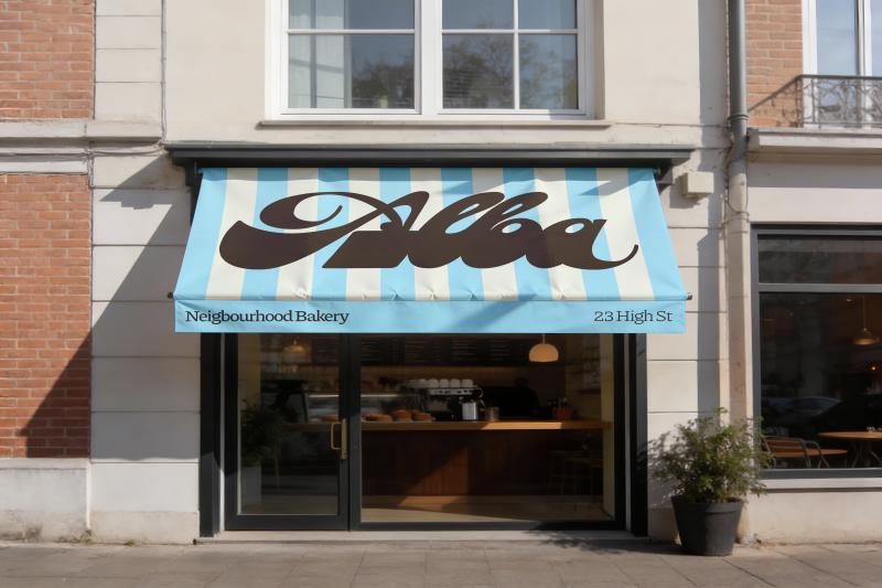
Flipping the script on rustic Another conceptually audacious response came from London-based brand designer Hafiya Moulana, who made an early decision that changed everything: she looked at what most bakery brands do and went in an entirely different direction. Rather than the usual warm tones and rustic textures, Hafiya built Alba's identity around the quality of light just before a town wakes up. Early mornings, she notes, are cooler (slightly blue, slightly purple), and that observation became the foundation for a palette that feels genuinely distinct in the category.
Article truncated for readability. Read the full piece →
While the article discusses a creative branding challenge, the concept of branding fictional entities is not groundbreaking, but it offers valuable insights for designers seeking originality in their work.