Score
The Naturally Refreshing Visual Language Of Sour Soda Studio
The article discusses the innovative visual language developed by Sour Soda Studio, which emphasizes a refreshing and organic aesthetic that reflects themes of nature and sustainability. This approach highlights the importance of evolving brand strategies to incorporate unique visual identities that resonate with contemporary values and consumer interests, particularly in the context of environmental awareness.
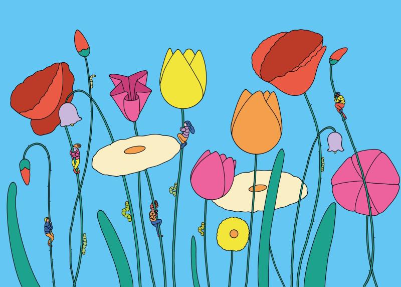
Creative Boom: Inspiration Illustration The naturally refreshing visual language of Sour Soda Studio From graphite on paper to digital drawing to vector brushes in Fresco, illustrator A has developed a new visual alphabet through experimentation and dubbed it Sour Soda. Written By: Garrick Webster 24 June 2026 Flower Huggers Being an illustrator is a wonderful job, but it can be easy to get into a rut. Clients look at your portfolio, see something they like, and commission you to create similar work. It's a good thing! You get to work consistently with people who understand who you are and what you do.
But it's a bad thing when the artist inside needs the freedom to produce something fresh, different and entirely unattached to any established style. Sour Soda Studio is a new initiative by an already successful illustrator to break out of the confines of a more or less set way of working – an anonymous project that refuses to be bound by what's come before. We'll call them A, for clarity. "It is a project that explores a colourful, surreal and slightly strange language, where simple forms and full colours are used to build images that are poetic, decorative and narrative at the same time," says A.
Curving, organic line work and a lack of hard corners give it a gentle, natural feel, while the simple forms and colours nevertheless lend impact. The subject matter in the Sour Soda portfolio so far has focused on nature, the environment, resources, consumption, and sustainability. But it was the visual language that came first – something that has been gradually shaped over the last four years or so, and that steps away from the two styles A has previously worked in. "The first two came more from the gut.
The article presents a fresh perspective on visual identity in branding, particularly in relation to sustainability, making it significant and relevant for brand strategy professionals.