Score
Entrelinhas Brand Identity Design by Chá de Bold Estúdio
The brand identity design for Entrelinhas by Chá de Bold Estúdio emphasizes the importance of a unique visual language that combines custom typography and a bold color palette. This approach highlights how distinctive design elements can effectively communicate a brand's values and narrative, making it essential for brands to invest in thoughtful and creative identity strategies.
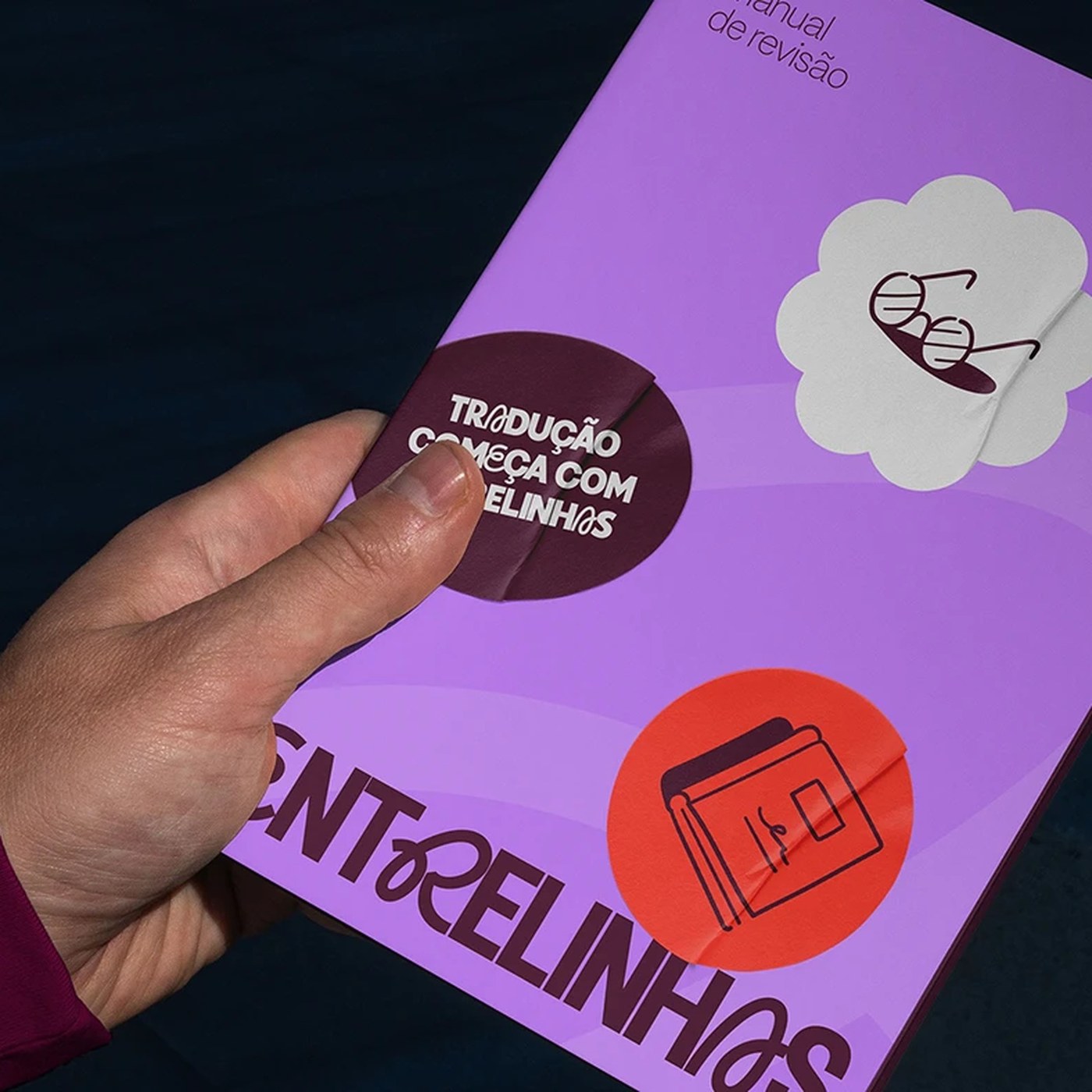
Abduzeedo: Chá de Bold Estúdio’s identity for Entrelinhas pairs a custom ligature wordmark with halftone portraits and a striking maroon-to-violet palette. The brief for Entrelinhas was unconventional: a transla...
The article discusses a specific brand identity design project that showcases effective design strategies, which is relevant to brand professionals, but the concepts of custom typography and color palettes are common practices in the industry.