Score
Wendy’s restaurants abroad are about to break the biggest color rule of food branding
Wendy's is breaking traditional food branding norms by introducing a light blue facade for its new restaurant designs, a significant shift from the typical red associated with fast food. This strategic move aims to differentiate the brand in international markets, particularly as it expands its presence abroad, while also catering to modern consumer preferences for digital-first layouts and grab-and-go service.
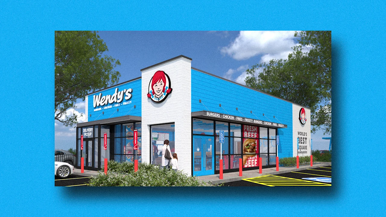
FastCompany: Wendy’s is feeling blue. Light blue, to be exact. In April, a new design concept accompanied the opening of the burger chain’s 100th store in the Philippines. In addition to its digital-first layout , the new Wendy’s boasts a light blue facade instead of a red one. The refreshed restaurants are now available to franchisees across the company’s international markets. Wendy’s tells Fast Company that locations are also open in Chile, England, and Scotland, but there are currently none in the U.S.
The blue color scheme is part of an initiative Wendy’s is calling “Future Fresh” that could make one of the brand’s secondary colors more primary if adopted widely. On the company’s May 8 earnings call, CFO Ken Cook, who is also currently serving as Wendy’s interim CEO, said the new store format makes the brand stand out from the competition—and he’s not wrong. [Photo: Wendy’s] Though the shades are different, Wendy’s shares a main brand color with plenty of other fast-food chains, like McDonald’s , Burger King , Jack in the Box, In N Out, and Chick-fil-A.
There’s good reason so many fast-food companies are branded with ketchup-colored red: The color can make you hungry . For Wendy’s, though, cool blue isn’t such a leap. Its long-used cartoon mascot (inspired by founder Dave Thomas’s red-headed daughter) is accented in blue, and in the past the company has used the hue for its blue-and-white-striped worker uniforms. Wendy’s new digital-first layout is one that many chains are embracing, as in the rise of self-serve kiosks at McDonald’s or Chick-fil-A’s mobile-only store in New York City.
Starbucks, on the other hand, has moved away from the grab-and-go concept with café renovations designed to entice customers to stick around. The coffee chain announced last year it’s closing its pickup-only locations in favor of a new store concept with cushier seating and laptop-friendly tables ideal for remote workers. Instead of investing in a cozier dining room or bringing back its salad bar, Wendy’s is catering to mobile orders and grab-and-go customers with its new store design. Wendy’s announced last year that it would close hundreds of U.S. restaurants , and there’s an effort to try and take the company private .
Internationally, though, the Ohio-based chain is still expanding, meaning more locations overseas could open with the blue building. Cook said last week the company signed new franchise agreements to build up to 1,000 restaurants in China over the next decade. Wendy’s last rebranded in 2012 , removing long-running brand identifiers like the color yellow, vintage-style typography, and its “Old Fashioned Hamburgers” tagline.
The modernized logo and sterile restaurant designs fit trends at the time, but also lost the nostalgic feel of a fast-food chain where you could once enjoy Frosties and chili served in bright yellow cups while sitting in a sunroom. Architecturally, the sanitized, modern “Future Fresh” building doesn’t unbland what Wendy’s has blanded—but at least light blue isn’t greige .
Article truncated for readability. Read the full piece →
Wendy's decision to adopt a light blue facade represents a significant departure from established food branding norms, making it impactful and relevant for brand strategy professionals, while also introducing a novel approach to restaurant design.