Score
Bob’s Red Mill has a plan to win grocery store shelves: a better logo
Bob's Red Mill is undergoing a significant rebranding effort to unify its product packaging and enhance brand visibility in grocery stores. By simplifying its logo and packaging design, the company aims to better communicate its core values and improve consumer recognition, which is crucial for standing out in a competitive market focused on health-conscious choices.
FastCompany: When Bob’s Red Mill began in 1978, it was a flour company operated out of a literal red mill by one dedicated married couple. Since then, it’s grown into a grocery store staple with more than 200 products—and, along the way, its fascinating brand story has gotten lost amidst a sea of colorful, overwhelming packaging. To fix that, the company has spent three years on a full branding overhaul to bring all of its products back under one mill roof.
Bob’s Red Mill began as the passion project of the late Bob and Charlee Moore, a husband and wife duo who started their own flour milling business as a way to introduce more whole grains into their family’s diet. And, according to Margret Brown, Bob’s Red Mill’s creative director, that core goal of seeking out high-quality base ingredients is a mission that’s become even more relevant today, when many shoppers are seeking healthier alternatives to ultra-processed foods. The company had the backstory and the products it needed to meet consumers—but its branding was holding it back.
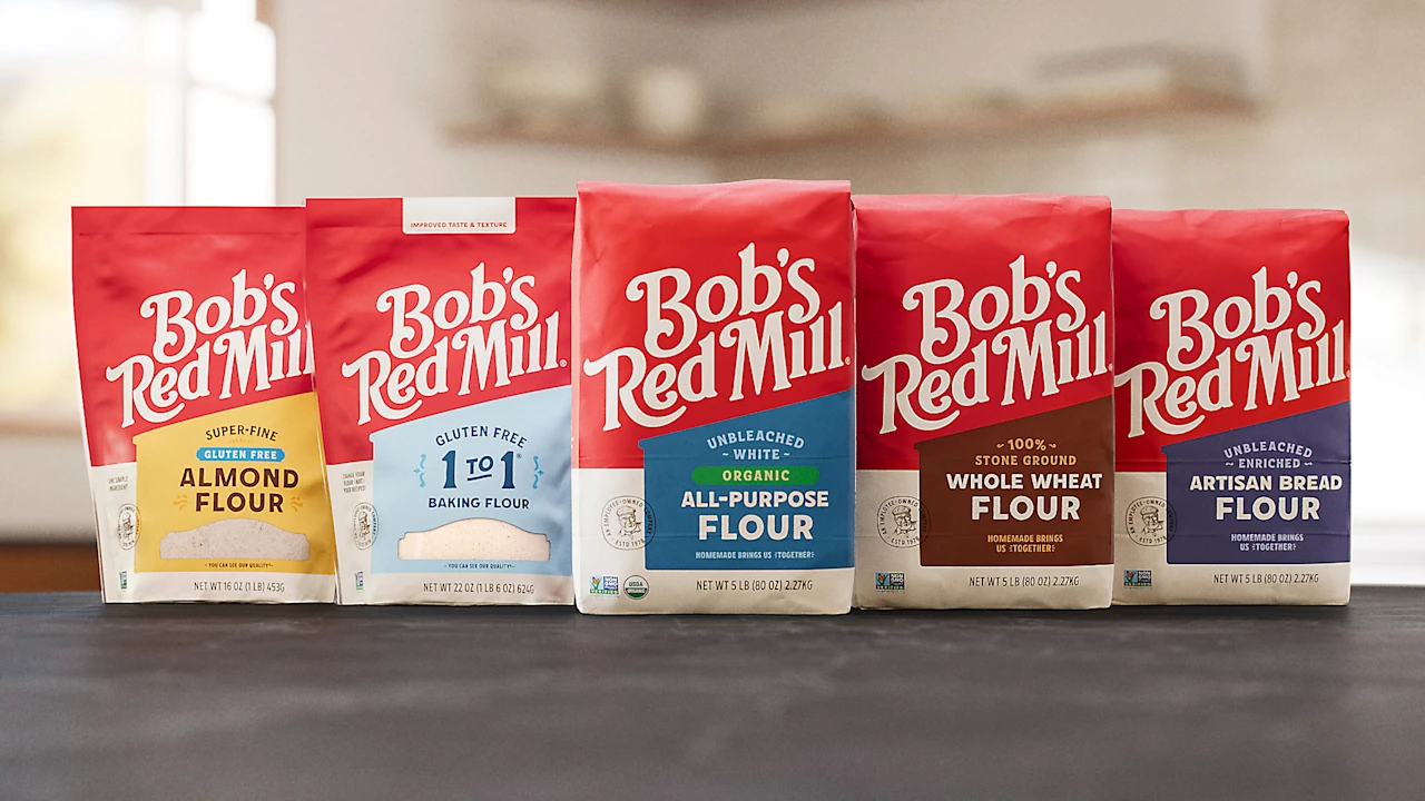
As dozens of new Bob’s Red Mill products were introduced over time, many were given their own packaging treatments, making product lines like cereal and beans look divorced from oats or breakfast items. And the company’s core SKU—its five-pound flour bag—sported a design that, while quaint, looked more like a bottle of Dr. Bronner’s soap than a baking ingredient. In totality, the designs were cluttered, difficult to read, and hard to see on grocery shelves. “People weren’t remembering our name,” Brown says.
“They might say that our name was Bob’s Red Mill Road, or Barb’s Red Mill, for example.” The new branding includes a more modern, legible logo; a streamlined color palette; a custom font family; and a new hero image of the mill itself, which has not previously featured on the brand’s packaging. While in recent years countless brands have simplified their identities to fit a minimalist aesthetic trend , Bob’s Red Mill’s rebrand is one example of an overhaul wherein less is truly more. [Photo: Bob’s Red Mill] Brand lore for the history books The idea for Bob’s Red Mill was spawned in 1968.
The Moores were living in Redding, California, when Bob picked up a book called John Goffe’s Mill , which followed a man who resurrected his family’s ancestral mill with no prior experience. The book planted the seed for Bob to leave his job as the manager of a JCPenney Auto Center and open Moore’s Flour Mill, where he spent several years perfecting the art of flour milling. Some years later, Bob and Charlee decided to retire to Milwaukie, Oregon, leaving Moore’s Flour Mill with their adult sons. While on a long walk in their new town, though, they came across an old feed mill for sale. The opportunity was too good to pass up.
They bought the mill, painted it bright red, and named it Bob’s Red Mill. In the following decades, it ballooned from a small, local business to a national operation that sells its wares at giants including Whole Foods, Sprouts, and Target. While the company was initially privately owned, Bob decided to transition it to an employee-owned model in order to fend off larger companies looking to acquire the brand. He introduced the Employee Stock Ownership Plan on his 81st birthday in 2010, and 10 years later, Bob’s Red Mill became 100% employee owned, one of only a few thousand companies in the U.S. to hold the status.
Article truncated for readability. Read the full piece →
The rebranding of Bob's Red Mill is significant for the brand/design industry as it highlights the importance of visual identity in a competitive market, while the approach of simplifying a logo is somewhat common, making it moderately novel and highly relevant to brand strategy professionals.