Score
8 Remarkable Typefaces That Will Instantly Elevate Your Editorial Designs
The article emphasizes the critical role of typography in editorial design, suggesting that the right typeface can significantly enhance a brand's visual identity and emotional impact. For brand strategy, selecting distinctive and versatile typefaces can help establish a cohesive design language that resonates with audiences and elevates overall brand perception.
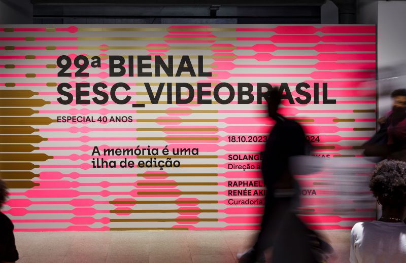
Creative Boom: Resources Sponsored 8 eye-catching typefaces that will elevate your editorial designs These beautifully crafted typefaces from Blaze Type will sharpen your layouts and bring genuine character to every page. Written By: Tom May 19 March 2026 Area in use for 22º Bienal Sesc, Videobrasil, project by Luciana Facchini. Pictures by Nino Andrés Typography is one of those things that separates good editorial design from great editorial design... and great from genuinely memorable.
The right typeface doesn't just carry words across a page; it sets the emotional register, establishes hierarchy, and does half the creative heavy lifting before a reader processes a single sentence. The problem? Hunting down type that's both distinctive and genuinely usable can take hours. So at Creative Boom, we aim to do the legwork for you and bring you indie type foundries with the best fonts, some of which may have slipped under your radar. One foundry that's long been on radar is Blaze Type.
Founded in 2016, they've spent the past decade building a catalogue of more than 100 variable typeface families, all designed with editorial and branding work in mind. And they're well worth checking out. To get you started, here are eight typefaces from their catalogue that deserve a place in your editorial design toolkit right now. 1. Big Sans If you've ever wanted a sans serif that can go from buttoned-up to expressive without switching fonts entirely, Big Sans is worth your time. By default, it's clean and precise; firmly rooted in the mid-century grotesque tradition, with enough geometric structure to give it backbone.
But activate Stylistic Set 7 and the personality shifts: terminals go vertical, proportions open up, and suddenly you have a typeface with considerably more warmth and human rhythm. That dual nature makes it genuinely rare. Across 9 weights from Thin to Black, each with a matching slanted style, Big Sans handles everything from dense footnote text to punchy cover lines without breaking a sweat. Designed by Karol Mularczyk and released in 2025, this is a workhorse with an interesting inner life. 2. Druto Space is always a negotiation in editorial design: you want generous leading for readability, but tighter spacing for denser layouts.
Druto was built specifically to resolve that tension. Designed by Adrien Troy and released in 2025, it achieves minimal line spacing without sacrificing comfort, thanks to a strong visual horizontality, very high arches, and flat counter-forms that keep the eye moving efficiently across the line. The result is a typeface that feels open and wide even when compressed, making it ideal for long-form journalism, data-heavy spreads, or any layout that needs to pack a lot in. Four weights, three widths and matching italics give you plenty of control. Think of it as type that's been engineered around the reader. Druto 3.
Intermedial Slab Slab serifs are having a moment right now, and Intermedial Slab is one of the most considered options on the market. The key to its versatility lies in its contrast range. High-contrast styles are built for commanding, eye-catching headlines; low-contrast options work beautifully for longer body text. Mix and match the two, and you have a typographic hierarchy built in, with no additional fonts required. Designed by Karol Mularczyk and released in 2024, every style carries a humanistic warmth that stops it from ever feeling mechanical or cold.
Article truncated for readability. Read the full piece →
While the article provides valuable insights on typography's role in brand identity, the topic itself is commonly discussed in design circles, making it moderately impactful and novel, but highly relevant for brand strategy professionals.