Score
Netflix Tarot Design System by LOS YORK Is a Masterclass in Scale
The Netflix Tarot Design System exemplifies how a brand can leverage a creative narrative to engage audiences globally while maintaining a coherent visual identity. By integrating traditional tarot symbolism with contemporary design, Netflix not only enhances its storytelling but also establishes a robust framework for future campaigns, showcasing the importance of adaptability and cultural sensitivity in brand strategy.
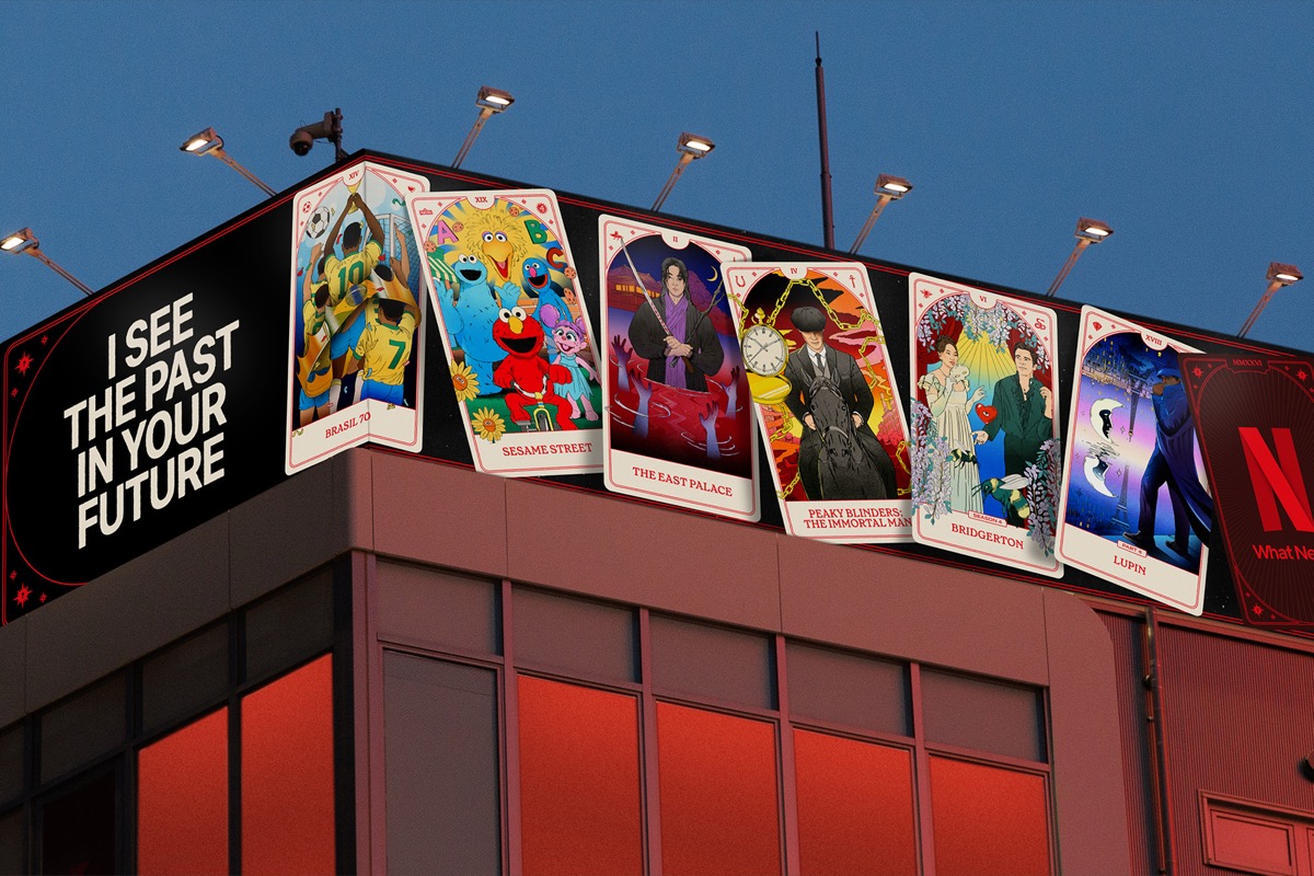
Abduzeedo: Netflix Tarot Design System by LOS YORK Is a Masterclass in Scale jeff March 16, 2026 The Netflix tarot design system built by LOS YORK is one of the most ambitious creative campaigns of 2026. It spans 50 hand-illustrated tarot cards, over 400 pages of design guidelines, 30-plus languages, and massive 3D anamorphic billboards across New York and Los Angeles. LOS YORK, the award-winning creative studio based in Los Angeles, developed the complete Netflix tarot design system for the streaming platform's largest global campaign of the year.
The project, titled Discover Your Future, was conceived in partnership with Netflix and Wieden and Kennedy. The studio approached the campaign as a portal into the Netflix universe, using the visual language of tarot to invite discovery across every market and format imaginable. The Netflix tarot design system begins with 50 bespoke illustrated tarot cards, each one depicting a specific Netflix title. Illustrator Maria Jesus Contreras created every card from scratch, bridging traditional tarot sensibility with a contemporary graphic edge. Each card carries two custom icons in the corners. One icon ties to the specific Netflix show.
The other references the underlying arcana. This layering rewards close attention and creates a conversation between Netflix storytelling and centuries of tarot symbolism. How LOS YORK Built the Netflix Tarot Design System to Scale Globally Typography anchors the Netflix tarot design system in familiar brand territory. Netflix Sans Condensed provides the structural backbone. Grenette by Colophon Foundry adds warmth and historical texture. The colour palette holds tight at the system level: red, black, and off-white for cards and out-of-home placements. Individual illustrations carry richer secondary colours drawn from Netflix brand language.
This restraint allows each card to feel distinct without breaking coherence. The Netflix tarot design system also gave rise to a permanent Netflix brand mark for the global tagline What Next. It was designed to outlast the campaign itself. The guidelines now run to over 400 pages, reflecting how far the system had to travel. LOS YORK even developed a simplified parallel expression for markets where tarot symbolism is culturally sensitive. This preserved the campaign spirit without imposing the same metaphors.
The result is a Netflix tarot design system that blends high-concept storytelling with genuine technical craft, setting a new benchmark for global campaign design.
The article discusses a significant innovation in brand strategy through the Netflix Tarot Design System, which combines cultural elements with modern design, making it highly impactful and relevant for brand professionals.