Score
Muted Char's Incense Packaging Looks Like a Found Object
Muted Char's packaging design exemplifies a minimalist approach that emphasizes material contrast and typographic tension, reinforcing the brand's identity without unnecessary embellishments. For brand strategy, this highlights the importance of restraint and thoughtful design choices in creating a strong visual identity that resonates with consumers seeking authenticity and simplicity in wellness products.
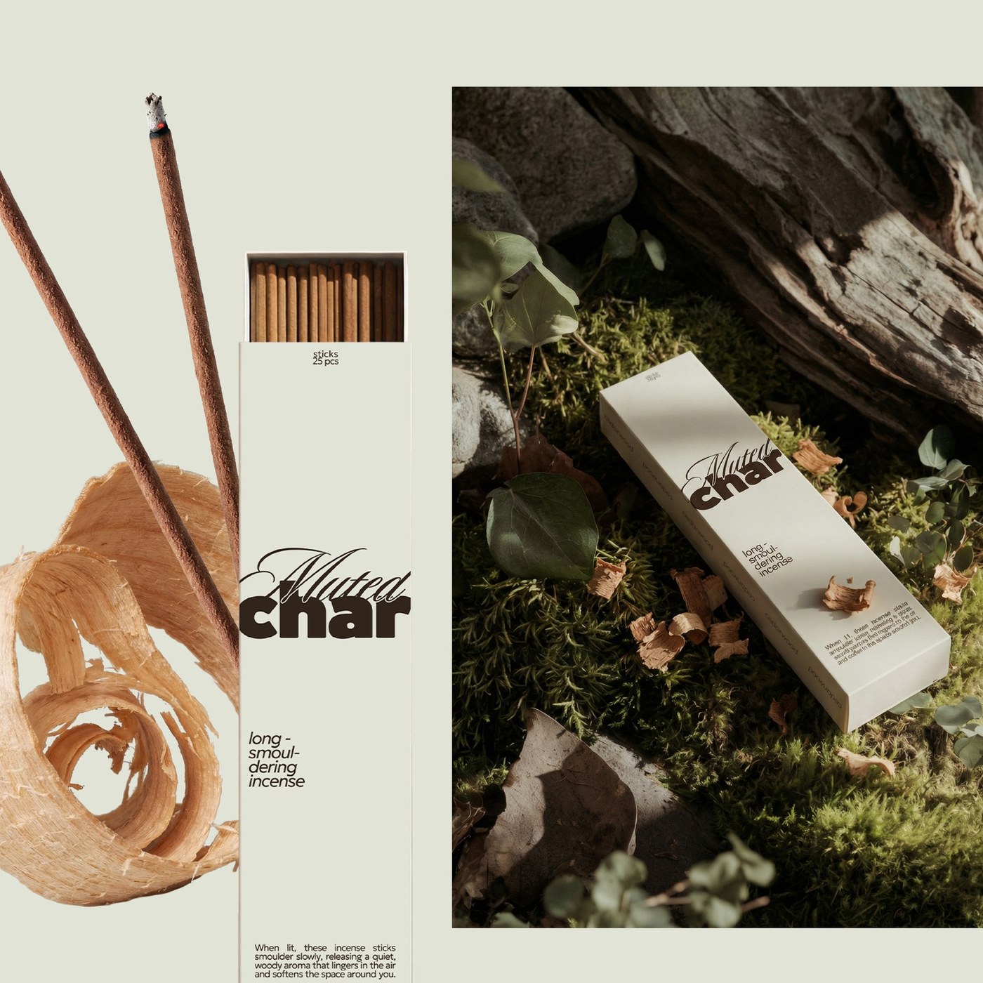
Abduzeedo: Muted Char's Incense Packaging Looks Like a Found Object jeff May 05, 2026 Muted Char is a minimal incense brand packaging design where off-white paper, dark matte tin, and a weight-contrast logotype do every bit of the talking. Alex O'Connor set two typefaces against each other and let the tension carry the whole brand. 'Muted' sits above 'char' in a thin flowing italic; 'char' answers in a heavy condensed serif at roughly three times the weight. That ratio is the identity. The palette runs two tones: warm cream near #E8E0D0 for the paper stick box, deep brown-black near #2A1E17 for the metal cone tin. No accents, no intermediate steps.
The stick packaging is a tall pull-out drawer box with incense sticks fanning from the open top; the cone tin carries the logotype embossed on its lid, photographed against green moss and bark rather than studio white. Every image is shot against organic texture because the incense brand packaging design demands an environment that matches the object's register. Minimal Incense Brand Packaging Where Restraint Is the System The wellness and ritual product category tends toward one of two failure modes: either it reaches for spiritual shorthand, or it overworks photography into lifestyle cliche. Muted Char does neither.
This incense packaging holds its tone by trusting material contrast to carry what color and decoration usually overcommunicate. This is Alex O'Connor's argument in visual form: restraint is not absence. It accumulates across every surface of a minimal incense brand.
The article discusses a notable packaging design that reflects current trends in minimalism and brand identity, making it relevant and moderately impactful for brand strategy professionals, though the concepts are not entirely groundbreaking.