Score
Friday Free Fonts: Datatype, SONKO, and inkt
This article highlights the importance of innovative typography in brand strategy, showcasing how unique typefaces like Datatype and SONKO can enhance visual identity and user experience. By integrating functionality and aesthetic appeal, brands can leverage these fonts to create memorable and engaging communications that resonate with their audience.
Abduzeedo: Friday Free Fonts: Datatype, SONKO, and inkt jeff March 20, 2026 Three free fonts worth downloading right now — from a typeface that draws charts inside text to a brutalist variable system and a blobby Y2K display face. Free Fonts That Push Typography Forward Every Friday, the hunt begins. Designers scroll through specimen pages, test drive new releases, and look for that one typeface that shifts everything. This week delivers three free fonts that do more than fill a gap in the type library — they open new directions. Datatype by Frank Tisellano is the most unusual of the three.
It is a variable OpenType font that renders inline data visualizations — bar charts, sparklines, and pie charts — directly from text expressions. No JavaScript. No external libraries. Type a simple syntax like {b:30,70,50,90} and a bar chart appears in the text flow. Two variable axes control width and weight, and the whole system runs on ligature substitution. Already serving 1.76 million requests per week on Google Fonts, Datatype sits at the intersection of typography and interface design. It is free and open source under the SIL Open Font License. SONKO by Dazor takes the opposite approach.
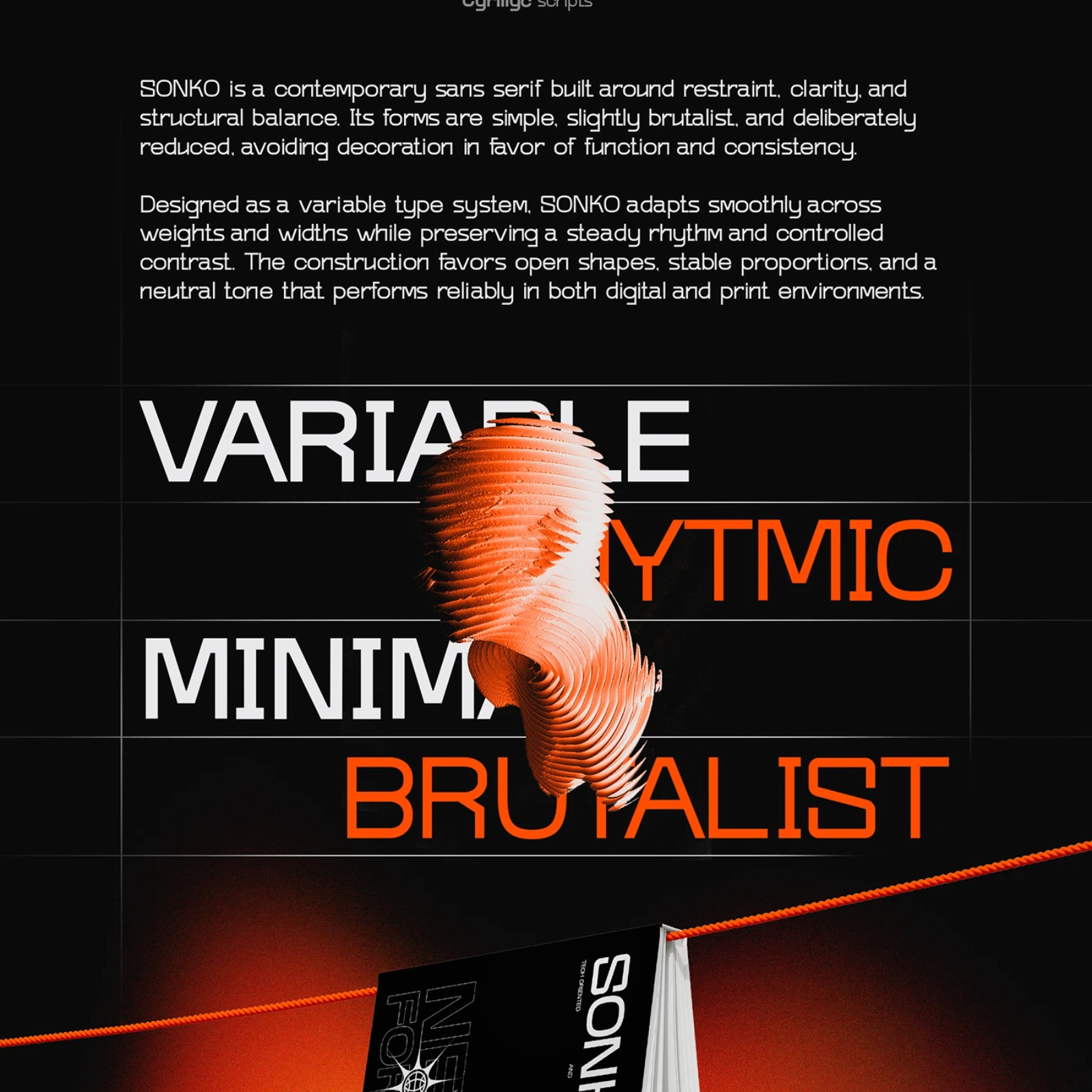
Where Datatype innovates through function, SONKO refines through form. This brutalist sans serif released in 2026 is built as a variable type system with smooth weight and width transitions. The letterforms are stripped to their structural core — tight apertures, flat terminals, and consistent stroke width across the entire character set. Latin and Cyrillic scripts are both supported. The Behance specimen is worth visiting on its own: bold orange and black 3D renders, editorial layouts, and book mockups show the typeface at every scale. SONKO is free to try and fits anywhere that calls for confident, no-nonsense typography.
ink©t by Züli rounds out the trio with pure personality. This display typeface leans into the Y2K revival with blobby, ink-like forms that feel both nostalgic and current. Three versions ship together — Regular, Italic, and Outline — each with the same organic, hand-pulled quality. The character shapes bulge and taper like wet ink on smooth paper, giving headlines an immediate visual identity. It works best at large sizes where the fluid contours can breathe. For posters, social graphics, or editorial headers that need to stop the scroll, ink©t delivers without apology. Three free fonts, three different philosophies.
Datatype treats type as a data interface. SONKO distills letterforms to pure structure. ink©t lets them melt into something expressive and strange. All three are free to download and worth adding to the collection this Friday.
The article discusses innovative typography which is significant for brand identity, but the topic of using unique typefaces is a common practice in design, making it moderately novel and relevant.