Score
YouTube is on a major decluttering mission
YouTube is undergoing a significant design overhaul aimed at decluttering its interface and enhancing user experience. By streamlining features and focusing on a cohesive design system, YouTube aims to improve engagement and retention, ultimately positioning itself as the preferred platform for both viewers and creators in a competitive landscape.
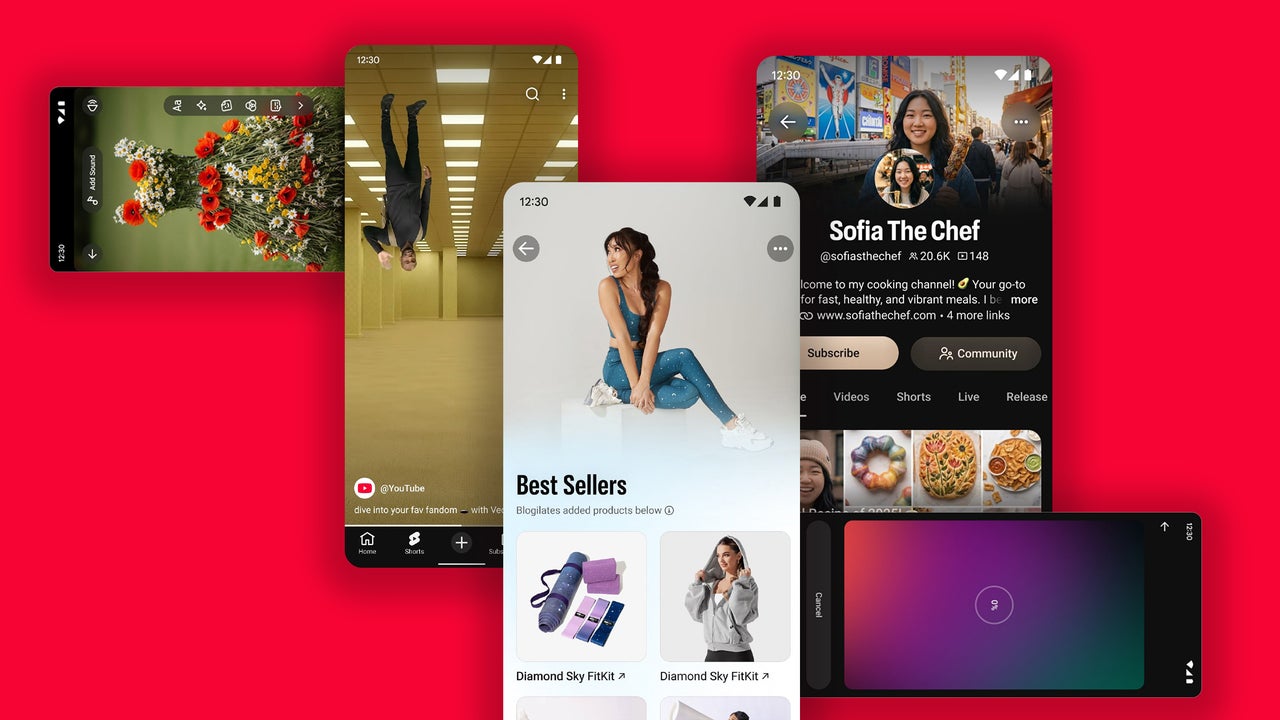
FastCompany: YouTube has ballooned from a small selection of low-resolution videos in 2005 to a total library of more than 20 billion videos uploaded. Over the course of two decades, it has introduced a bevy of new features including YouTube Premium, Shorts, and YouTube Shopping. Today, it has billions of logged-in monthly users. But as YouTube’s user base and content have expanded exponentially, the platform’s actual design has struggled to keep pace.
Historically, YouTube’s product team was guided by boosting traditional KPIs without any clear design infrastructure, resulting in cluttered interfaces, distracting pop-ups, inconsistent iconography, and an overall clunky user experience.
Now, for more than a year, the company—headed by design lead Jonathan Terleski—has been quietly working behind the scenes on what Terleski calls the “most significant design overhaul in YouTube history.” Terleski’s team is working to cut back YouTube’s unnecessary features and replace them with a streamlined design that includes fewer buttons, clearer user and creator homepages, and a better viewing experience. [Image: courtesy YouTube] “We’re at a pretty incredible scale, and as part of that, many of our surfaces have become noisy, less clear, and less simple than they otherwise could be,” Terleski says.
“What I’m trying to do here is really step back and say, ‘Let’s look holistically at this. If we were designing all the things that we now know as YouTube, how might we have done it differently?’” The resulting changes are evidence that often it’s the least obvious features that make the biggest impact on user experience. And, Terleski hopes, they’re also a key “business lever” that will keep viewers coming back for decades to come.
[Image: courtesy YouTube] YouTube’s new design culture The first step in YouTube’s design decluttering didn’t actually have anything to do with the platform’s visuals—it started with the company’s culture and organization. Before Terleski’s major initiative, YouTube’s design was handled with a fairly siloed approach. Teams dedicated to different components of the platform, like the YouTube Music and YouTube Living Room teams, would be responsible for owning the design of their products.
Without any formal guiding design principles, UI decisions were made primarily with performance KPIs in mind, turning aesthetics and usability into more of an afterthought. For example, illustration styles might differ across the brand’s apps; information was often not organized in the most legible order; and layers of updates over time resulted in repeated information or defunct buttons.
Article truncated for readability. Read the full piece →
YouTube's redesign is significant for the brand/design industry as it reflects a major platform's strategic shift that could influence design trends and user engagement strategies across digital platforms.
Weekly digest
Get the Signal digest
Every Monday morning — the top 3 brand trends, 10 high-signal articles, and one emerging signal to watch.
No spam. Unsubscribe anytime.