61Signal
Score
Score
A
AbduzeedoAugust 13, 2026Dashboard UI Design: Bakker's Inn by Dnyanesh Maid
The dashboard UI design for Bakker's Inn emphasizes the importance of modularity and clarity in data visualization, which can enhance user engagement and decision-making. For brand strategy, this approach suggests that investing in intuitive design can significantly improve user experience and brand perception.
◎ EmergingdigitalstrategyBakker S Inn
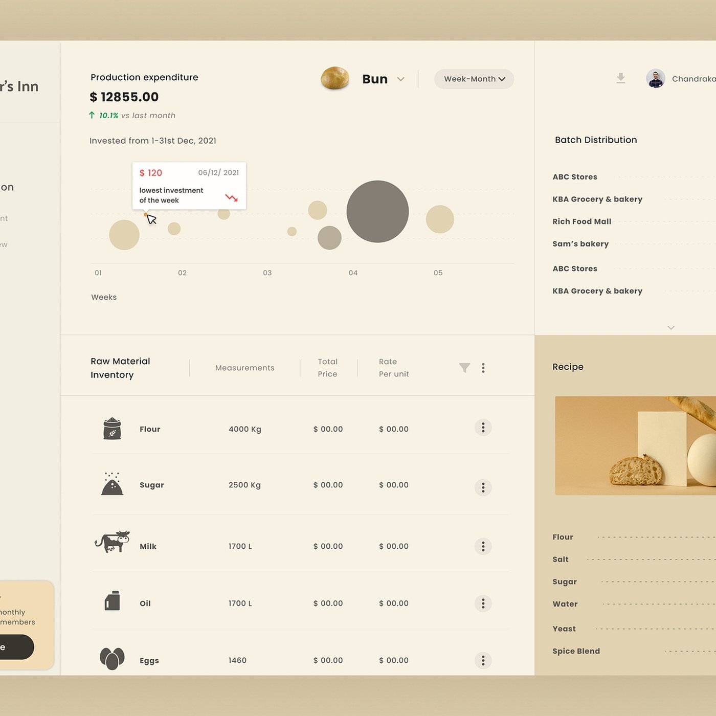
Abduzeedo: Bakker's Inn by Dnyanesh Maid is a dashboard ui design project featuring modular analytics widgets and clean data visualization. Dnyanesh Maid developed the management portal, custom analytics widgets...
Intelligence PanelSignal score: 60.5 / 100
Primary Signal
Emerging
Building momentum — trajectory being tracked
Brand Impact
Medium
Impact score: 60/100 — moderate relevance to positioning decisions
Novelty
Moderate
Novelty: 50/100 — iterative development of an existing theme
Action Priority
Soon
Flag for the next strategic review cycle
Scoring Rationale
The article discusses a specific dashboard UI design that highlights important design principles, making it moderately impactful and relevant for brand strategy professionals, though the concepts are not entirely new.
60
Impact
weight 35%
50
Novelty
weight 30%
70
Relevance
weight 35%
Brands Mentioned
BBakker S Inn
Related SignalsAll Signals →