Score
Red takeout box with cartoon character and "SHIO" branding on a black background.
The branding for Shio Asian Street Food emphasizes a modern, clean aesthetic that marries traditional Asian influences with a vibrant, community-focused spirit. By incorporating a playful mascot and a bold visual identity, the strategy aims to create an authentic and energetic brand experience that resonates with its audience in a dynamic street food market.
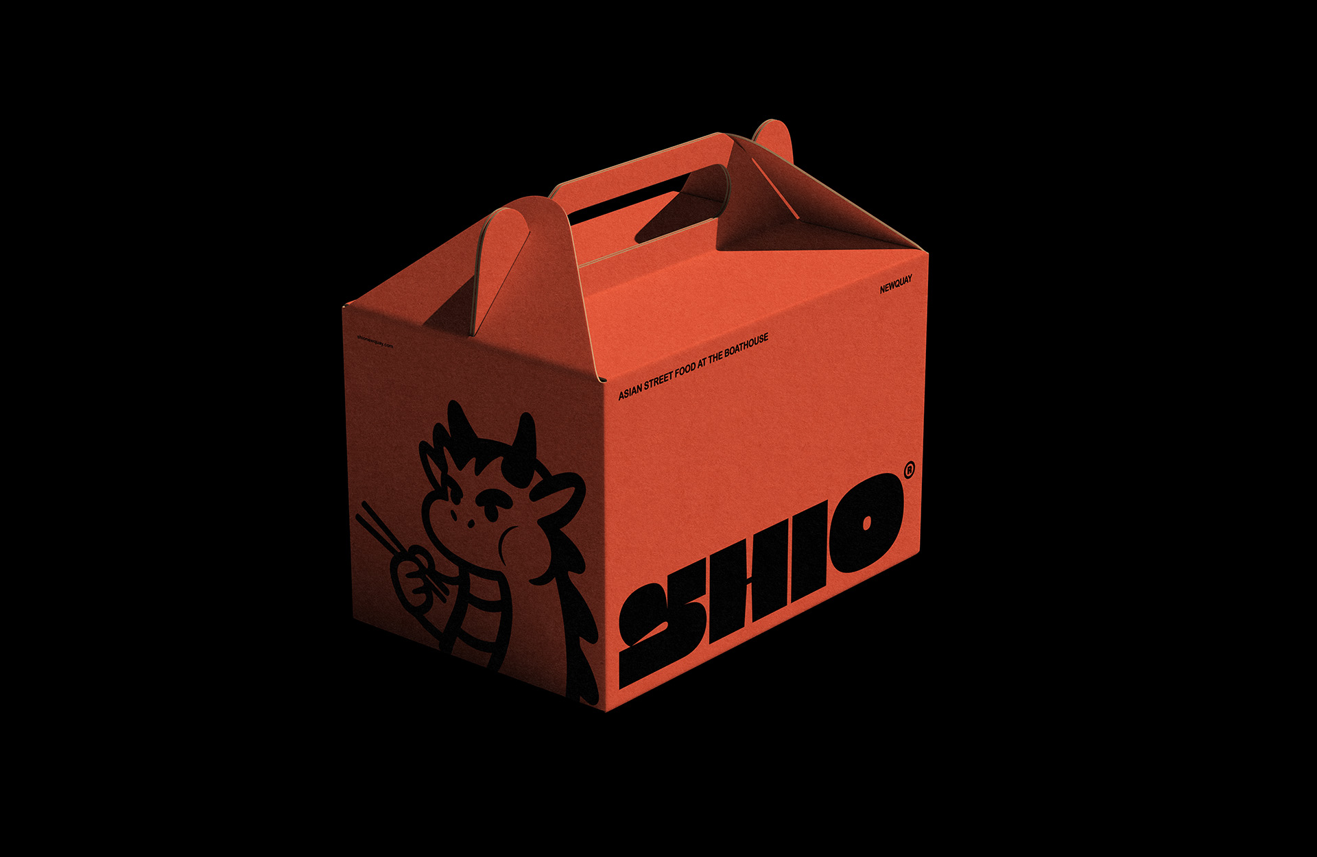
Mindsparkle: Edoardo Maccari United Kingdom DATE April 01, 2026 EDITOR Mindsparkle Mag Shio Asian Street Food Branding Shio was born at The Boathouse in Newquay as a contemporary street food experience immersed in Asian culture and coastal energy. The project defines a visual identity to bridge the gap between traditional influences and a modern, clean urban aesthetic.
The goal was to balance the freshness of local produce with the vitality of oriental flavours, avoiding clichés and building a brand that feels authentic, distinctive and energetic.Developed for a dynamic street food market, the new branding direction by Edoardo Maccari is rooted in accessibility: colours, shapes and icons reflect a warm, community-focused spirit. The result is a bold, welcoming identity that feels refined yet remains extremely vibrant and truly alive.Accompanying the brand is the mascot: Shio the dragon that is inspired by the world of manga but reinterpreted through a Western lens.
More than a simple decorative element, he is an active character who cooks and eats, transforming every touchpoint into a small act of storytelling that amplifies the venue’s personality and energy.
The article discusses a branding strategy for a specific food brand, which is relevant and impactful within the niche of food branding, but does not represent a groundbreaking approach in the broader design industry.