Score
Between Brand Identity Reframes Sexual Wellness Packaging
The rebranding of Between by LYM Design Studio emphasizes a more intimate and tactile approach to sexual wellness packaging, moving away from clinical aesthetics. This strategy highlights the importance of emotional connection and sensory experience in brand identity, suggesting that thoughtful design can redefine consumer perceptions in sensitive categories.
Abduzeedo: Between Brand Identity Reframes Sexual Wellness Packaging sofia April 12, 2026 Between brand identity by LYM Design Studio reframes sexual wellness packaging with braille-inspired dots, neutral tones, and restrained visual language. LYM Design Studio, a Warsaw-based creative agency, developed the Between brand identity for a sexual wellness company that wanted to exist outside the clinical and the explicit. Between brand identity approaches intimacy as a quiet, shared space rather than a performance. The result is a visual system built on restraint, tactility, and emotional awareness.
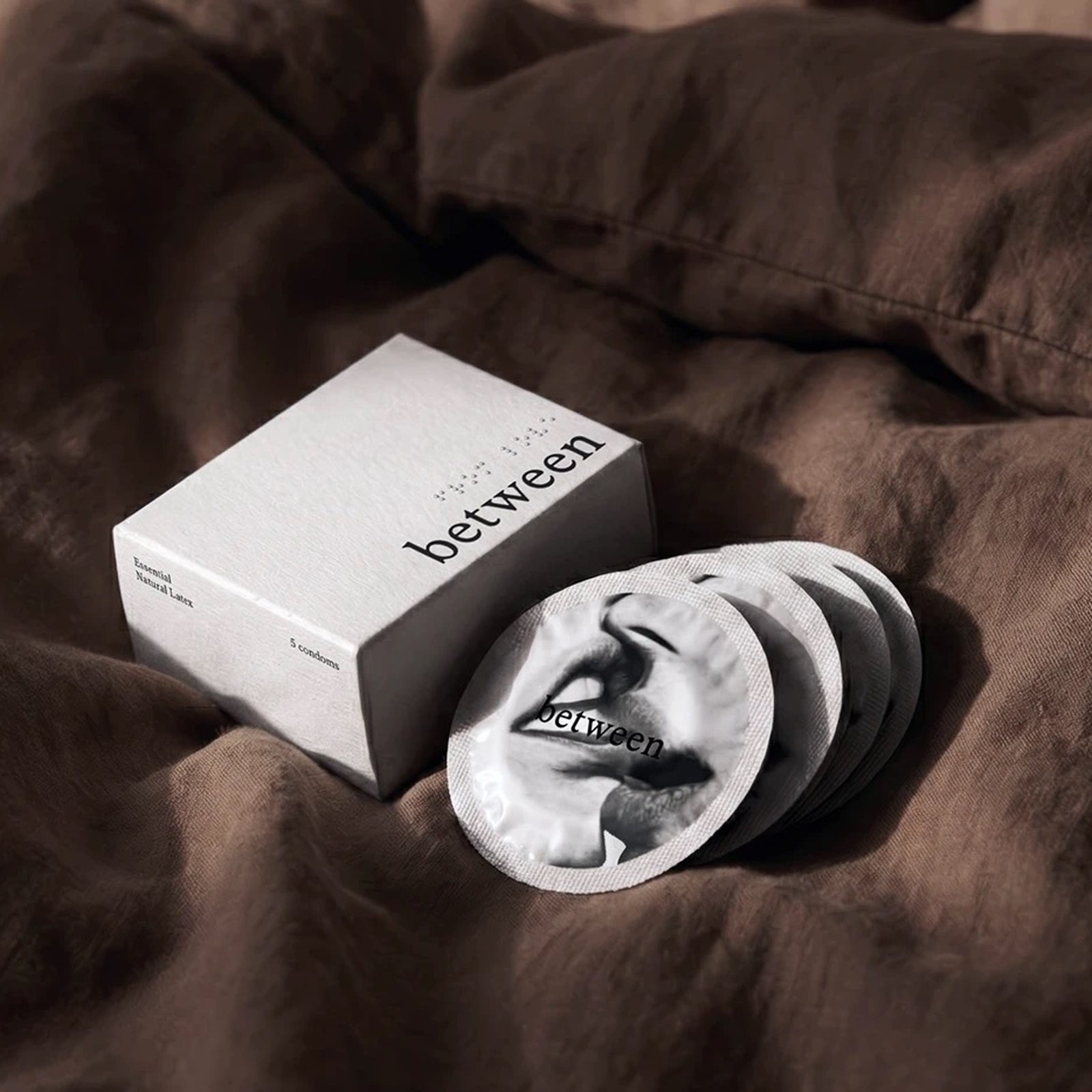
The central design move is a braille-inspired dot system woven through all packaging. These raised tactile dots function as a sensory layer that introduces touch as a core part of communication. Braille becomes a metaphor for intimacy: a language understood through closeness, felt rather than declared. The dots appear across the white carton packaging, the pale blue bulk box, and the kraft shipping box sealed with a white label band. Between brand identity: intimacy through tactility and type Typography reinforces the restraint. The wordmark sets between in lowercase, a quiet serif without urgency.
Individual foil condom packets carry intimate editorial photography, black-and-white close-ups of mouths and hands printed directly onto the foil. This shifts the product away from pharmaceutical aesthetics and toward emotional presence. The color palette holds to neutral: off-white, warm kraft, and muted slate blue. Soft linen textures in the lifestyle photography ground the brand in domestic warmth. Every choice reinforces the same idea: intimacy begins before contact, in the shared space between two people.
LYM Design Studio's work on Between brand identity demonstrates how packaging can reframe a product category through calm, systematic thinking. View the full project on Behance .
The article discusses a significant rebranding effort in a sensitive industry, presenting innovative design strategies that enhance emotional connections, making it highly relevant for brand strategy professionals.