Score
How to look like a space company without space company clichés
Turion Space's rebranding reflects its evolution from a space debris removal company to a comprehensive space infrastructure provider, necessitating a brand identity that balances its current capabilities with future aspirations. The new visual identity aims to differentiate Turion in a crowded market by moving away from typical space branding clichés and fostering a sense of optimism about the future of space exploration.
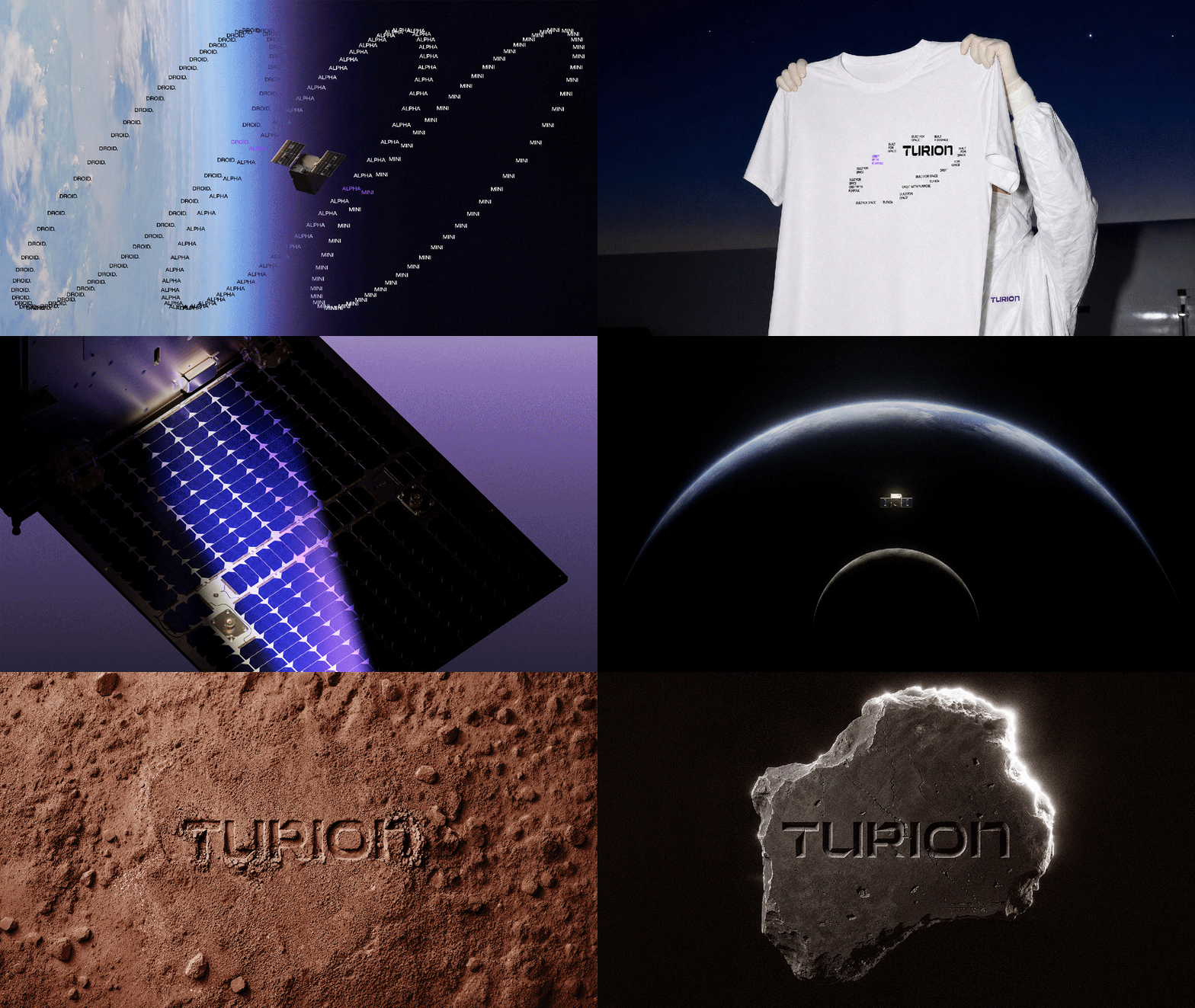
FastCompany: A lot has changed at Turion Space since it was founded in 2020. Originally focused on space debris removal, the Irvine, California-based company has since transformed into a space infrastructure company, building the vehicles, software, and payloads that help spacecraft move, maneuver, collect data, and carry out missions in orbit. That evolution has also changed the scale of the opportunities it is pursuing. Turion has moved from proving its technology to competing for major government programs and taking on increasingly complex missions, alongside both established aerospace and defense contractors and newer space companies.
Turion’s growth coincides with a broader shift in the space industry. In the U.S., major government programs are increasingly bringing commercial and emerging space companies into the fold alongside established contractors, creating a competitive landscape for companies like Turion. [Image: Turion Space] In that evolving landscape, the team at Turion realized that their brand hadn’t quite kept pace with their progress. The original identity took cues from Turion’s early focus on space debris removal, with a literal orbital motif built into the wordmark.
As the company expanded into mission software, space logistics, and other capabilities, the navy-on-white, corporate-leaning identity could no longer reflect the breadth of its work. [Image: Turion Space] Sid Fritts, former head of marketing and brand at Turion Space, says the team wanted to go “beyond the generic space-defense identity so many companies in this category default to.” To lead the rebrand, Turion called on the creative chops of Buck and Wild —both part of Residence , a global network of independent creative companies—to reimagine its identity, brand world, and website.
Together, the teams quickly identified a few tensions: Turion’s story had to strike a balance between its present and its future. Turion already has two satellites in orbit, so its identity needed to hold its confidence and credibility while also making room for its aspirations. [Image: Turion Space] “Our long-term vision, Starforge—an ambition to build infrastructure for deep-space missions and resource extraction—can come across as a pipe dream to some customers, a distraction from the mission at hand,” says Fritts.
“But that misreads what it is: the result of compounding capability, where each product line we ship today builds directly toward it.” As Fritts adds, achieving this balance meant creating a system that seamlessly scales from the micro to the macro. “The same brand has to carry a spec sheet for a mission operator and a thesis about the next hundred years in orbit, and both have to feel like the same company,” he notes. [Image: Turion Space] There was another challenge at hand, too.
Turion wanted its identity to spark a sense of optimism about space, but much of its work cannot be shared publicly—a constraint that can push defense brands towards vague, interchangeable identities. The team needed to show off Turion’s products and engineering in realistic detail, “while also finding clever ways to hide or redact the proprietary (or even government-classified) bits,” says Mike Payne, creative director at Buck, which developed the visual identity, while Wild translated it into the new web experience.
Article truncated for readability. Read the full piece →
The article discusses a significant rebranding effort from a space-related company, which is impactful and relevant to brand strategy professionals, while also introducing a fresh perspective on avoiding clichés in branding.
Weekly digest
Get the Signal digest
Every Monday morning — the top 3 brand trends, 10 high-signal articles, and one emerging signal to watch.
No spam. Unsubscribe anytime.