Score
LUKTHIS: Lollapalooza Brazil 2026 Festival Motion Design
The motion design for Lollapalooza Brazil 2026, created by LUKTHIS, emphasizes the importance of visual storytelling in brand strategy, particularly for music festivals. By layering various design elements and cultural references, the campaign not only announces the lineup but also encapsulates the festival's hybrid identity, making the visual form a critical part of the brand narrative.
Abduzeedo: LUKTHIS: Lollapalooza Brazil 2026 Festival Motion Design abduzeedo May 09, 2026 LUKTHIS (São Paulo) built Lollapalooza Brazil 2026 lineup motion as music festival motion design — halftones, collage, and analog texture doing the work. The brief for a lineup reveal is specific: ten seconds to make the audience feel like they’re already there. LUKTHIS (Lucas Ribeiro) answered it through layered collision.
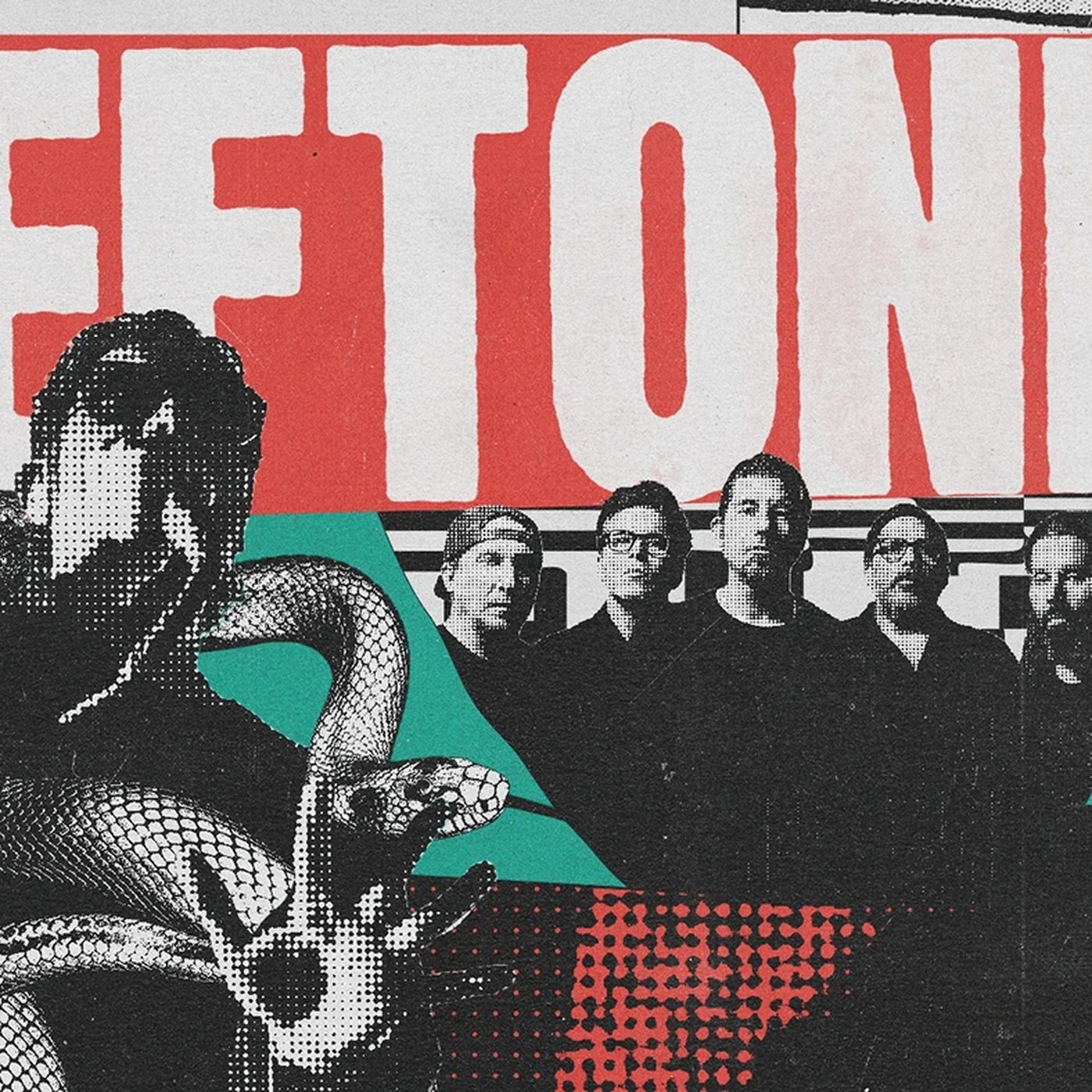
Each frame in this music festival motion design campaign operates as a simultaneous cultural archive — the opener title card runs teal paint-splash shapes against lavender halftone dot fields and a red halftone strip, all over a dark stage photograph. A condensed white slab-serif ‘DEFTONES’ at roughly 200pt fills the top third of one frame against a halftone-textured black ground, with an engraving-style snake coiling at lower left and a band photo at right. Three registers — type, illustration, photography — occupy the same frame without fighting each other.
Motion design by Ricki Mendes builds the rhythm that holds this music festival motion design together. Music Festival Motion Design: How LUKTHIS Built Lollapalooza Brazil 2026 The male artist portrait frame pushes further: yellow disc-halo behind the subject, high-saturation teal background, deep red halftone shapes at left, a Marilyn Monroe screen-print composite in the lower right — five cultural reference layers in one composition. The guitar silhouette frame reduces it differently: three overlapping figures, halftone-rendered face, teal Fender as the sole saturated object cutting through grunge texture.
The music festival motion design logic holds across both — density as argument, not decoration. The festival’s hybrid identity (classics and avant-garde in collision) is encoded in the visual method, not stated in a title card. That’s what separates this music festival motion design work from a standard lineup announcement: the form is the argument.
The article discusses a significant motion design campaign for a major music festival, highlighting its role in brand strategy, which is relevant and impactful for professionals in the design industry.