Score
Bottle and card with "ORTHOFER" branding, surrounded by dark seeds on a green background.
Orthofer's brand strategy centers around the pumpkin, which serves as a key visual element in their identity. By utilizing a flexible logo, a premium color palette, and authentic imagery, they effectively communicate the traditional craftsmanship and high quality of their award-winning pumpkin seed oil.
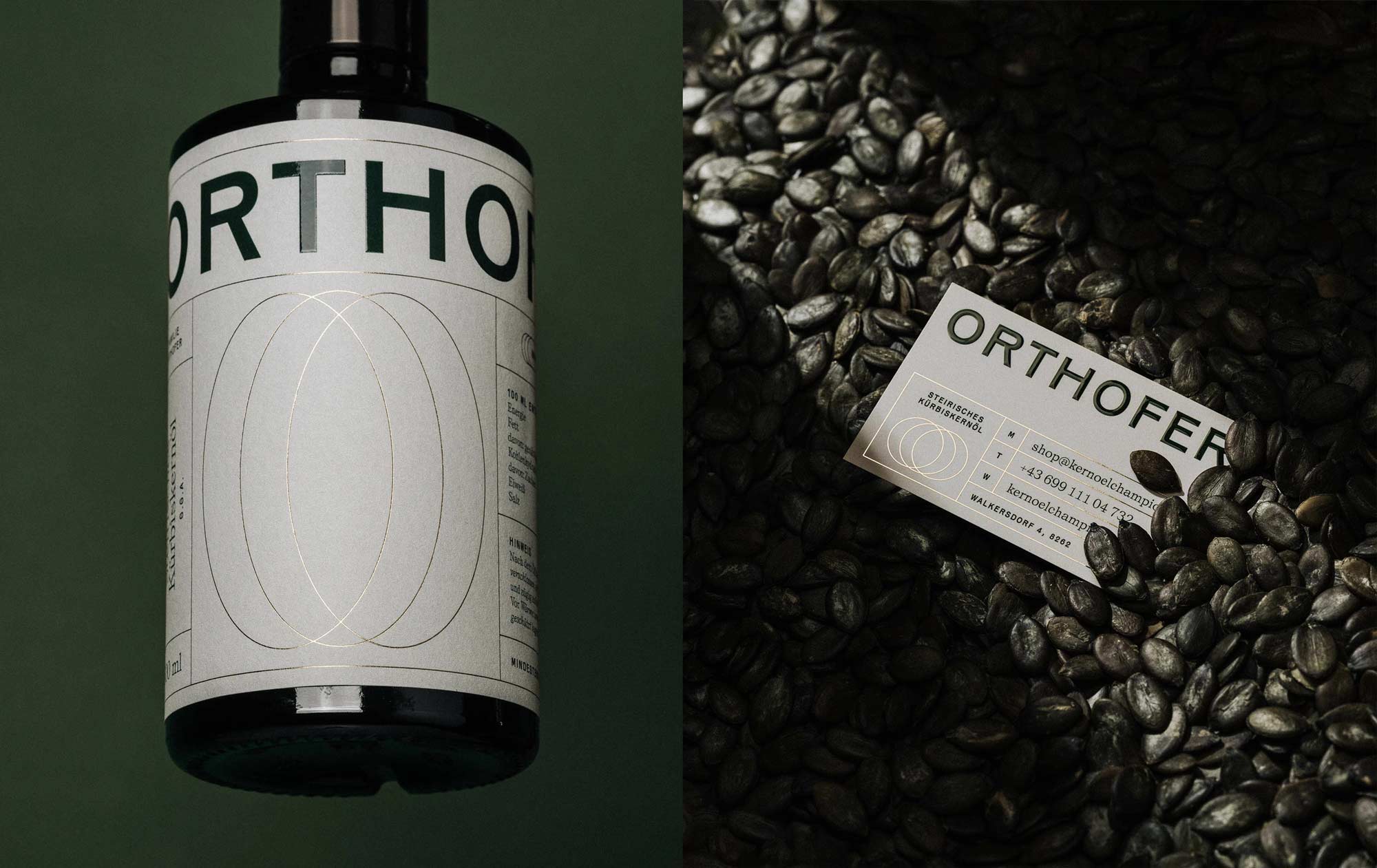
Mindsparkle: Lukas Diemling DATE April 14, 2026 EDITOR Mindsparkle Mag Orthofer’s brand identity puts the pumpkin at its core Orthofer is a Styrian family-run business that has been producing award-winning pumpkin seed oil for over 30 years. Made from 100% first pressing, it embodies traditional craftsmanship, purity, and the highest quality. At the core of Orthofer’s visual identity is the pumpkin, which becomes a defining design element through a flexible logo. A color palette that emphasizes the premium nature of the product, combined with authentic imagery and expressive typography, supports the logo and completes the overall brand appearance.
The article discusses a specific brand's strategy which may not be groundbreaking but highlights effective branding practices relevant to the industry.