Score
Brand Identity Typography: Ruda's Bold Olive Oil Packaging
The design of Ruda's olive oil packaging highlights the importance of brand identity typography in creating a strong visual presence. By utilizing custom geometric monograms and a disciplined layout, Ruda effectively communicates its brand values and enhances consumer recognition, which is crucial for brand strategy.
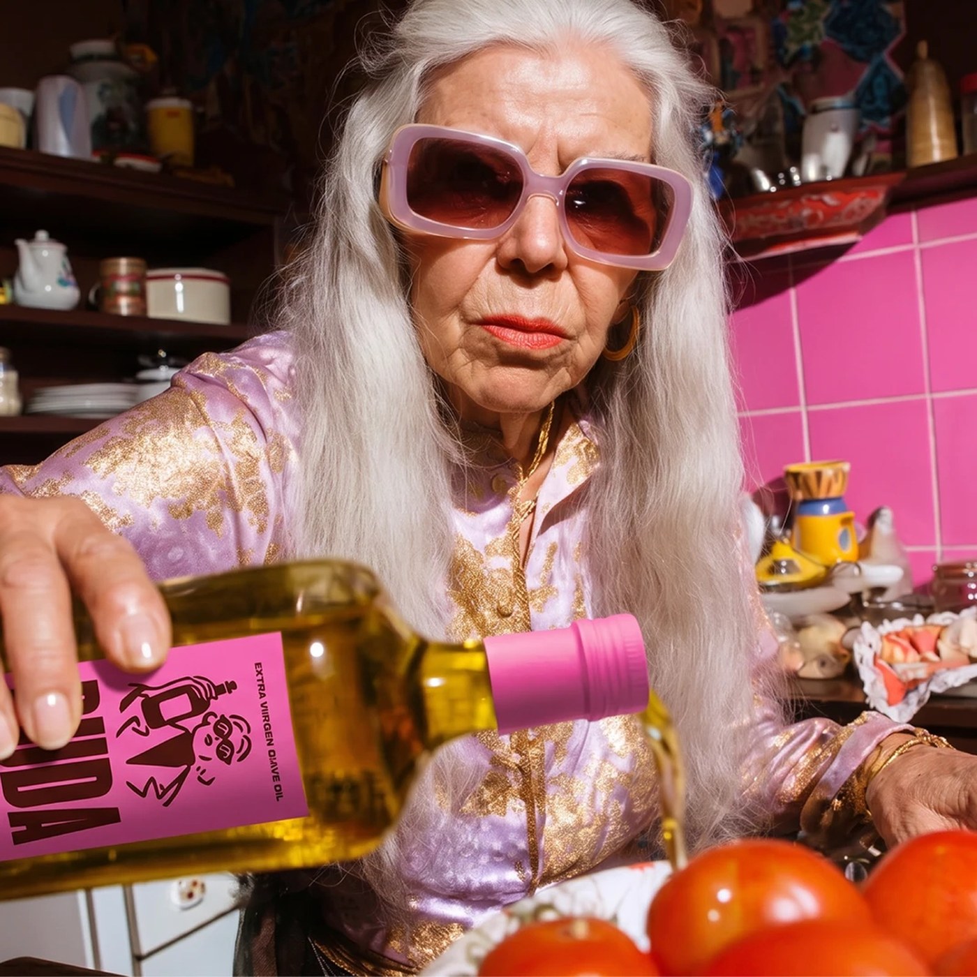
Abduzeedo: Brand identity typography defines the Ruda olive oil design system by Yai Salinas, using custom geometric monograms and strong layouts. Yai Salinas developed a disciplined layout grid for Ruda. The sy...
The article discusses a specific case of packaging design that emphasizes typography's role in brand identity, which is significant for brand strategy professionals, though the concepts presented are not groundbreaking.