Score
Soto Branding by Forner Studio
Forner Studio's Soto branding emphasizes creativity in home improvement through a modernist design approach, featuring a unique square-to-circle wordmark and a calming sage green color palette. This strategy highlights the importance of visual identity and packaging in transforming consumer perceptions and experiences in the home improvement sector.
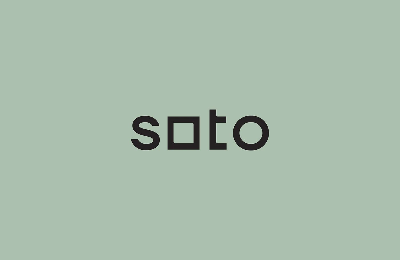
Abduzeedo: Forner Studio's Soto branding turns home improvement into a creative act — square-to-circle wordmark, sage green packaging, and pure modernist restraint. The wordmark is the argument. In the Soto bran...
The article discusses a branding project that showcases creativity in a specific sector, which is relevant and impactful for brand strategy professionals, though the concepts of visual identity and packaging are not particularly novel.