Score
Offf Barcelonas Logo Is Built On Its Attendees Dna Literally
The OFFF Barcelona festival's new logo, created by Uncommon, utilizes biological samples from attendees to embody the community's essence, emphasizing collective creativity. This innovative approach not only reflects the festival's core values but also serves as a strategic reminder that the future of creativity lies in collaboration and shared experiences.
Creative Boom: News Branding OFFF's logo is built out of designers' DNA – literally When a global creative studio invited the design world to a drinks party, it wasn't just being sociable. It was collecting biological samples. Written By: Tom May 16 April 2026 There's a long tradition of designers being asked to "reflect the community" in their work. Usually, this means a mood board, a few vox pops and a palette inspired by the client's existing brand colours. Uncommon, a global studio with offices in New York, London and Stockholm, took a rather different approach for this year's edition of the long-running design festival OFFF Barcelona.
They invited members of the global creative community to casual mixer events in both cities, waited for everyone to relax and start talking, and then quietly swabbed the cups, doorknobs and shared surfaces for biological traces. Those traces were cultured in a lab. The resulting moulds served as the visual foundation for the entire campaign. The punchline was saved for the festival's opening morning on 16 April, when Uncommon's Nils Leonard revealed the concept live on stage at Disseny Hub Barcelona.
The crowd's reaction moved rapidly from laughter to genuine delight, which is the response you'd hope for when you tell a room full of designers they've unknowingly starred in a brand identity. A living magic trick The campaign is called Cultured, a title that works on multiple levels. It nods to the petri dish, to the idea of creative culture as something grown rather than manufactured, and to the gentle joke that designers, of all people, consider themselves cultured. The central proposition is that the creative industry is nothing but the people in it, and that its future is shaped by those who choose to participate.
Even when they think they're just having a glass of wine and complaining about clients. "For OFFF, the community has always been the core," explains Pep Salazar, director of OFFF Barcelona. "This collaboration with Uncommon makes that idea tangible. The campaign doesn't just speak to designers, it's literally built from them. It's a celebration of shared authorship and the power of gathering, exchanging and making together." To deliver a library of bold textural imagery, Uncommon brought in the artist Dasha Plesen, known as the Mould Queen for her practice of using bacteria as a creative medium.
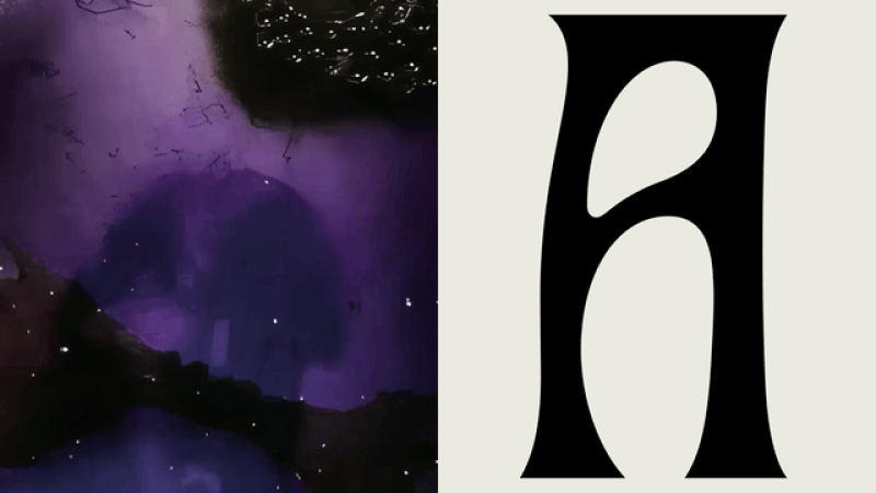
The result is a visual system that feels genuinely alive: unpredictable, asymmetrical, organic and, crucially, not like anything you've seen at a design conference before. Typography with a biological logic The identity is built around a custom typeface called Hyphae, developed specifically for the campaign and named after the thread-like structures that form fungal networks. The letterforms draw on two unlikely but surprisingly compatible sources: experimental biomorphic design and Modernisme, the Catalan architectural movement that gave Barcelona so much of its decorative vocabulary.
The typeface has the quality of something grown rather than drawn, with an organic movement and asymmetrical balance that mirror the living material it references. Across the festival's touchpoints, from printed posters to stage signage, wristbands, lanyards and social content, the system holds together with the kind of confidence that suggests the constraints were very clear from the start. The colour approach draws from nature's boldest palette: deep reds, electric greens, vivid purples, and earthy ochres.
Article truncated for readability. Read the full piece →
The use of biological samples to create a logo is a unique and innovative approach that highlights community engagement, making it significant for the brand/design industry, though its direct application may be limited to specific events or festivals.