Score
RayNeo Brand Identity: Speed and Light in Motion
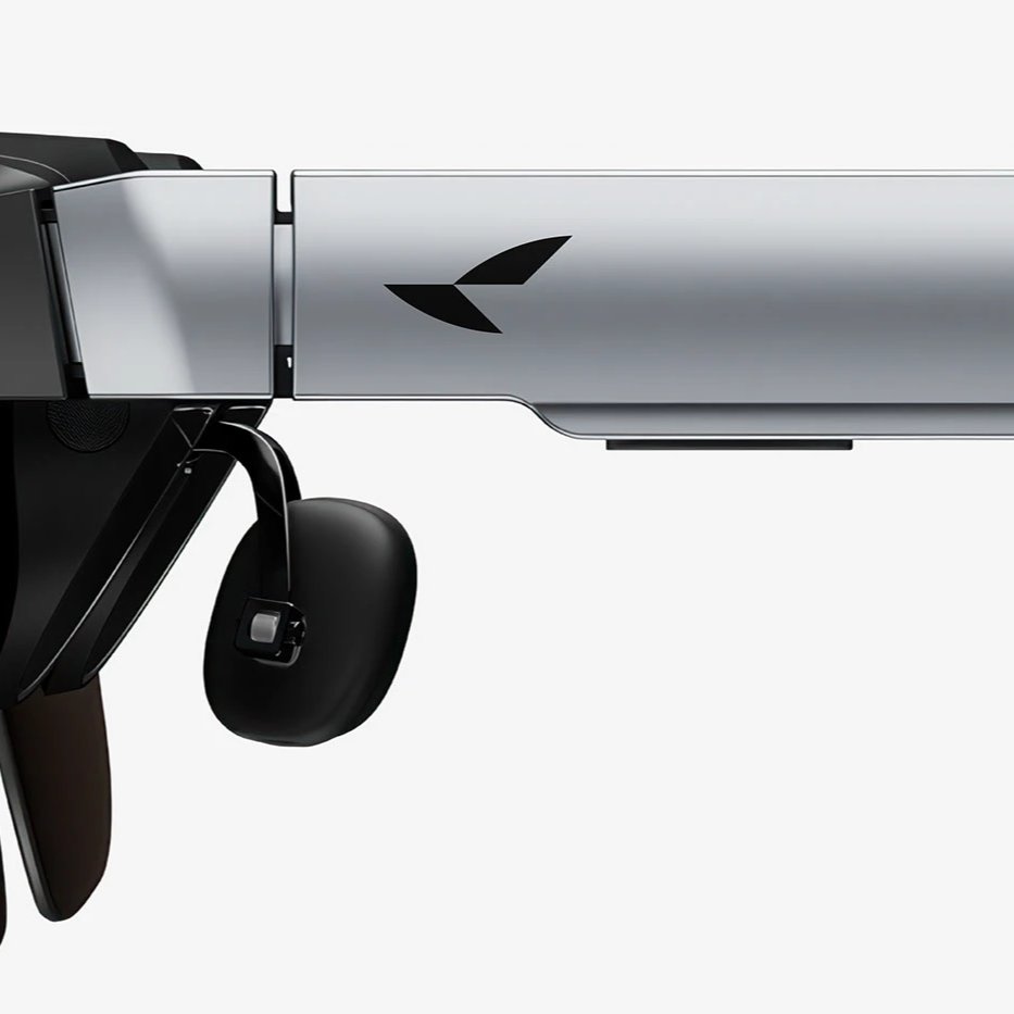
RayNeo's brand identity strategically embodies the concepts of speed and motion through a dynamic bird-in-flight logo, reflecting its focus on AR wearables and optical technology. The design's geometric precision and directionality not only align with the brand's name but also differentiate it in a saturated tech market, emphasizing a modern and energetic visual identity that resonates across cultural contexts.
Abduzeedo: RayNeo Brand Identity: Speed and Light in Motion alex March 30, 2026 Han Gao's RayNeo brand identity turns optics and speed into a bird-in-flight mark built from precise geometric planes—sharp, directional, built for tech. RayNeo is an AR wearables company, and the brand identity design challenge was finding a visual form that matched both its name and its technology ambitions. Designer Han Gao , based in New York, approached the mark as an act of recomposition—reassembling dynamic geometric elements until the silhouette of a bird in passage emerged from the structure. The result resists being pinned down.
Straight on, it registers as an angular, forward-moving form. Studied more closely, the full bird shape resolves. The geometry is tight and faceted rather than rounded, giving the mark a lens-like quality that fits naturally with a brand whose product category sits at the intersection of optics and display technology. Every angle of the mark conveys intent. Brand Identity Built on a Moment of Motion What makes this brand identity distinctive is its built-in directionality. The mark avoids the stable symmetry of most tech logos—it leans, moves, implies trajectory.
That energy carries through the full brand identity system: against deep, near-black backgrounds, the mark reads as sharp and immediate, like a form caught mid-flight rather than posed for the camera. Han Gao references optical science and RayNeo's Chinese name as the two conceptual anchors. The bird silhouette aligns with the phonetic and semantic character of the name, creating resonance that works in both English and Chinese contexts. That dual register—East and West, abstract and figurative—gives the brand identity depth beyond its geometry. The typography lockup reflects the same logic.
A lean, geometric sans-serif wordmark carries none of the institutional weight of legacy tech brands. It reads as motion rather than declaration. Paired with the mark, it keeps the system cohesive without over-engineering it.
The project earned Best of Behance recognition on March 19, 2026—a strong endorsement for work that found conceptual clarity in a space crowded with derivative tech logos.
The article discusses a significant rebranding effort in the tech sector, which is impactful for brand identity professionals, while the focus on speed and motion offers a fresh perspective on design strategy.