70Signal
Score
Score
A
AbduzeedoJune 5, 2026Sans Serif Typeface: Solare and the Integration of Grotesque Form and Serif Grace
The development of the Solare typeface highlights the importance of blending traditional design elements with modern digital needs in brand strategy. By integrating grotesque forms with serif grace, brands can create a unique visual identity that resonates with contemporary audiences while maintaining a sense of heritage.
◎ EmergingtypographyidentitydigitalNikolas Type
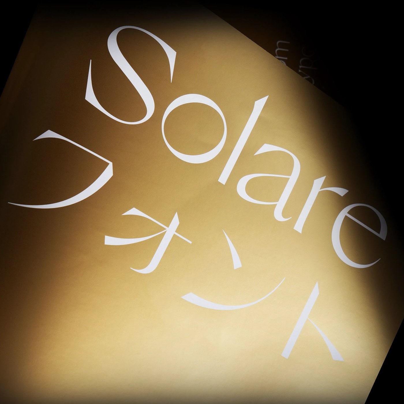
Abduzeedo: Solare is a versatile sans serif typeface designed by Nikolas Wrobel of Nikolas Type. Five years in development, the project merges traditional details with digital utility. The family offers sixteen ...
Intelligence PanelSignal score: 70 / 100
Primary Signal
Emerging
Building momentum — trajectory being tracked
Brand Impact
Medium
Impact score: 60/100 — moderate relevance to positioning decisions
Novelty
Moderate
Novelty: 70/100 — iterative development of an existing theme
Action Priority
Soon
Flag for the next strategic review cycle
Scoring Rationale
The article discusses a new typeface that merges traditional and modern design elements, which is significant for brand identity but may not be groundbreaking in the broader context of design trends.
60
Impact
weight 35%
70
Novelty
weight 30%
80
Relevance
weight 35%
Brands Mentioned
NNikolas Type
Related SignalsAll Signals →