Score
Mamico Kids Store Branding by TRUE AGENCY
The branding for Mamico Kids Store by TRUE AGENCY emphasizes a cohesive visual identity that integrates architecture, signage, and packaging, creating a holistic experience for customers. By utilizing a distinctive color palette and a unique logo design that embodies the brand's playful nature, this strategy reinforces the store's identity and enhances customer engagement in a physical space.
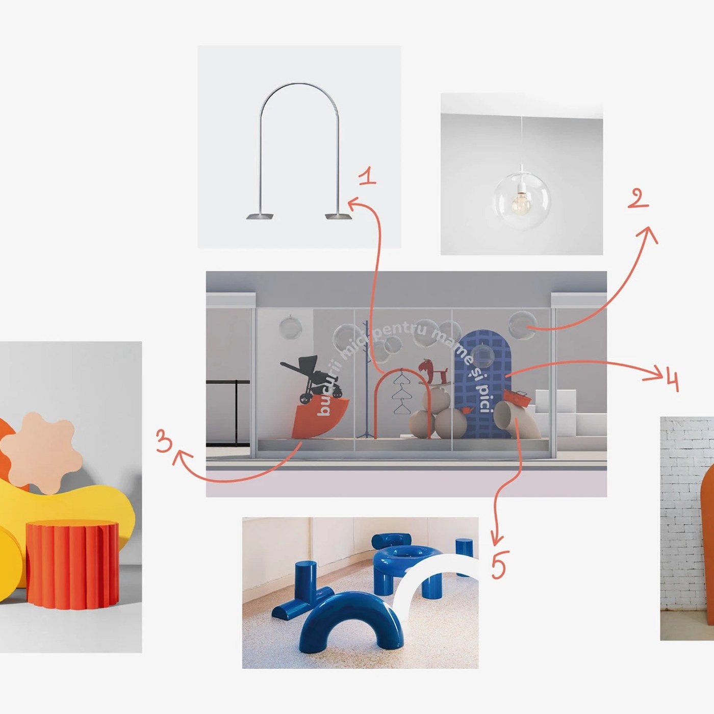
Abduzeedo: Mamico Kids Store Branding by TRUE AGENCY abduzeedo April 30, 2026 TRUE AGENCY's Mamico kids store branding covers 1,700 m² — isometric zoning maps, coral-orange play structures, and a double-heart M mark at every scale. The palette is three values: deep navy (#3B4A7A), coral-orange (#E8573A), and off-white. No exceptions across the kids store branding — signage, bags, and architecture. TRUE AGENCY used isometric 3D room cutaways on a navy field to map childhood-stage zones. Each cutaway shows a furnished nursery with the coral accent ladder and brand copy at 18pt on the walls.
The M is a double heart — two arched forms that read as both the letter and a heart, scaling from wall mural to bag handle without losing shape. Mamico Kids Store Branding: When the Space Is the Identity The birch plywood and coral-orange steel play structure makes the kids store branding physical. TRUE AGENCY drew a flat illustration of the same structure for print, placing object and graphic twin side by side. Two bag variants on warm sand — navy with an oversized heart-M, white grid with a small navy mark — are shot as matched specimens, not lifestyle props. This is kids store branding where the architecture is a touchpoint.
The article discusses a branding project for a kids' store, which is significant for the niche market but not groundbreaking in the broader brand/design industry.