Score
Meet the new ‘reuse’ symbol, a spiraling cousin to the ‘recycling’ icon
The introduction of a new 'reuse' symbol aims to enhance brand strategies by promoting sustainable practices and encouraging consumers to embrace reusable products. This initiative, led by PR3, signifies a shift in consumer culture towards sustainability, potentially reshaping how brands communicate their commitment to environmental responsibility. As brands like Coldplay and Billie Eilish incorporate reusable systems into their tours, the symbol could become a key element in brand identity and marketing strategies focused on sustainability.
FastCompany: The lights drop, the first chord detonates, and somewhere in a stadium packed with 60,000 people you’re holding a cold beer. At a growing number of stadiums in the United States, your beverage cup isn’t made of flimsy plastic you’d toss into a bin on the way out. It’s a sturdy, reusable cup, designed to be handed back, washed, and ready for the next customer. This isn’t hypothetical. Coldplay served drinks in reusable cups during its Music of the Spheres World Tour, and Billie Eilish went a step further, writing reuse into her tour rider, from refillable bottles and mugs for the crew and water refill stations for fans.
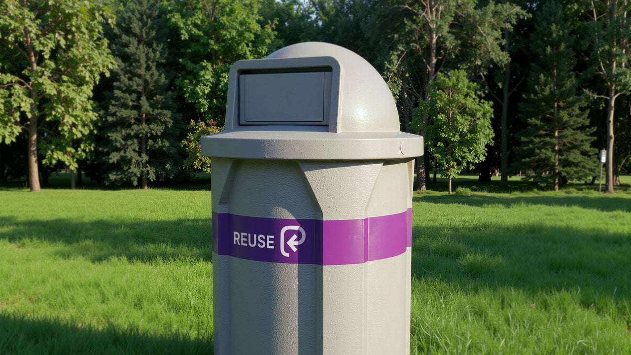
Getting that cup into your hand is enormously complicated—a tangle of collection hubs, wash facilities, digital tracking, contracts, and standards almost no one in the crowd will ever see. And today, consumers will become acquainted with a new icon that identifies a product as reusable. [Image: courtesy PR3] The symbol is being launched by an organization called PR3: The Global Alliance to Advance Reuse . It arrives amid mounting pressure over the plastic and climate crises and a growing recognition that recycling alone can’t solve a problem of this scale.
Today only about 9% of plastic waste is recycled, while the rest is landfilled, burned, or lost to the environment. Reuse addresses this problem by keeping packaging in circulation, which could ultimately reduce the production of single-use packaging as well as the carbon emissions required to make them. It will take time for reuse to become as widespread as recycling. “I believe we’re close to a tipping point,” says Amy Larkin, PR3’s cofounder and director. But a crucial step to getting there is building awareness that these new systems exist— and the new symbol is instrumental to creating this new reality.
[Image: courtesy PR3] A spiral, not a loop To find its new symbol, PR3 hosted a design initiative in 2025 with an open call to crowdsource designs—a call that drew 236 submissions from 29 countries. [Image: Epigrama Studios] The winner came from Epigrama Studios, a creative practice in Bogotá, run for nearly two decades by the cofounders Juan Navarrete and Nicole Ascanio Rodriguez. Their design was chosen after multiple rounds of jury review and market testing with roughly 1,275 people across 17 countries.
Epigrama heard about the competition through one of its own clients, Xiclo, a software platform that manages returnable packaging, so the designers came into the process familiar with the psychology of getting people to bring products back for reuse. [Image: Epigrama Studios] The shape reads as a spiral, but when you look closely, you see the letter R . The spiral, Navarrete says, is a tribute to the philosophy of the Global South, which understands time not as a straight line but as something that returns on itself. Consumer culture, in contrast, treats time as linear.
We’re always chasing the next thing: a new phone every two years, a new car, new clothes each summer. The spiral is supposed to represent the opposite: that some answers for the future lie behind us, in older ways of living with materials. For Navarrete, it’s also a symbol of resistance to the status quo that has been largely perpetuated by the consumer culture in the Global North. The designers studied the recycling symbol closely and admired its universality, but felt it had curdled into something institutional and faintly shaming—you recycle because you feel bad.
Article truncated for readability. Read the full piece →
The introduction of a new 'reuse' symbol is significant for the brand industry as it aligns with the growing emphasis on sustainability, providing actionable insights for brand strategies while also being a relatively new concept in consumer branding.