Score
Kester Black's vibrant pink packaging features uniquely shaped lipstick containers in a minimalist display.
Kester Black's recent rebranding emphasizes a vibrant and playful identity through unique packaging and custom design elements, reinforcing the brand's ethical and fun persona. This strategic overhaul not only enhances visual appeal but also ensures consistency across various platforms, allowing for seamless integration of new products without frequent redesigns.
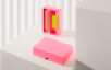
Mindsparkle: A Friend of Mine DATE September 30, 2026 EDITOR Mindsparkle Mag Kester Black's beauty packaging gives every lipstick shade its own shape Melbourne studio A Friend of Mine has evolved and repositioned Kester Black, Australia’s best-known ethical beauty brand. The label had built its following on breathable nail polish and a certified ethical supply chain, but its visual language needed to stretch across a product range that kept widening.
The studio’s answer was a brand identity that treats colour, shape and cut as structural decisions rather than surface decoration.Rather than replacing what already worked, the studio leaned into Kester Black’s legacy trademarks — bright, poppy colours and a slightly quirky styling sensibility — and pushed them somewhere more deliberate. The brand language was elevated into a strong graphic system that holds together across print, packaging and digital marketing platforms.
Consistency here comes from rules about contrast and composition, not from locking every application to a single palette.The packaging received a complete overhaul, built on vivid colour combinations that sit deliberately close to clashing. Two devices carry the system: a custom lettering pattern and a set of wavy die-cut edges that run along the edges of boxes and envelopes.
Together they give a flat printed box a sense of movement before it is even opened, and they scale from a single polish carton up to a full gift set.The custom patterned liner is the detail that rewards a second look — its shapes playfully spell out the words ‘Kester Black’ in a loose, almost liquid lettering. It is printed inside the boxes, so the brand name arrives at the moment of unboxing rather than on the shelf.
The scalloped edges mirror that same undulating attitude, tying the interior surprise back to the silhouette of the pack itself.For the Hyperreal lipstick range, the studio set out to challenge the norms of more traditional cosmetic packaging. Leaning into the brand’s fun and playful persona, it developed a system that pairs each unique shape with a corresponding lipstick shade.
Lined up on a retail shelf the range reads as one family while still letting a shopper find their colour by silhouette alone, giving it a presence a uniform tube could never manage.In line with the repositioning, the studio designed a suite of posters and digital marketing applications to instate and promote the new Kester Black brand. The campaign imagery crops tight on hands and garments, letting saturated blocks of colour do the work a conventional beauty shot would.
Article truncated for readability. Read the full piece →
Kester Black's rebranding showcases innovative packaging and design strategies that can inspire other brands, making it significant and relevant to brand strategy professionals.
Weekly digest
Get the Signal digest
Every Monday morning — the top 3 brand trends, 10 high-signal articles, and one emerging signal to watch.
No spam. Unsubscribe anytime.