Score
Perfection, begone! Laura Pappa and Tüpokompanii’s new typeface is all about letting yourself be bad at something
The article discusses Laura Pappa and Tüpokompanii's new typeface that embraces imperfection and the idea of allowing oneself to be 'bad' at something. This typographic revival aims to highlight the beauty in flaws and the creative potential that comes from embracing mistakes.
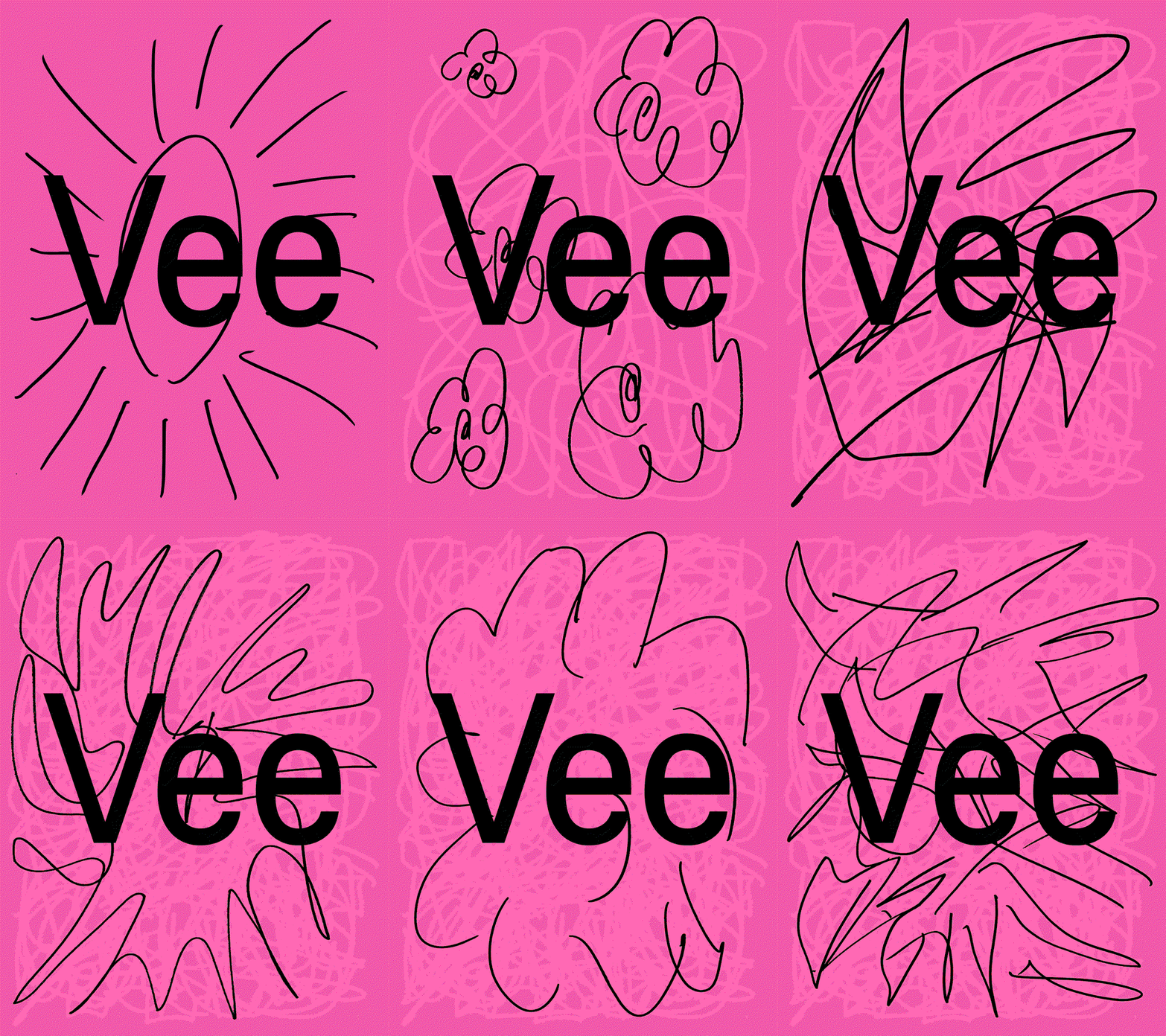
Its Nice That: When the foundry set out on this typographic revival, they knew something would get lost in translation – so they chose to embrace it, and the results are much more interesting.
The article introduces a fresh perspective on typography that encourages embracing imperfection, which is significant for the design industry but may not have widespread implications for brand strategy professionals.
Weekly digest
Get the Signal digest
Every Monday morning — the top 3 brand trends, 10 high-signal articles, and one emerging signal to watch.
No spam. Unsubscribe anytime.