Score
Louise Sloper On The Typography Trick That Most Designers Get Backwards
Louise Sloper emphasizes the critical role of typography in brand strategy, arguing that it should be prioritized over other design elements. By treating typography as a foundational aspect of communication, brands can create a more impactful identity that resonates with their audience, as demonstrated in the Bacardi Untameable campaign where typography was central to conveying the brand's message.
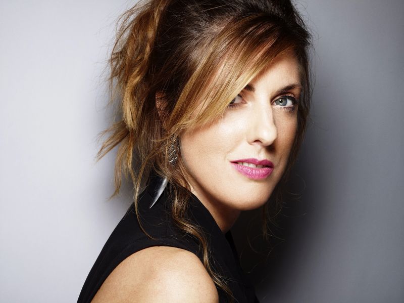
Creative Boom: Insight Graphic Design SWC's Louise Sloper on the typography trick that most designers get backwards The executive creative director of SWC and TypoCircle chair shares hard-won lessons from the Bacardi Untameable campaign… including when you should bin the grid. Written By: Tom May 19 February 2026 Louise Sloper. Portrait by Rankin Most designers, if they're honest, treat typography as the bit that happens after the interesting decisions have been made.
The photography gets art-directed, the concept gets refined, the layout takes shape… and then the type gets "bashed on", as Louise Sloper puts it; like a garnish on a plate that's already been plated. Louise reckons this is entirely backwards. "Typography is such a key part of my approach to art direction," she says.
"Words have the power, and to me typography is their body language." It's a conviction she's earned over 25 years in the industry, working as head of art and design director at several London advertising agencies before founding her own purpose-led studio, Here We Go, and more recently taking up the role of executive creative director at the SWC Partnership. She's also chair of TypoCircle, the not-for-profit creative organisation now celebrating its 50th year of championing typographic craft.
In a recent talk to The Studio, our own private network, Louise took a deep dive into the Bacardi Untameable campaign, a global brand reset she worked on at BETC London that turned the rum brand from a sugary party drink into something with genuine heritage and soul. It was all of that. But threaded through the Bacardi story were a series of practical lessons about typography, process and creative bravery that any designer could steal tomorrow morning. Build the grid later Perhaps the most provocative takeaway is Louise's cheerful rejection of the grid system as a starting point.
"All the lecturers kill me because I'm not actually a big fan of grid systems," she admits, clearly relishing the heresy. "The grid system in my mind can constrain your typographic play." Her alternative? Design instinctively first, then reverse-engineer the structure. "Break from the grid to begin with and just see if that frees you up," as she puts it. "Then if you do need to iterate on it or hand it to other designers to understand, build the grid around your instinct." It's an approach that rewards speed over deliberation. Louise described her own process as relentless, rapid iteration.
"Usually, within sort of half an hour, I'll end up with 40 or 50 layouts, just because I've tweaked, tweaked. I just copy, tweak, copy, tweak and go through it that way." She even recommended setting a timer: ten minutes, see what happens before the alarm goes off. "Overthinking it sometimes causes us trouble." Kill your darlings (all 2,000) That instinct for volume certainly served the Bacardi project. Louise estimated her team produced around 2,000 visual iterations for the campaign: enough to fill a five-minute GIF, flashing through at a split second per frame.
Article truncated for readability. Read the full piece →
The article discusses a significant aspect of brand strategy—typography—highlighting its importance in a major campaign, making it impactful and relevant for professionals, though the focus on typography itself is a common topic in design discussions.