Score
The Best New Typefaces For May 2026
The introduction of new typefaces, particularly the evolution of Gotham Variable by Monotype, highlights the importance of adaptability and flexibility in brand strategy. As brands operate on a global scale, having a typeface that can convey authority while remaining approachable is crucial for effective communication in diverse markets.
Creative Boom: Resources Typography The best new typefaces for May 2026 May's new fonts have something to say, and the typographic vocabulary to say it—at any size, weight or width you care to mention. Written By: Tom May 18 May 2026 Gotham Variable by Sara Soskolne In global terms, much of 2026 has felt like we're teetering on the edge of a precipice. And yet at the same time the world keeps turning, and type designers are still doing what they've always done: making life that little bit better, one character at a time.
And May's new releases have a pleasing breadth, from a 500-year-old Bible to a Times Square billboard, a twig in a Swiss forest to a plate of Spanish biscuits. (Yes, really.) Dalton Maag's Deiverson Ribeiro serves up a food-themed Brazilian script with a jazz-like swagger. Sproviero pushes Art Deco into new territory. But the month's biggest moment arguably belongs to a typeface that's been around for a quarter of a century. Yes, Gotham is turning 25, and Monotype is celebrating with a variable evolution that further broadens what it can offer.
Elsewhere, Jean François Porchez launches the screen-optimised serif he started designing in 2021, Grilli Type releases its monospace industrial tool, and a botanical display font arrives from Switzerland with a philosophy borrowed from Japanese gaming. All in all, fun times are forging ahead in typeland, and there's plenty of fresh inspiration for designers to check out. 1. GT Mechanik by Shiva Nallaperumal, Reto Moser and Noël Leu Before monospace typefaces became synonymous with code and terminals, electromechanical text systems used fixed-width type to stamp messages onto physical matter (paper, wood, metal).
GT Mechanik, from Grilli Type, takes that old-school analogue logic and runs with it. Essentially, it treats the constraints of fixed-width design not as limitations but as generative principles. Abrupt joints, interrupted connections, oversized punctuation—these give GT Mechanik a sense of character that helps it embody its name. To get a little technical, the design space is organised into three tones (Mono, Semi, and Poly), each expressing the same underlying logic at different scales and amplifications.
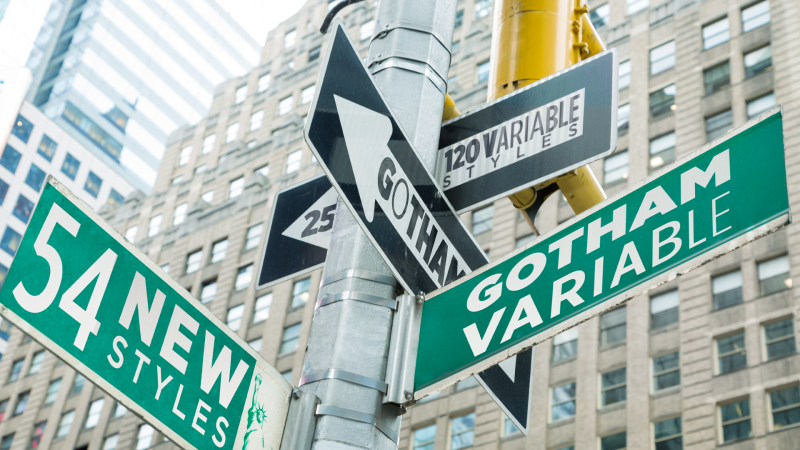
Mono is highly mechanical, with inktraps and idiosyncratic details fully present; Semi introduces a more lilting cadence; Poly arrives at a stark, ultra-low-contrast resolution. Significantly, those details dissolve as you move along the axis, creating a shift in character between settings. Rather than optimising for a single intended use, GT Mechanik allows designers to find the tone that suits their message. 2. Gotham Variable by Sara Soskolne Think you don't know Gotham? Trust me, you do. It's been used on GQ covers, on the Obama presidential campaign posters, on Netflix, on Coca-Cola, on the sides of buildings and on the backs of buses.
For a quarter of a century, it's offered authority with a friendly face; geometric confidence without coldness. But how do you evolve a typeface that iconic, when the world it was designed for has fundamentally changed? Monotype's brilliant answer to that question is Gotham Variable. Developed by Sara Soskolne, with Jordan Bell handling language support, a single-file architecture introduces continuous control across both weight and width, consolidating what was previously a large family of static files into a single system.
Article truncated for readability. Read the full piece →
The article discusses the evolution of a significant typeface and its implications for global branding, making it impactful and relevant, while the introduction of new typefaces provides a level of novelty in design trends.