Score
Swan Soda Packaging Design by Orchidea Agency
The packaging design for Swan Soda by Orchidea Agency emphasizes a modern and playful aesthetic through the use of flat illustrations and a custom sans-serif typeface. This approach not only enhances the visual identity of the brand but also positions it as a contemporary choice in the natural beverage market, highlighting the importance of cohesive design in brand strategy.
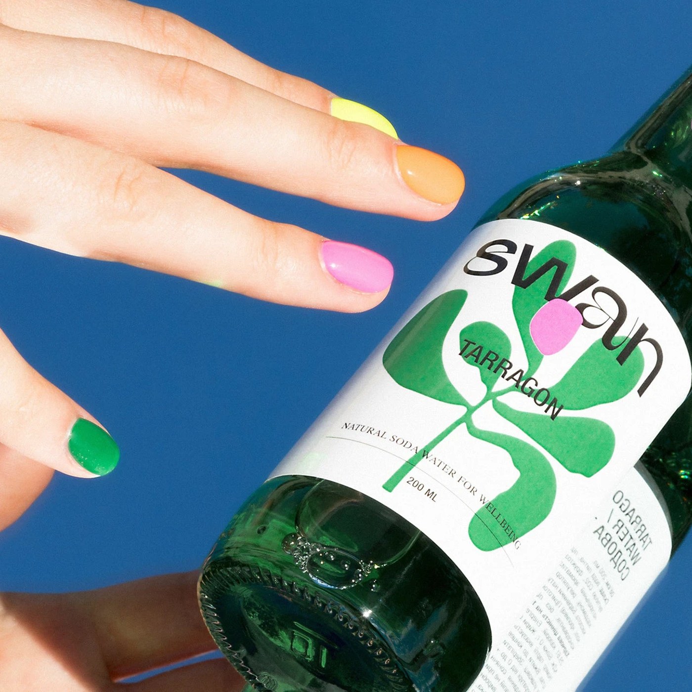
Abduzeedo: Swan is a natural soda water brand. Orchidea Agency built a soda packaging design system using flat illustration blobs and a bespoke sans-serif wordmark. Eight 200ml clear glass bottles, eight flavour...
The article discusses a specific packaging design that showcases modern branding techniques, which is significant for the industry but not groundbreaking, making it moderately impactful and relevant.