Score
Illustrator Rosa Snijders finds the softness in grief, debt and all of life's heavy subjects
Rosa Snijders' approach to illustration emphasizes the importance of conveying heavy themes with softness and emotional intelligence, which can enhance a brand's narrative and connection with its audience. By using a gentle color palette and abstract representations, brands can communicate complex messages without overwhelming their audience, making their storytelling more relatable and impactful.
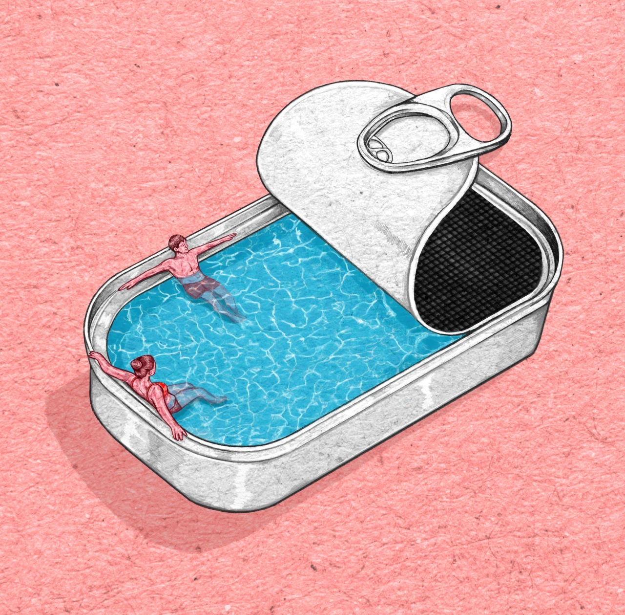
Creative Boom: Illustrator Rosa Snijders finds the softness in grief, debt and all of life's heavy subjects The Amsterdam-born, Milan-based artist graduated into the pandemic, yet built an editorial career by sending emails. She tells us how she turns difficult themes into an image in five hours flat, and why the darkness doesn't have to be grey. It's funny. I immediately saw softness when I first discovered Rosa Snijders' work. A textured delicacy that brings back memories of children's books from the 1980s. So I smiled when I learned that softness is deliberate.
A way of illustrating many of life's challenges for an array of editorial clients like Le Monde, National Geographic and Corriere della Sera. The Dutch artist, who's now based in Milan, has made a living out of drawing heavy subjects for newspapers and magazines around the world. But she doesn't go for depressing colours or anything deliberately miserable. There's an emotional intelligence behind her artworks. An understanding that life is hard enough without having things rammed down our throats, reminding us of the sadness of the world. Rosa often has to turn briefs around quite quickly.
She'll be asked to draw grief, not literally, but in an abstract way. You won't find clichés like a sad face or lone figure under a raincloud. She instead considers the weight of sadness. That heaviness we feel when loss takes over. And she has to do all that in five hours straight, to deadline, without much break. Flick through her portfolio, and you'll spot more subjects we'd rather not think about, such as losing a parent, talking to children about death, sexual intimidation at work... the list goes on. But, as I've said, her work isn't grim. It feels gentle and considered, all wrapped up in a palette mostly of pink, white and blue.
There might be the odd contrast with yellow and red when impact needs to be made. But overall, if you didn't think too much about the message behind her illustrations, you'd happily hang them on your wall. Rosa graduated from the Hogeschool voor de Kunsten Utrecht in 2020, straight into lockdown. But despite it all, within a few years, she was working for Le Monde, National Geographic and Le Temps, alongside Dutch titles like De Volkskrant and NRC. She's since had representation from Artbox Amsterdam and takes commissions in Dutch, English and Italian.
And if that doesn't make those of us feeling not as successful this morning any more anxious, she's a freelance photo and art editor in her spare time. All this in just five years, with the first being in a global pandemic. Was it the urgency to push ahead when faced with such a challenge? Most definitely. But Rosa says it was mostly about turning up and sending a lot of emails. "The first few years I mainly worked with Dutch media, which went pretty quickly and easily thanks to three internships at a well-known newspaper and magazine, in both illustration and image editing," she says.
"After a few publications there with my name in the paper, the ball started rolling. The nice thing about editorial illustration is that it's also a kind of free publicity. Your name is always published alongside your illustration, so a lot of people will see it." So the pandemic didn't hold her back. "Covid wasn't holding illustration back in the Dutch media landscape. If anything, there may have been more requests. No paper wants those little scientific Covid balls over and over again, so I think they were looking for more creative ways to visualise it and the problems emerging from it in society.
Article truncated for readability. Read the full piece →
Rosa Snijders' unique approach to illustrating heavy themes with softness offers valuable insights for brand storytelling, making it significant and relevant for brand strategy professionals.
Weekly digest
Get the Signal digest
Every Monday morning — the top 3 brand trends, 10 high-signal articles, and one emerging signal to watch.
No spam. Unsubscribe anytime.